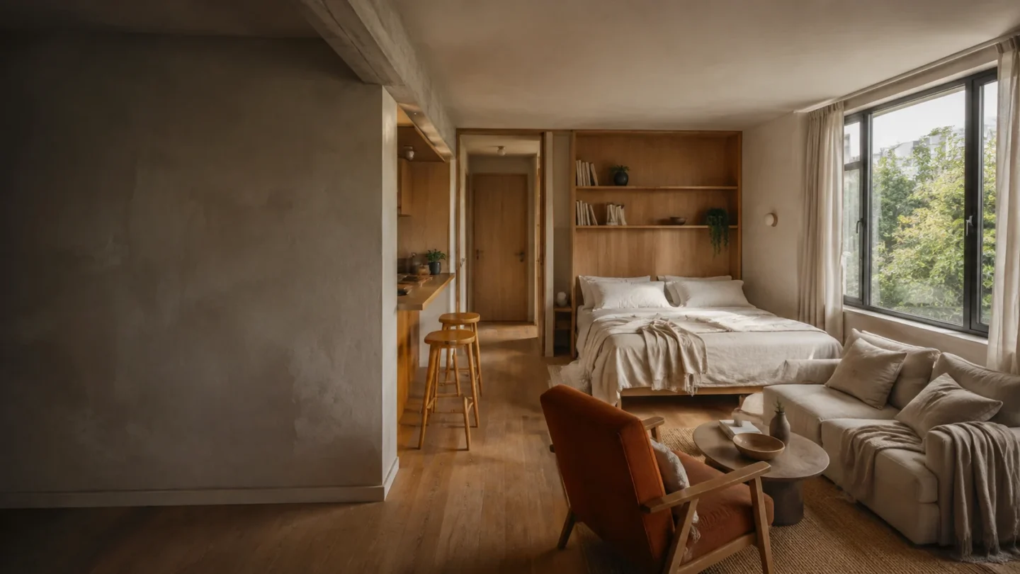
Small rooms feel larger when colors relate across doorways and functional zones. That does not require painting everything one shade; it requires a clear hierarchy that the eye can follow.
Choose the foundation from fixed materials
Start with flooring, cabinets, tile, and large upholstery. Identify whether their undertone is warm, cool, or balanced, then choose a wall color that supports rather than fights those permanent notes.
Repeat one material color
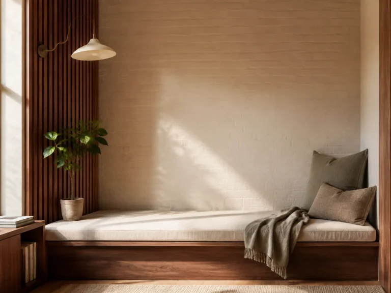
Carry the tone of wood, metal, stone, or woven fiber into at least two areas. Repetition creates continuity even when each zone uses different furniture and textiles.
Limit the strongest accent
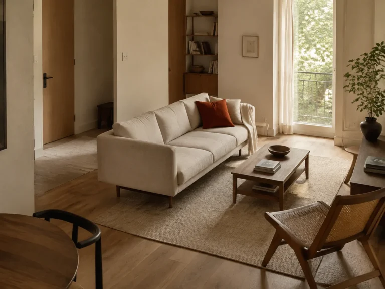
Use the boldest color on a few small or medium elements that can be seen together. Spreading it evenly through every corner can flatten the hierarchy and make the room feel themed.
Check the palette after dark
Bulb temperature changes how paint and fabric relate. Compare samples under the lamps you actually use and replace inconsistent bulbs before rejecting an otherwise coherent scheme.
Photograph the longest view through the home and count the competing colors. If one appears only once without a clear purpose, repeat it deliberately or remove it.
Community
Join the conversation
Add a useful idea, ask a specific question, or share what worked in your space. Every comment is reviewed before it appears.