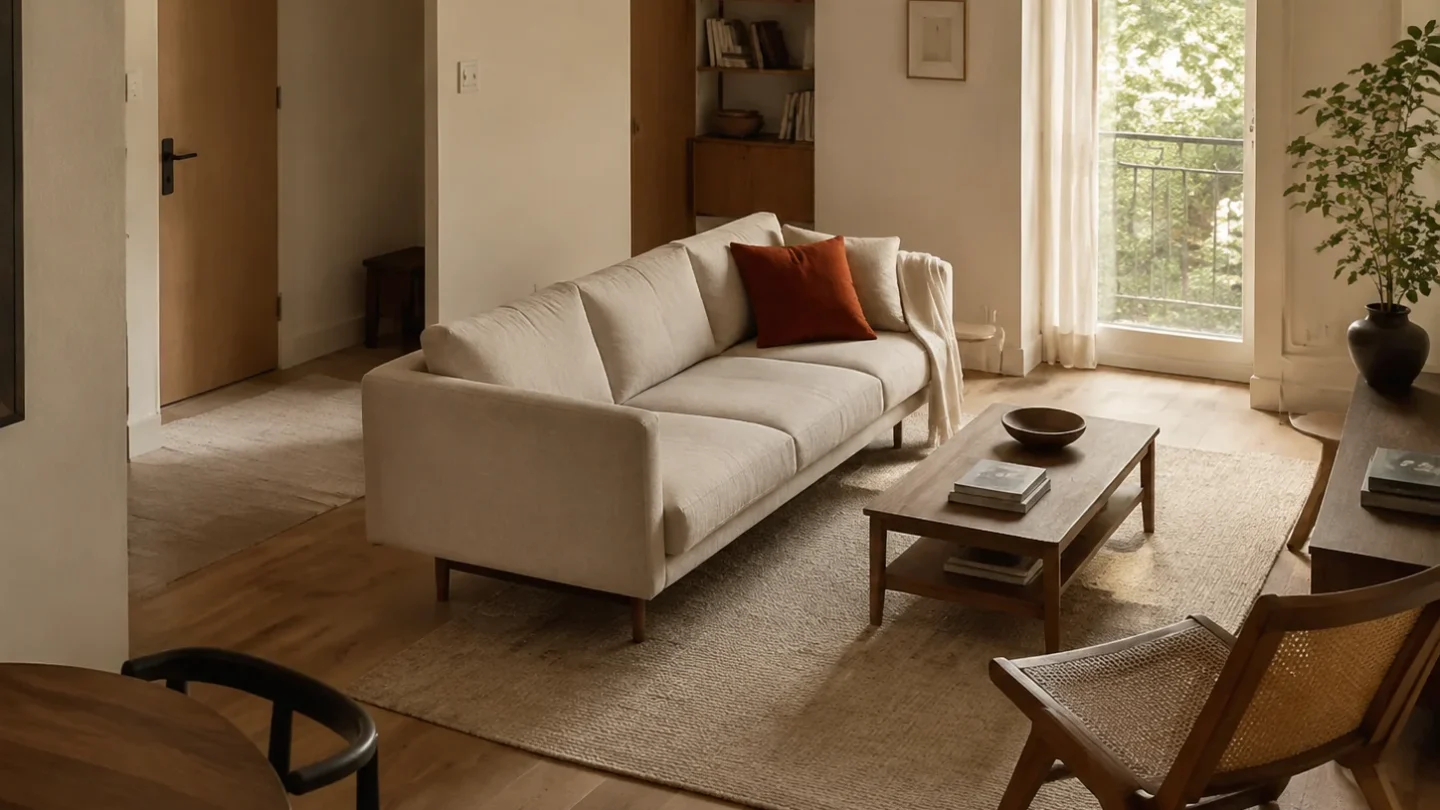
The sofa is often the largest block of color in a studio, so its fabric influences the sleeping, dining, and working zones at once. The safest choice is not always beige; it is the color that connects the room you already have.
Read the fixed finishes first
Compare fabric samples with the floor, cabinets, and wall paint in morning and evening light. A gray sofa can look blue beside warm oak, while a cream can turn yellow under a cool ceiling fixture.
Use contrast to clarify the layout
A sofa close to the wall color visually recedes and makes the room feel continuous. A deeper contrasting tone can help define the living zone when the rest of the plan is open and quiet.
Let texture carry a restrained color
Boucle, brushed weave, linen-look fabric, and subtle heathering keep a neutral sofa from feeling flat. In a small space, tactile variation is often more flexible than a loud pattern.
Test the color beside real clutter
Place the sample near bags, bedding, books, and electronics rather than styling it in isolation. The right upholstery should make ordinary life look more organized, not require the room to stay photo-ready.
Choose the most forgiving version of the color you love, then repeat it once or twice in smaller details so the sofa feels connected rather than accidental.

Community
Join the conversation
Add a useful idea, ask a specific question, or share what worked in your space. Every comment is reviewed before it appears.