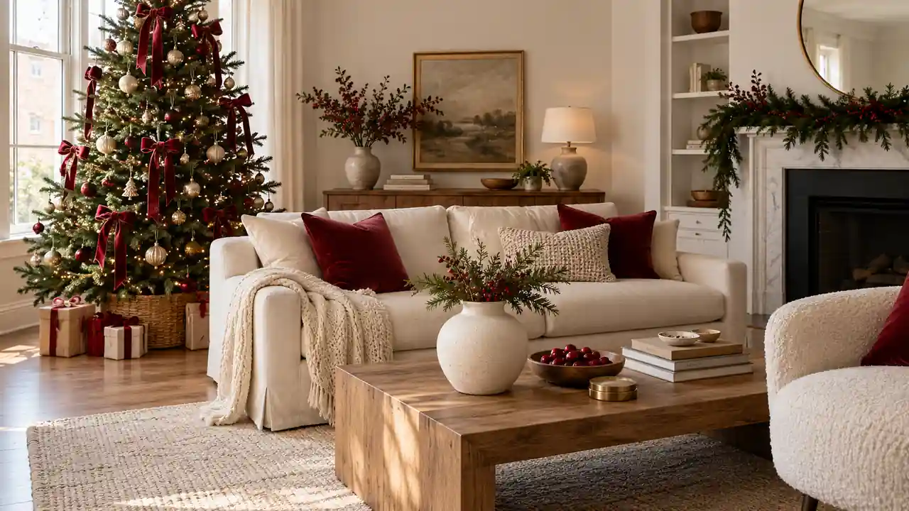
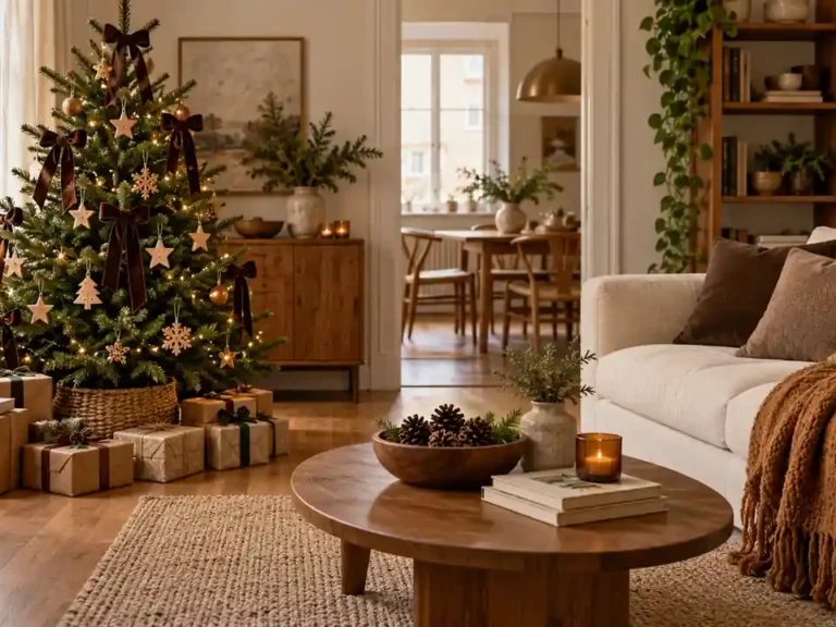
Apartment Christmas decor inspiration is most useful when it helps you choose a direction for the room you already have. A favorite cushion, a warm wood table, or a picture on the wall can become the starting point for a holiday palette. These ideas offer different moods, from quiet Nordic neutrals to a playful candy-colored corner. You do not need to combine them all. Choose the colors and materials that feel comfortable beside your existing furniture, then repeat a few details across the apartment. A clear direction makes the refresh easier to plan and gives even a small arrangement a finished feeling.
For a year-round base, these cozy studio apartment ideas explore comfortable layers and compact living areas.
1. Cranberry And Cream
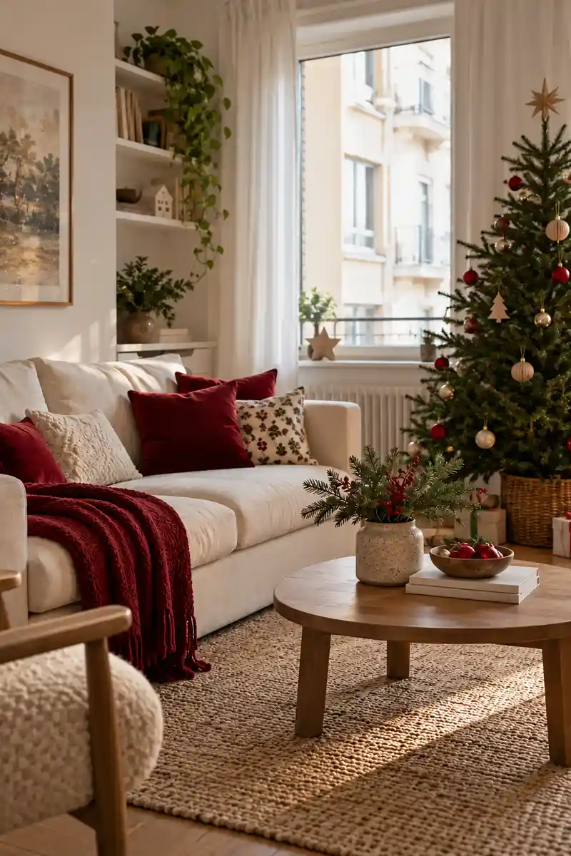
Pair cranberry cushions with a cream sofa and a lightly decorated green tree. Keep the larger surfaces pale so the red accents feel rich without dominating the room. Keep the nearby surfaces simple so the texture remains easy to appreciate.
This palette is easy to spread across a compact room because a little cranberry goes a long way. Repeat it in a ribbon or a few ornaments, then stop. If your sofa is already dark, use cream in a throw or runner to keep the arrangement from feeling too dense.
2. Soft Nordic Neutrals
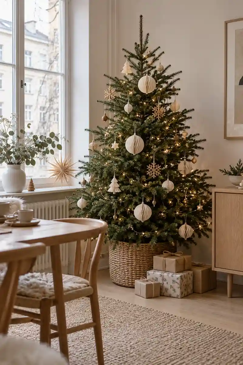
- Choose pale wood as the base.
- Add ivory paper ornaments.
- Keep green branches visible.
- Mix smooth and textured surfaces.
A neutral scheme still needs contrast to avoid looking flat. Put smooth ornaments beside a textured throw, or a crisp paper star near a rounded ceramic vase. Keep some dark green branches visible so the tree has definition, especially against a white wall in a bright apartment living room.
3. Moody Green Corner
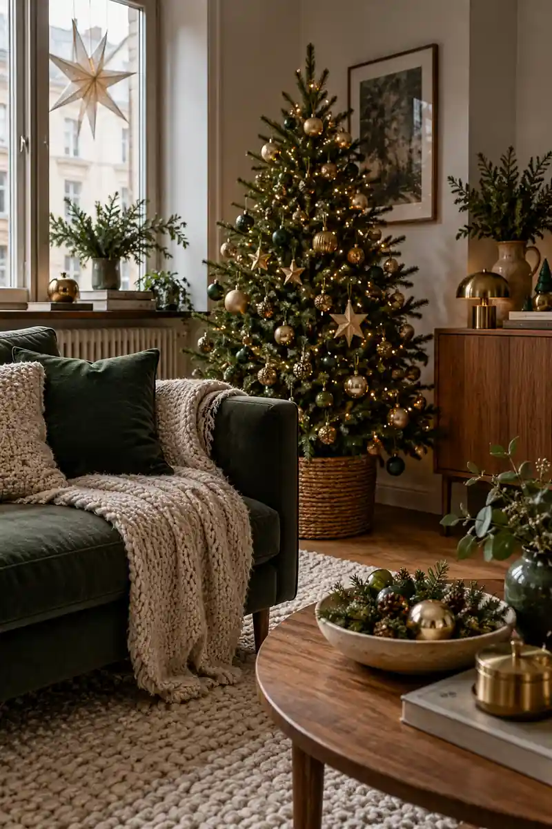
Quick tip: Use deep green fabric beside warm wood and a few brass-colored ornaments. Keep the arrangement in one corner so you can enjoy a richer mood without changing the entire room.
This works well when your existing furniture already includes dark tones. Bring in one lighter detail, such as a cream cushion or pale ceramic bowl, so the darker pieces remain easy to see. View the corner in daylight and evening light before deciding whether it needs any more decoration.
4. Vintage Ornament Mix
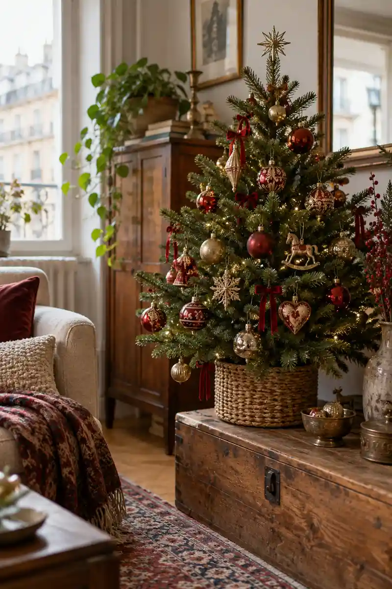
Before: Every ornament comes out together. The small tree feels busy and the favorite pieces disappear.
After: A shared color connects a smaller selection. One special ornament gets a clear place at the front.
A mixed collection can feel deliberate when the surrounding materials are simple. Plain ribbon and an understated tree base let the ornaments supply the character. You do not have to display every piece each year; rotate a smaller selection so the details are easy to appreciate in a compact room.
5. Blue Winter Accent
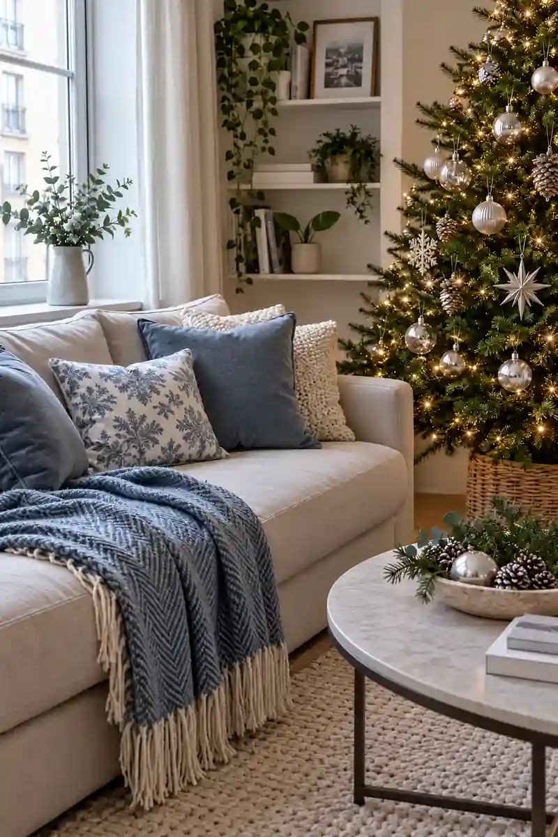
- Find a dusty blue textile.
- Test it against your existing furniture.
- Repeat blue in a small ornament.
- Add a restrained silver detail.
Blue can be a useful alternative when red clashes with your existing rug or artwork. Start with one textile and repeat the shade in a small decoration nearby. Keep the silver accents restrained so they add a little reflection without making every surface look shiny or competing with the room’s daylight.
6. Two Festive Directions
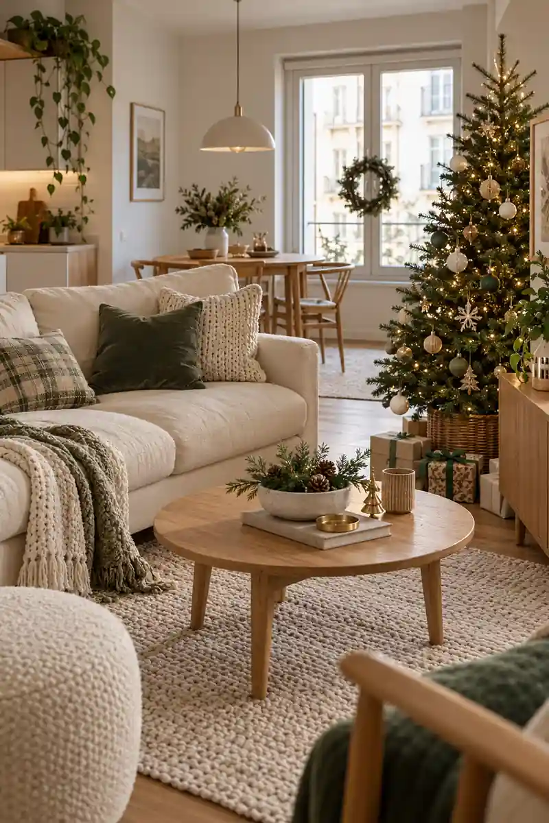
Classic red and green
Main accent: Warm red
Supporting material: Green branches
Best starting point: Existing red textiles
Quiet cream and wood
Main accent: Soft ivory
Supporting material: Natural wood
Best starting point: Pale neutral furniture
Look at the furniture and textiles you plan to keep throughout December. If they already contain warm red, the classic option may need very little new material. If the room is mostly pale and natural, a quiet scheme can make the holiday refresh feel like an easy extension of everyday styling.
7. Modern Black Detail
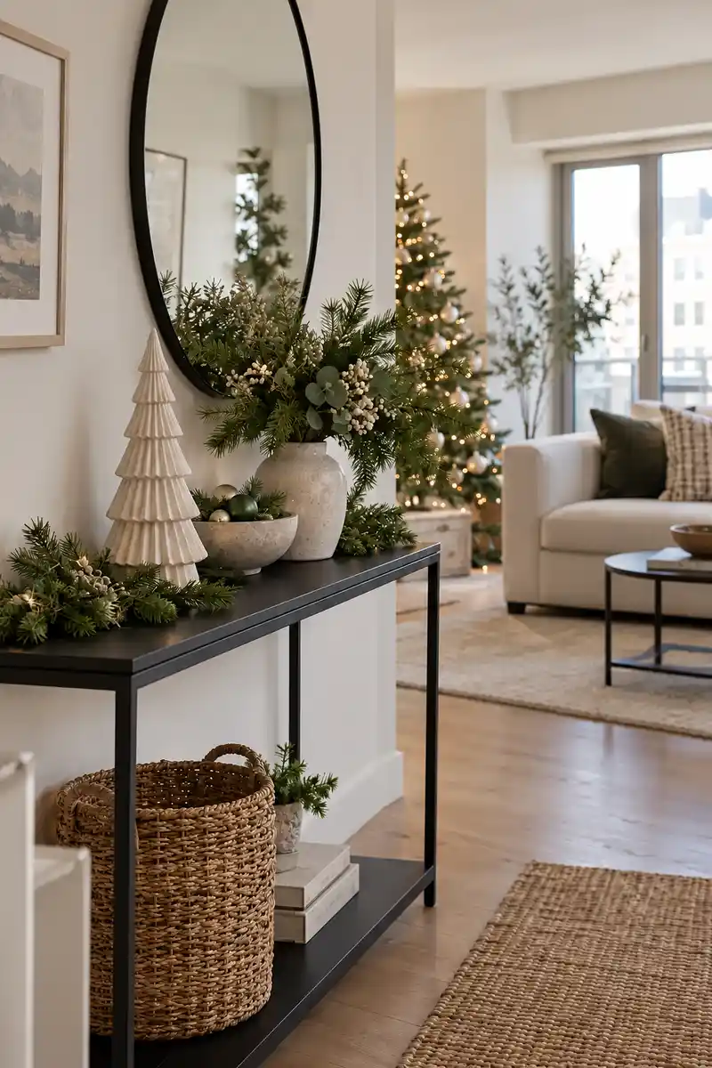
- Do: Repeat an existing dark detail.
- Do: Choose one black frame or ornament.
- Do: Keep surrounding shapes simple.
- Don’t: Scatter tiny black objects everywhere.
- Don’t: Hide pale decorations behind it.
- Don’t: Add contrast without a clear focal point.
Black is most effective here as a small supporting note. Repeat an existing black lamp or chair leg rather than introducing a whole new group of accessories. Keep the surrounding shapes simple so the contrast feels clean, and avoid scattering tiny dark objects across every surface in the room.
8. Warm Copper Touch
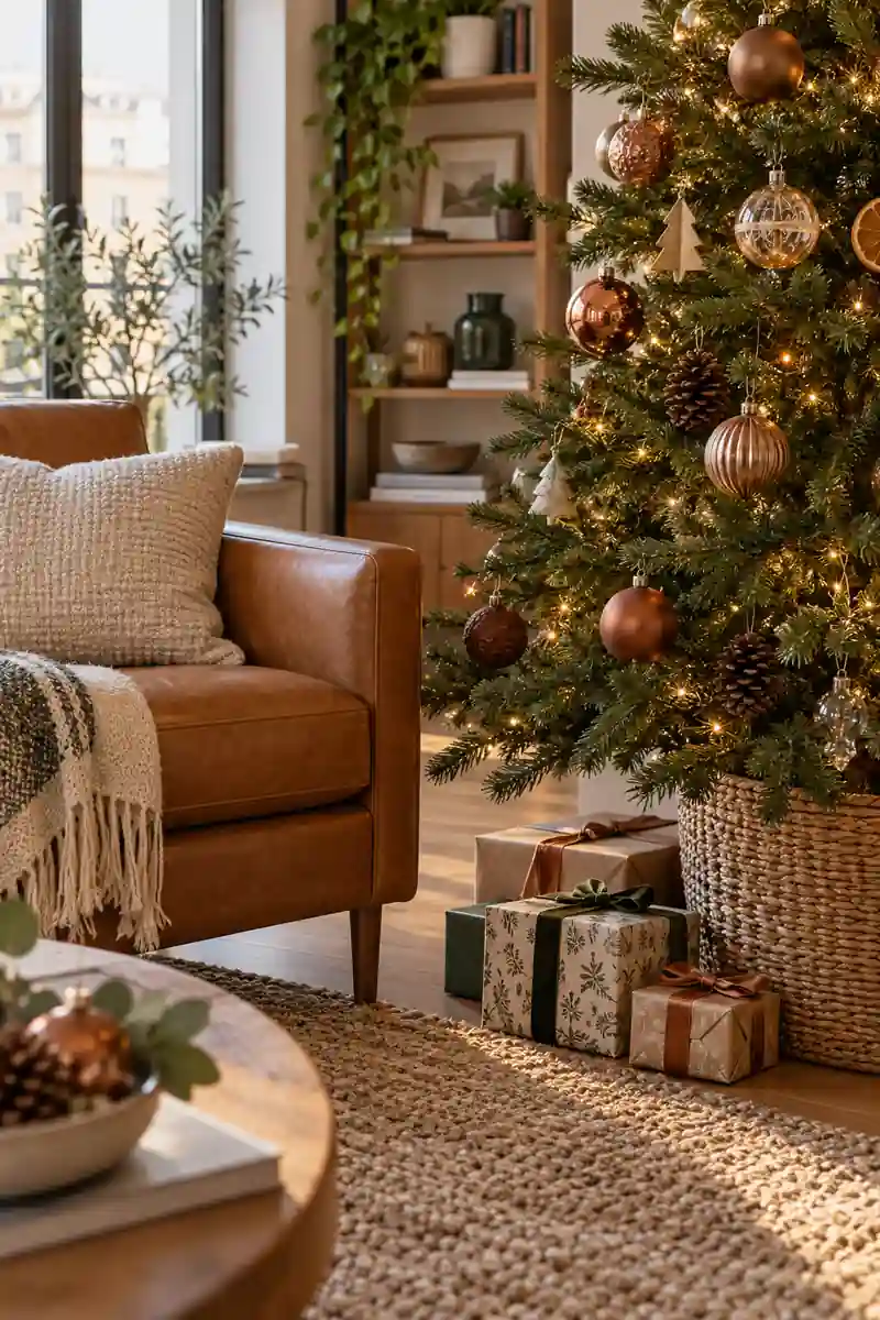
- Metal note: Soft copper tone.
- Furniture match: Tan leather or brown wood.
- Placement: One tree cluster or bowl.
- Balance: Keep other finishes familiar.
You do not need every metal finish to match. Let copper lead the seasonal accents while the existing hardware stays as it is. A small cluster on the tree or in one bowl will feel more intentional than single metallic objects dotted throughout the kitchen, bedroom, and living area.
9. Candy Color Corner
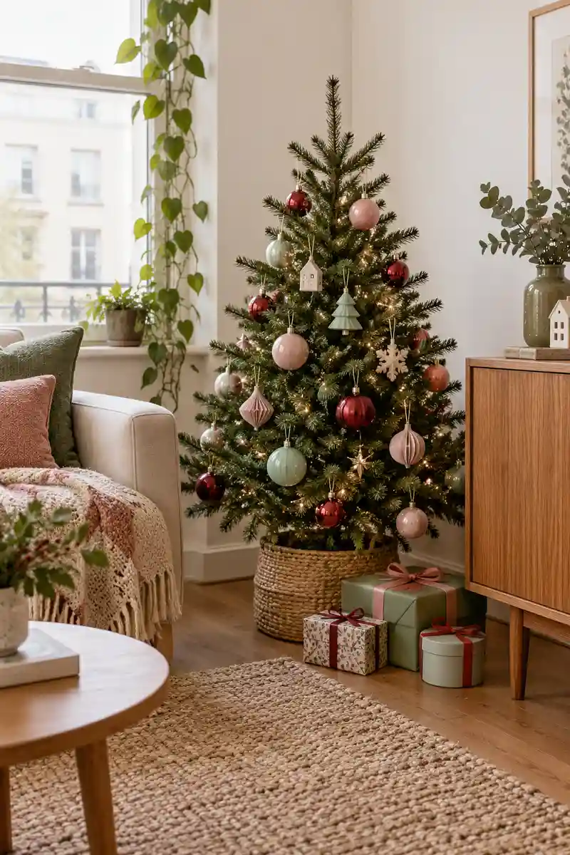
Create one playful corner with pink, mint, and soft red ornaments. Keep the nearby furniture plain so the colorful shapes have a clear place to stand out. Place pink ornaments at different heights, with mint pieces between them. Space the red accents farther apart so they punctuate the softer colors.
A playful scheme can feel edited when the color stays within a defined area. Choose two or three shades and repeat them in different sizes rather than adding every bright ornament available. A small tree is enough to carry the idea, leaving the rest of the apartment comfortably familiar.
10. Checked Textile Pair
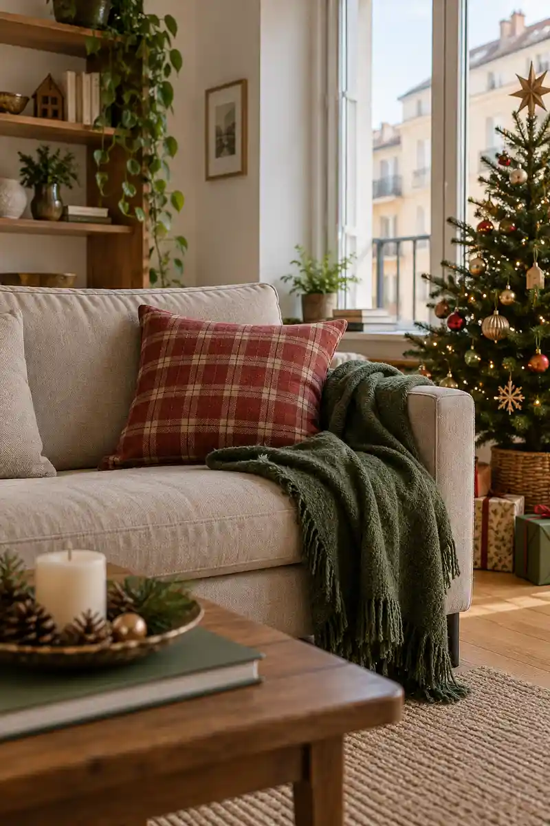
- Choose one checked textile.
- Pull one ornament color from it.
- Make the second textile plain.
- Test it beside existing patterns.
A pattern can do the palette planning for you. Keep the second textile solid so the room has somewhere quiet for the eye to rest. If your rug or curtains are already patterned, choose a check with a larger scale and fewer colors, then test the fabrics together before decorating further.
11. Paper And Porcelain
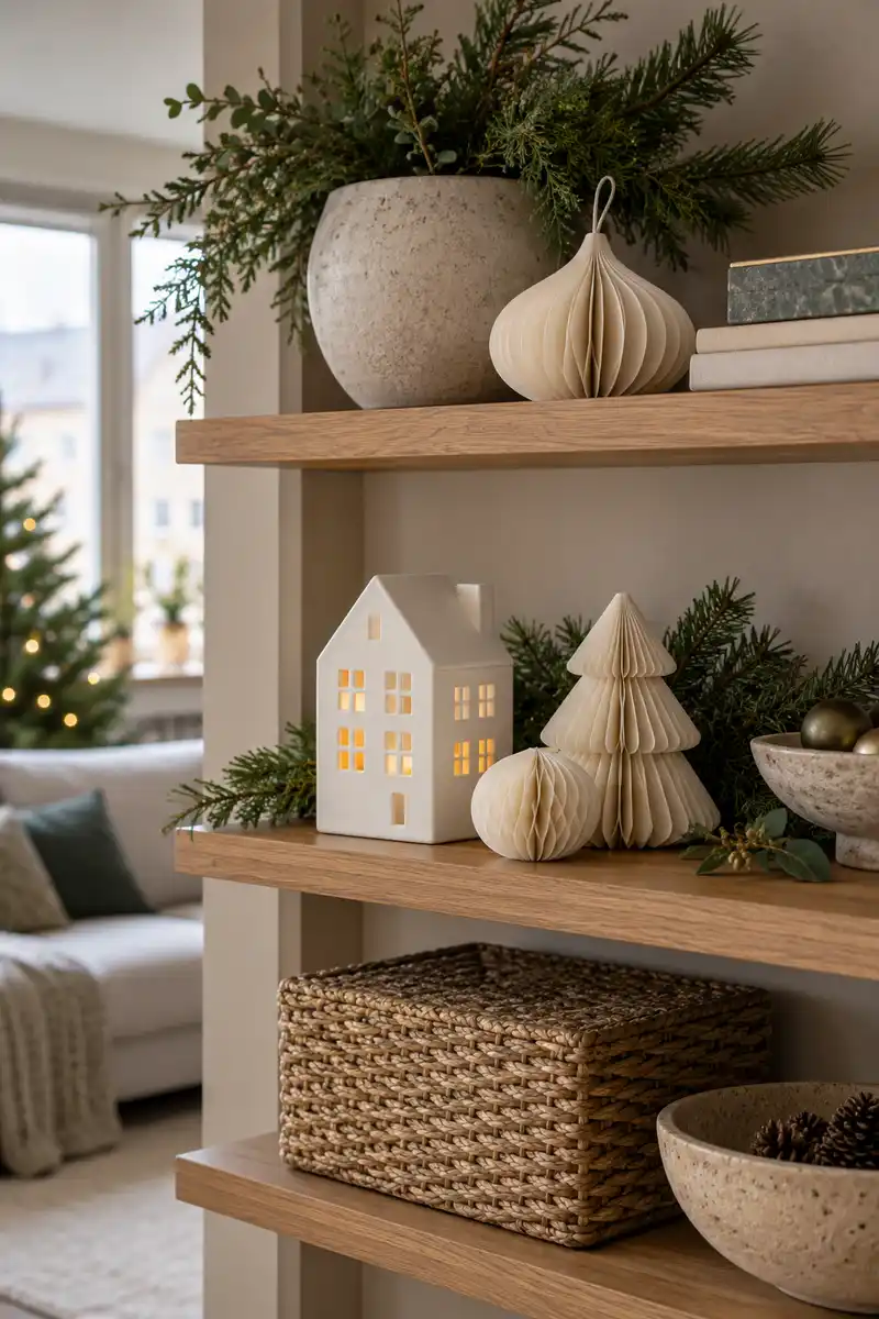
Quick tip: Pair folded paper ornaments with a smooth porcelain tree or house. The combination creates a quiet holiday display with enough texture contrast to feel interesting up close.
The materials can be similar in color without disappearing into each other because their surfaces catch light differently. Put the arrangement against a slightly warmer or darker background for definition. Keep paper pieces away from heat sources, and avoid crowding the display with additional shiny ornaments that change its calm character.
12. Art Led Palette
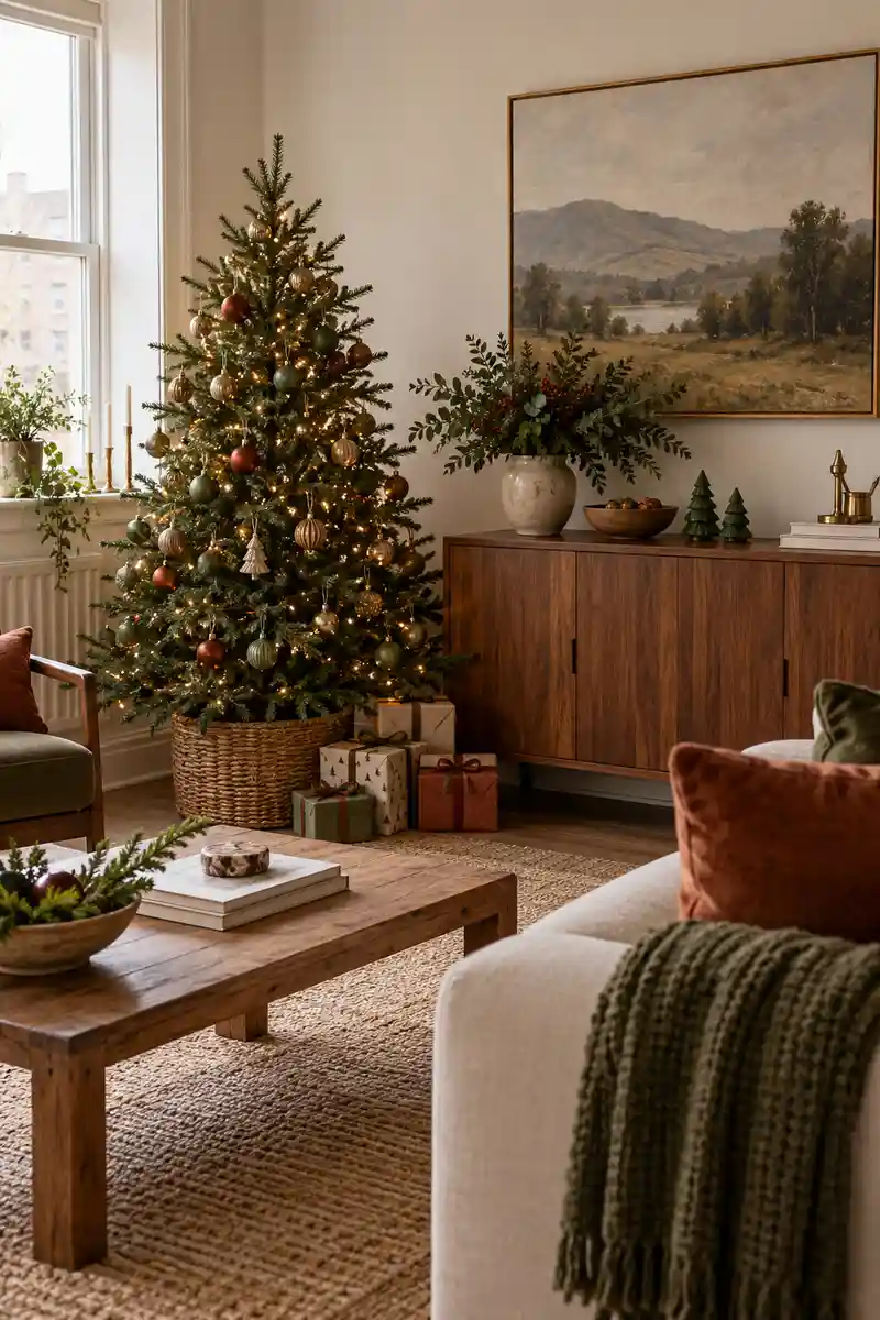
Before: Holiday colors feel unrelated to the room. The existing picture seems left out of the arrangement.
After: Two colors from the artwork appear in textiles and ornaments. The picture remains visible as part of the room.
Using existing art as a guide makes the seasonal room feel connected to your usual taste. The match does not need to be exact; a muted red in a painting can relate to a deeper ribbon. Let the artwork remain visible so the source of the palette still makes sense.
13. Golden Hour Neutrals
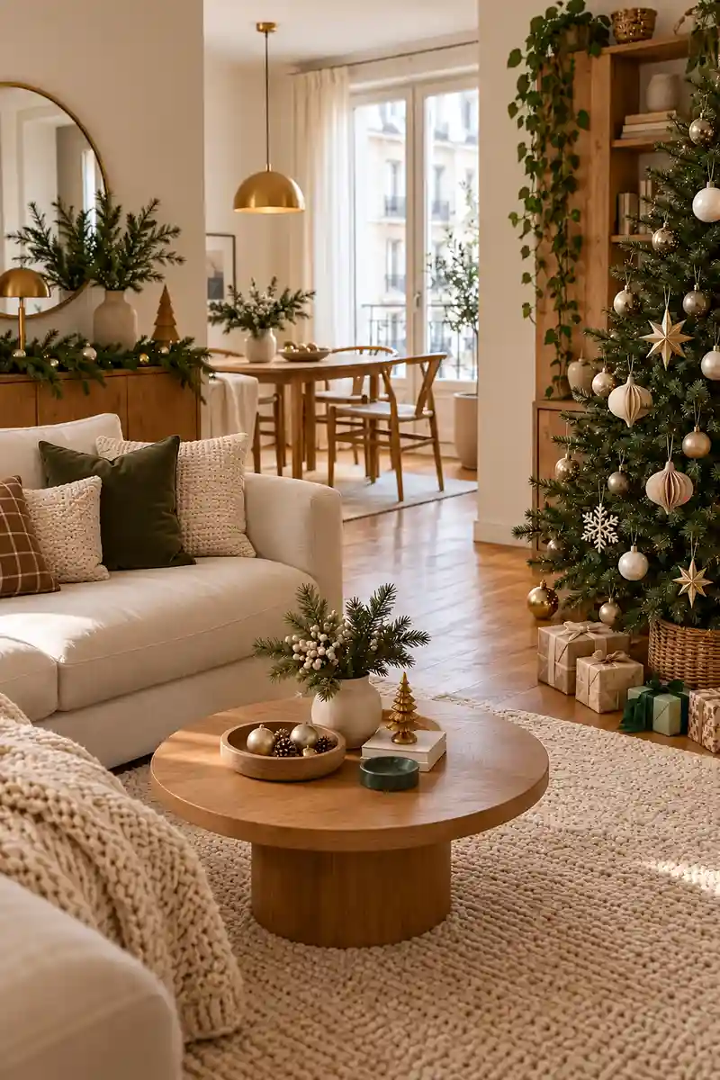
- Choose warm cream as the base.
- Repeat honey wood where it already exists.
- Add a few soft gold ornaments.
- Include one darker green detail.
This palette can suit a bright room or a quieter evening corner because the colors already sit close together. Add one darker green detail for depth, such as a small tree or faux branch. The restrained color range lets different materials carry the interest without requiring a large number of decorations.
14. Colorful Or Quiet
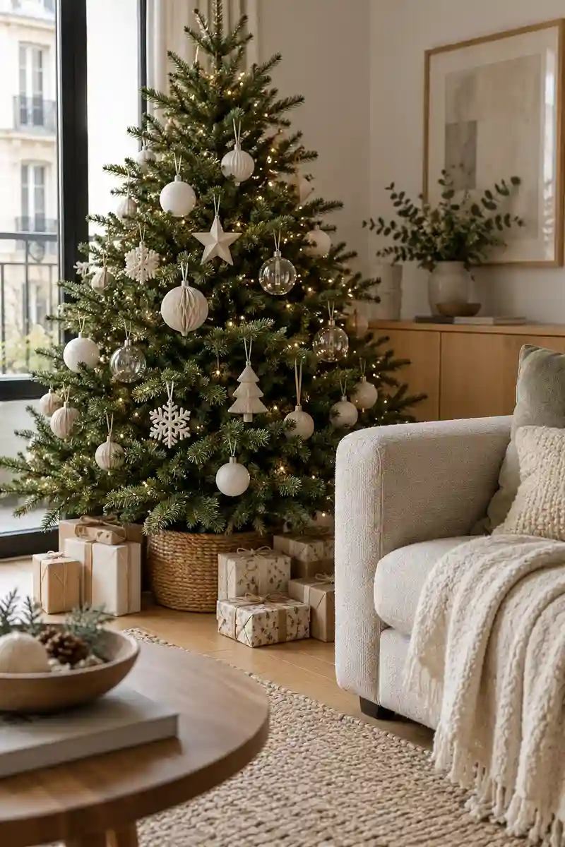
Colorful focal point
Tree palette: Two or three clear colors
Nearby textiles: Mostly plain
Supporting accents: Few repeated colors
Quiet focal point
Tree palette: Cream and natural green
Nearby textiles: Gently textured
Supporting accents: Varied simple shapes
Both approaches can feel festive, but mixing them without a plan may leave the room looking unfinished. If the tree is colorful, keep the table and sofa calmer. If the tree is quiet, use texture and shape nearby to add interest without suddenly introducing an unrelated strong color across the room.
15. Collected Ceramic Shelf
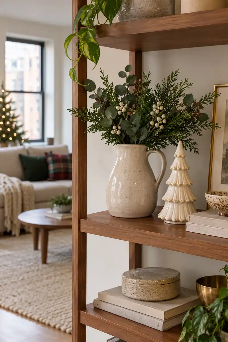
- Do: Start with favorite everyday ceramics.
- Do: Add one seasonal shape.
- Do: Vary heights slightly.
- Don’t: Fill every shelf gap.
- Don’t: Add a complete new set unnecessarily.
- Don’t: Hide the useful objects you still need.
The familiar objects help the arrangement feel personal and reduce the need for a complete seasonal set. Choose pieces with a shared finish or color, then vary their heights slightly. Leave some shelf visible between groups so the display reads as a considered arrangement rather than the contents of a cupboard.
16. Ribbon As Repetition
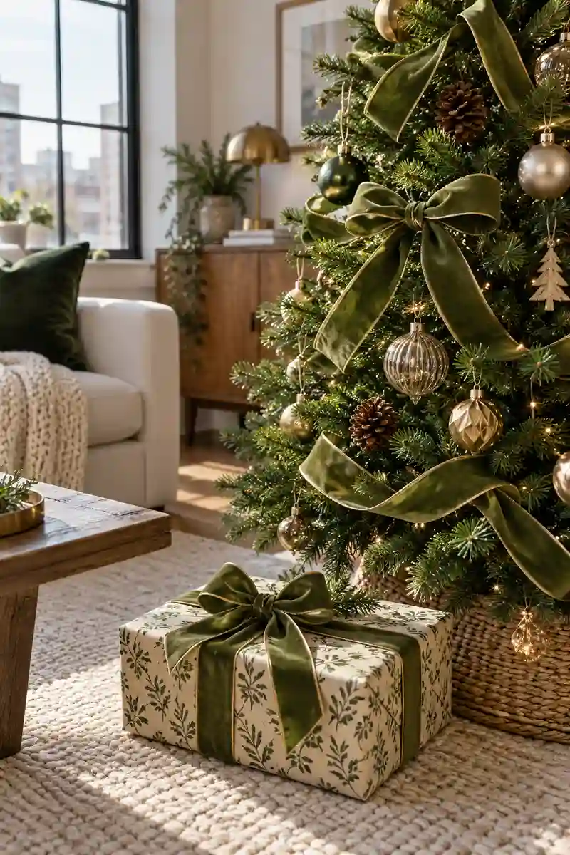
- Material: Linen, velvet, or cotton.
- Repeat: Two or three locations.
- Shape: Simple knots and short tails.
- Placement: Away from moving parts.
Ribbon is useful when the room contains different furniture styles but needs a shared seasonal detail. The material can be linen, velvet, or plain cotton depending on the mood you prefer. Keep it away from working hardware and moving parts, and choose short tidy lengths where people pass close by.
17. Tiny Woodland Scene
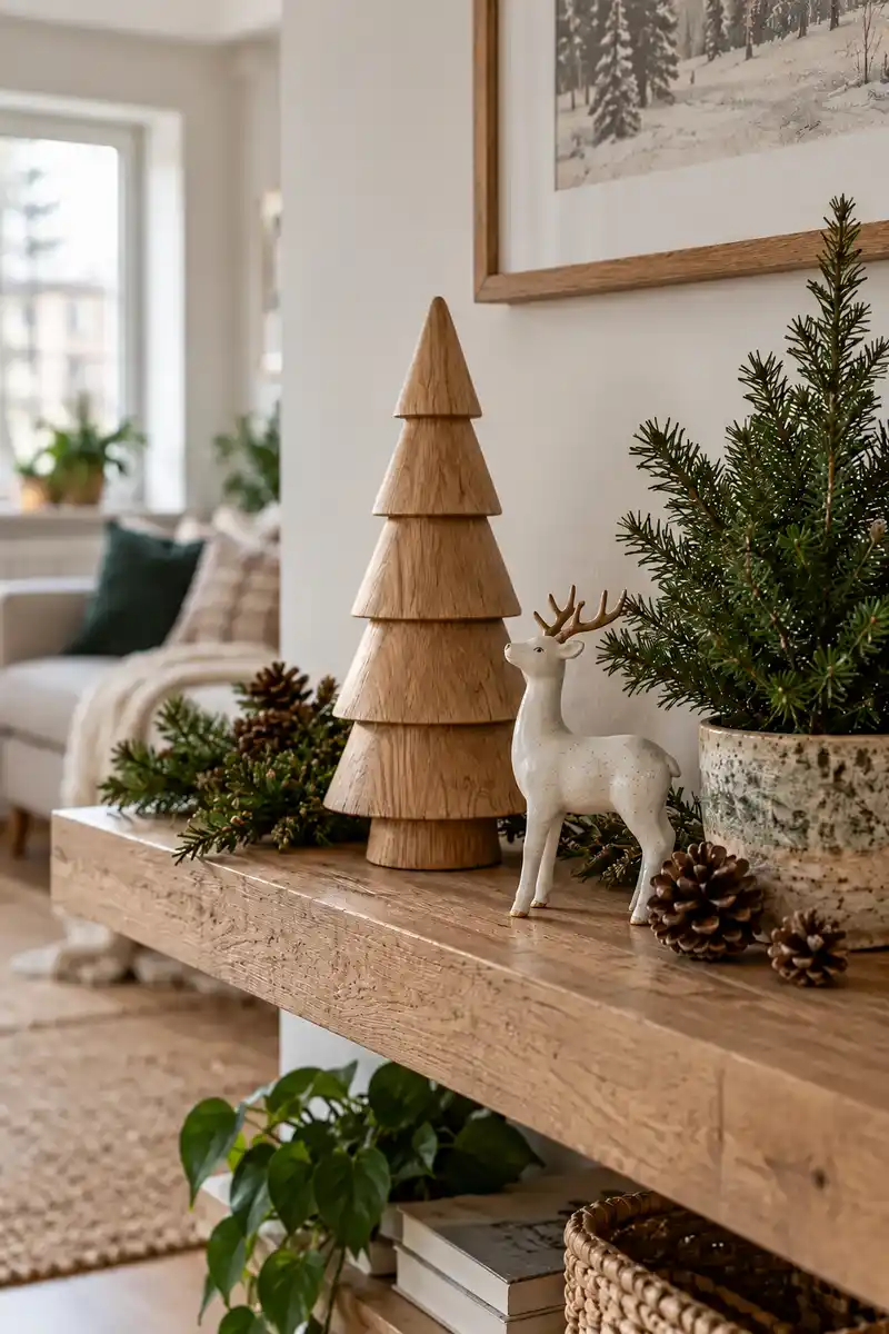
Group a wooden tree, a ceramic deer, and a small evergreen pot on a shelf. Keep the scale modest and let a plain wall provide the background. Keep the nearby surfaces simple so the texture remains easy to appreciate.
A woodland theme can feel grown-up when it relies on a few recognizable shapes rather than a crowded miniature landscape. Choose objects with simple finishes and leave space around their outlines. If the apartment already has many plants, one wooden tree may be enough to turn an existing green corner seasonal.
18. Velvet Color Note
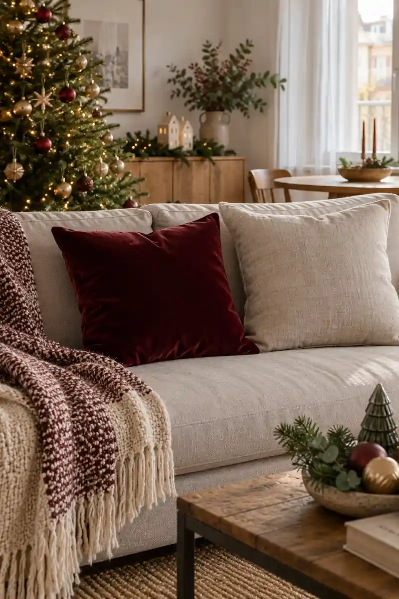
- Choose one rich velvet shade.
- Check it in daylight.
- Pair it with plain fabric.
- Limit other shiny accents.
Velvet can bring a slightly dressier mood without changing the whole room. Choose a shade that works with the sofa in ordinary daylight, since the fabric can look different from different angles. Limit the shiny supporting pieces so the texture feels special rather than becoming part of a busy mix.
19. Graphic Star Shapes
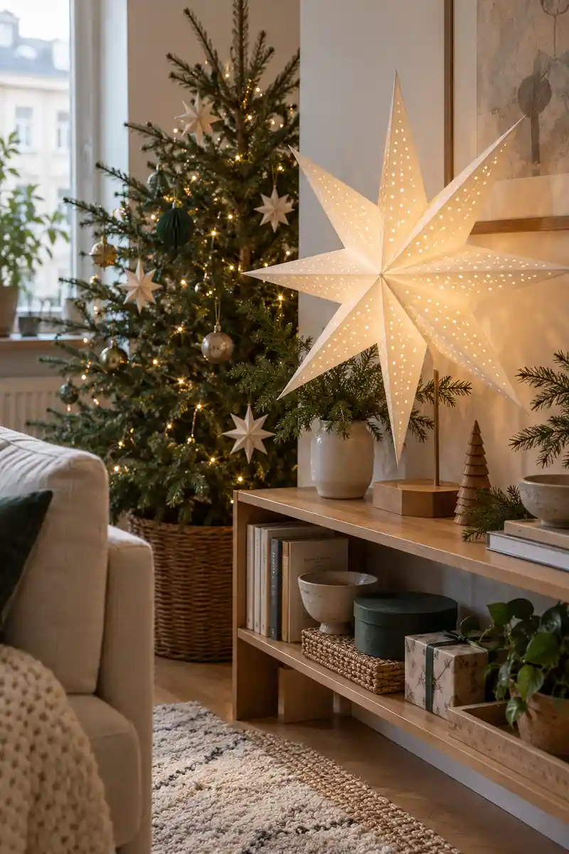
Quick tip: Repeat simple stars in two sizes, such as one large paper star and a few small tree ornaments. Use a limited palette so the shapes remain the main idea.
A repeated shape can connect decorations even when the materials differ. Keep the large star in one clear position and use the smaller ones as supporting details. If the room already has strong patterns, choose plain stars with clean edges rather than adding glitter, printed motifs, and several new colors.
20. Everyday Dining Refresh
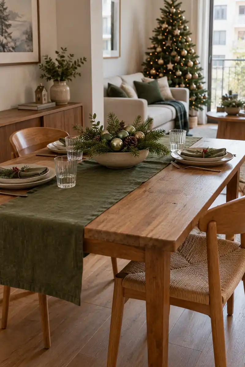
Before: The table feels ordinary beside the decorated living area. A large centerpiece would leave little serving room.
After: A short runner and low bowl echo the living-room colors. Everyday dishes remain the main table setting.
A dining refresh does not need special plates for every occasion. Your usual dishes can look different against a new fabric color or a simpler centerpiece. Keep serving space available and test the arrangement with the chairs occupied, so the table feels as comfortable during a meal as it looks beforehand.
21. Bedroom Color Echo
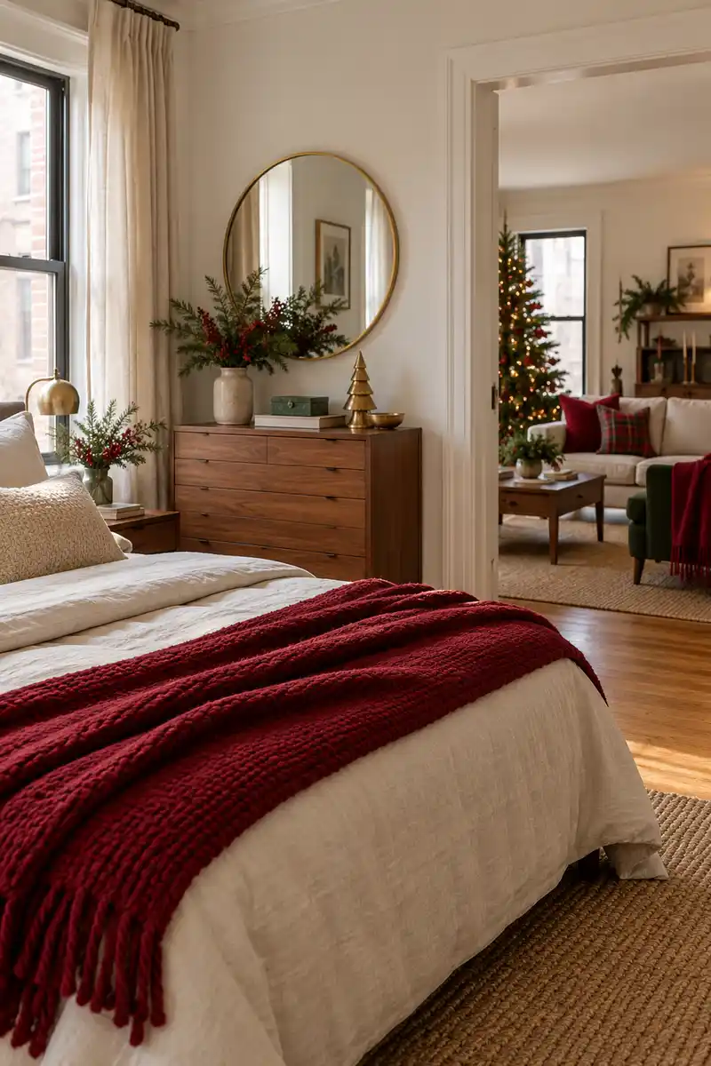
- Choose one color from the living area.
- Find a useful throw in that shade.
- Fold it across the bed.
- Keep the remaining bedding familiar.
This is especially useful in a studio where the bed and sofa share the same view. A quiet color echo helps the areas relate to each other while preserving their different purposes. Choose a textile you will actually use, and skip extra bedside ornaments if the tables are already doing enough.
22. Small Wreath Focus
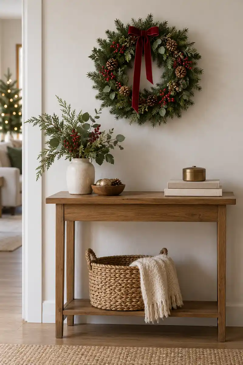
Wall position
Surface use: Leaves furniture clear
Background: Plain wall section
Best fit: Suitable existing support
Console stand
Surface use: Needs a small stable spot
Background: Clear space behind the stand
Best fit: Wide enough console
A wreath can carry a surprising amount of seasonal character because its shape is instantly recognizable. Give it a clear background and avoid surrounding it with several competing pictures or ornaments. Use a suitable existing support, and keep the arrangement away from doors and controls that need to work normally.
23. Muted Floral Accent
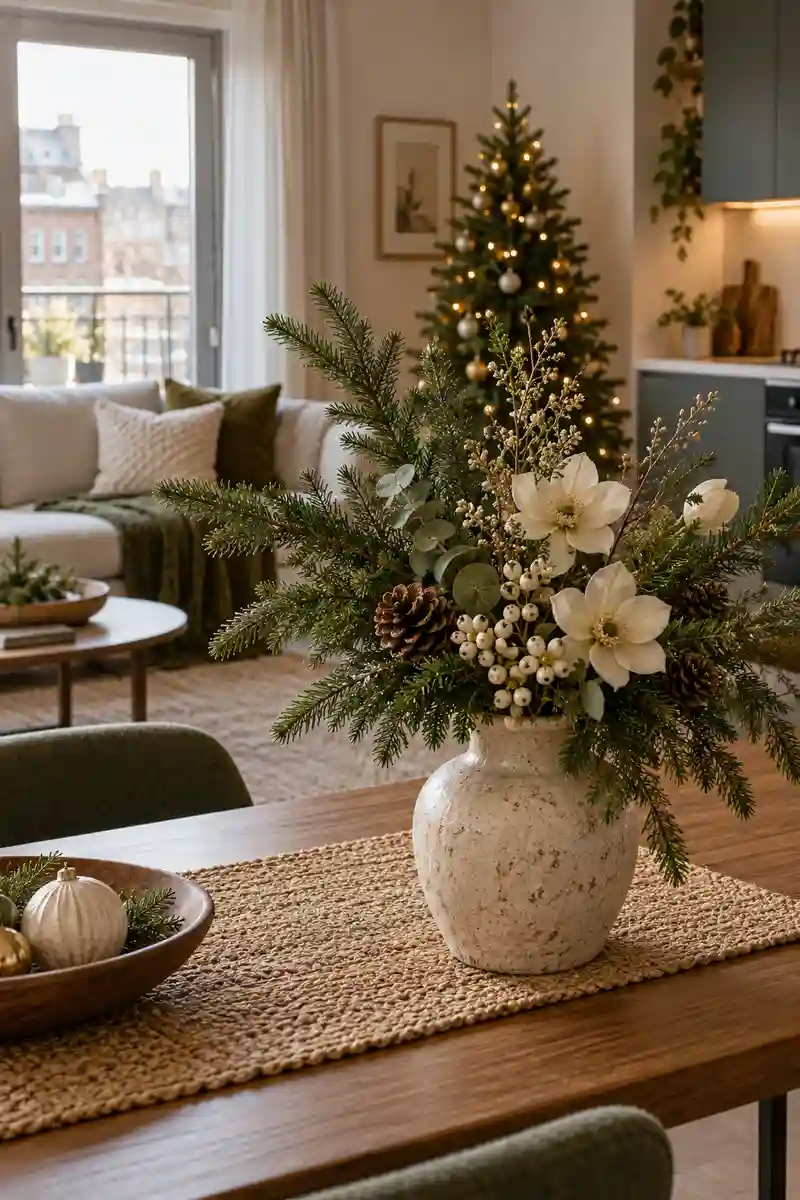
- Do: Choose a muted flower color.
- Do: Start with one stem.
- Do: Keep the greenery recognizable.
- Don’t: Mix every floral shade.
- Don’t: Fill the vase too tightly.
- Don’t: Add height that interrupts the room.
The flowers can soften a tree or vase arrangement that otherwise feels too traditional for your room. Use them sparingly so the evergreen remains recognizable. Start with one stem, check the balance from your usual seat, and add another only if the first looks isolated rather than deliberate within the grouping.
24. One Statement Ornament
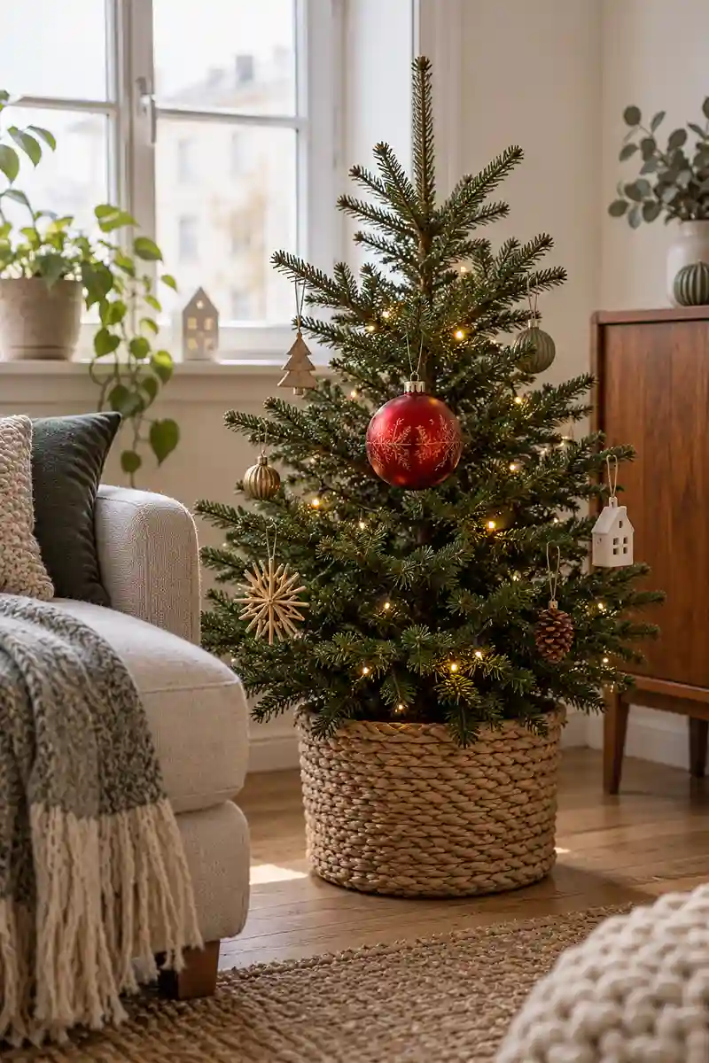
- Focal point: One larger ornament.
- Support: A branch suited to its weight.
- Surroundings: Lightly decorated nearby branches.
- Alternative: A stable display bowl.
One larger piece can provide the focal point that a collection of tiny ornaments sometimes lacks. Make sure the branch can support it comfortably, or display it in a stable bowl instead. The rest of the tree can stay simple, with a few repeated colors tying the special ornament into the room.
25. Your Palette Edit
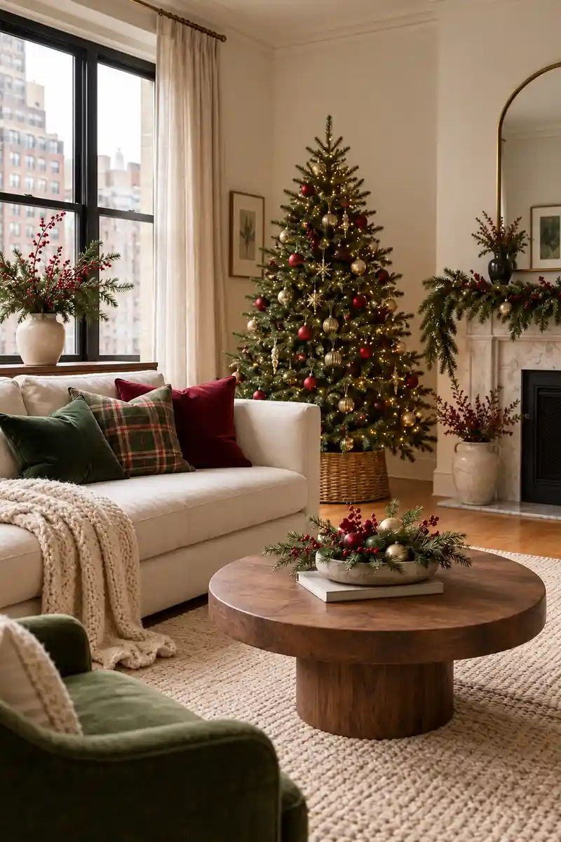
Take a final look at the whole room and identify the two or three colors that make it feel most like you. Put away any decoration that interrupts that clear direction. Keep the nearby surfaces simple so the texture remains easy to appreciate.
An inspiration board becomes a useful room when you choose what to leave out. Keep the details that relate to your furniture, daily routines, and favorite objects rather than trying every idea at once. A smaller selection with a clear palette will be easier to enjoy and easier to store afterward.
Frequently Asked Questions
How do I choose a Christmas color palette?
Start with a color already present in your artwork, rug, or favorite textile. Choose one or two supporting shades, then repeat them in a few seasonal details rather than introducing a different palette in every zone.
Can I mix different Christmas styles?
Yes. Connect the styles through a repeated color, material, or shape. Keep one direction dominant so the mixture feels intentional instead of looking like several unrelated displays.
Do I need to replace my everyday decor?
Often, a few swaps are enough. Keep useful ceramics, familiar textiles, and furniture in place, then replace a small number of accessories with seasonal pieces that suit them.
How do I make a small display feel complete?
Give it a clear focal point and a limited palette. Leave some space around the objects, then check the arrangement from your usual seat rather than only from close up.
Choose Your Holiday Direction
The best holiday refresh begins with a few choices that feel right for your own home. Pick a palette, repeat one material or shape, and give the main display enough room to stand out. Use these apartment Christmas decor inspiration ideas as options rather than a checklist to complete. Your favorite artwork, everyday ceramics, and familiar textiles can help the seasonal pieces belong naturally in the room. Keep what you enjoy looking at, simplify anything that feels busy, and let the apartment stay comfortable for ordinary December days as well as the moments when you want it to feel a little special.
Community
Join the conversation
Add a useful idea, ask a specific question, or share what worked in your space. Every comment is reviewed before it appears.