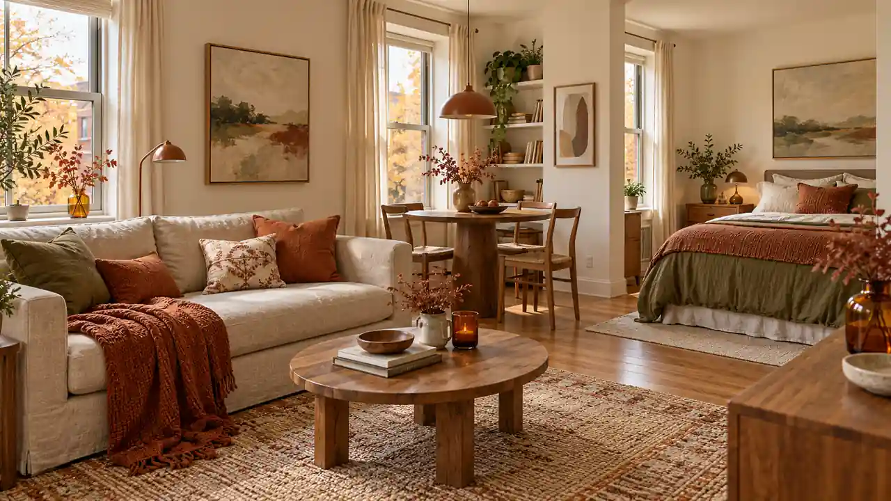
A fall apartment decor aesthetic can start with the colors and textures you already enjoy. You do not need a room full of pumpkins to make your home feel warmer. A rust cushion, soft cream bedding, or one amber vase can shift the mood while leaving plenty of space for everyday life.
These 21 ideas focus on different visual directions, from gentle pink and cocoa to deep blue and warm wood. Choose one palette that works with your existing furniture. Then repeat a few details across the room. You can keep the look quiet, useful, and easy to change when the season passes.
1. Oat and Rust
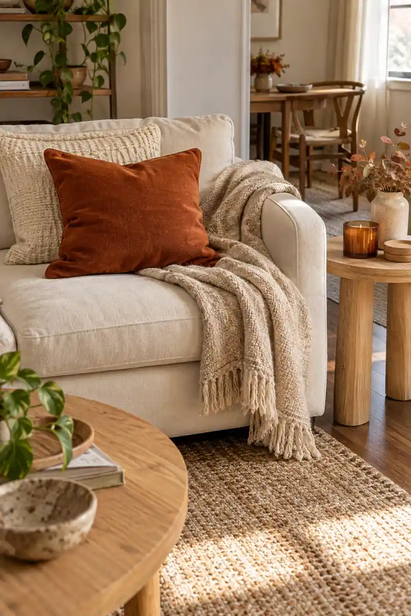
A warm fall palette does not need orange on every surface. Start with the cream sofa, pale curtains, or wood flooring you already have. Add rust through one cushion and a folded throw. Keep the larger areas quiet so the warmer color feels clear rather than scattered across the room.
Let texture carry the rest of the look. A nubby cushion beside smooth cotton creates interest without adding another color. Repeat the rust once in a small print across the room, then stop. That small connection helps separate corners feel like parts of the same home.
2. Olive and Walnut
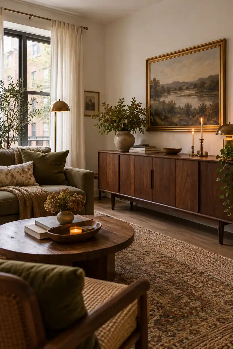
- Olive cotton cushion covers
- A dark wood tray
- Ivory curtains or bedding
- One warm brass detail
Olive green gives a fall room depth without making it feel seasonal for only a few weeks. Pair it with walnut tones and soft ivory. Use the green on something useful, such as a cushion cover, while the darker wood can come from furniture you already own or a small tray.
3. Amber Glass Glow
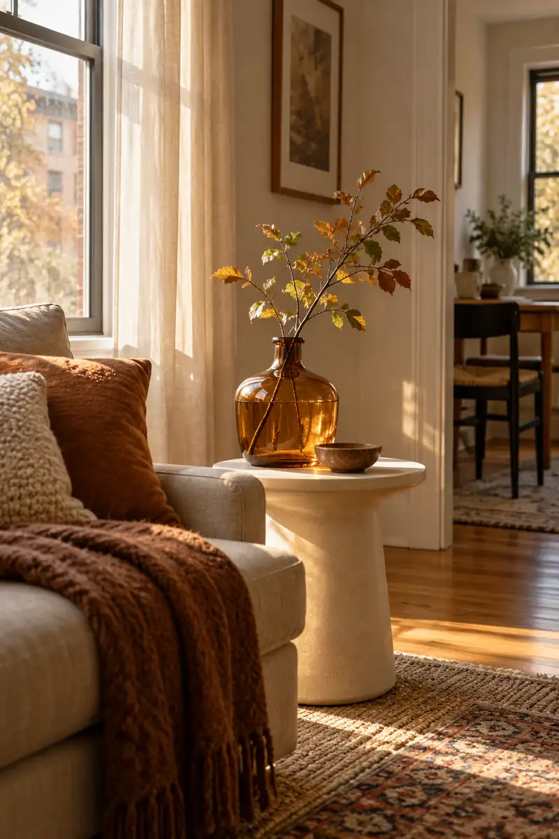
Quick tip: Place the glass where it can catch soft daylight. Check the view from your usual seat before adding anything else.
Amber glass adds color even when nothing is switched on. A small vase catches daylight on a side table, while its warm tint feels softer than a solid orange object. Leave open space beside it. A single clear shape often reads better in a small room than several tiny bottles.
4. Dusty Rose Layers
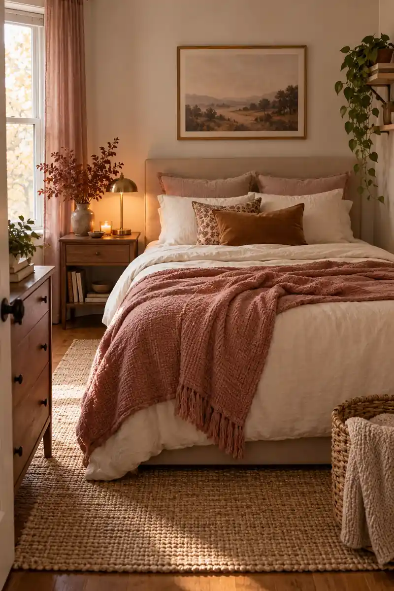
Before: Pale bedding and white walls can look a little flat together. Adding more white may not give you the warmth you want.
After: A dusty rose throw brings in a soft middle tone. One cocoa cushion gives the lighter pieces a clear contrast.
Dusty rose works well when bright autumn colors feel too strong for your home. Balance it with cocoa, cream, and a little faded plum. Keep the pink muted rather than sugary. A rose throw over plain bedding gives the room a gentle change without making the bed look overly dressed.
5. Quiet Cocoa Corner
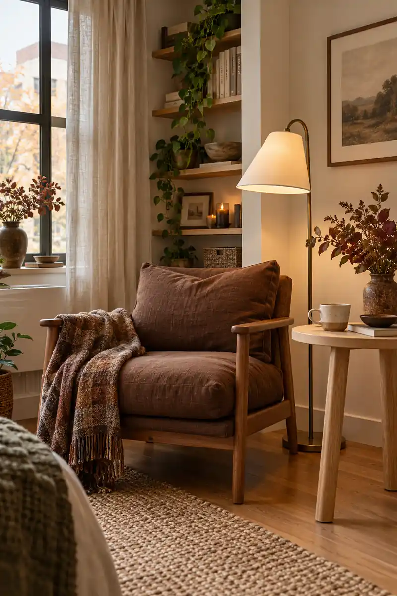
- Choose one comfortable chair already in the room.
- Add a cocoa cushion with a plain weave.
- Place a light-colored table beside the seat.
- Finish with a book and a warm reading lamp.
A cocoa corner can feel rich without needing dark walls. Choose a brown cushion, a warm wood surface, and a cream reading light. Keep the arrangement close to one chair rather than spreading brown throughout the apartment. That gives the eye a place to rest while the rest stays light.
6. Soft or Crisp Plaid
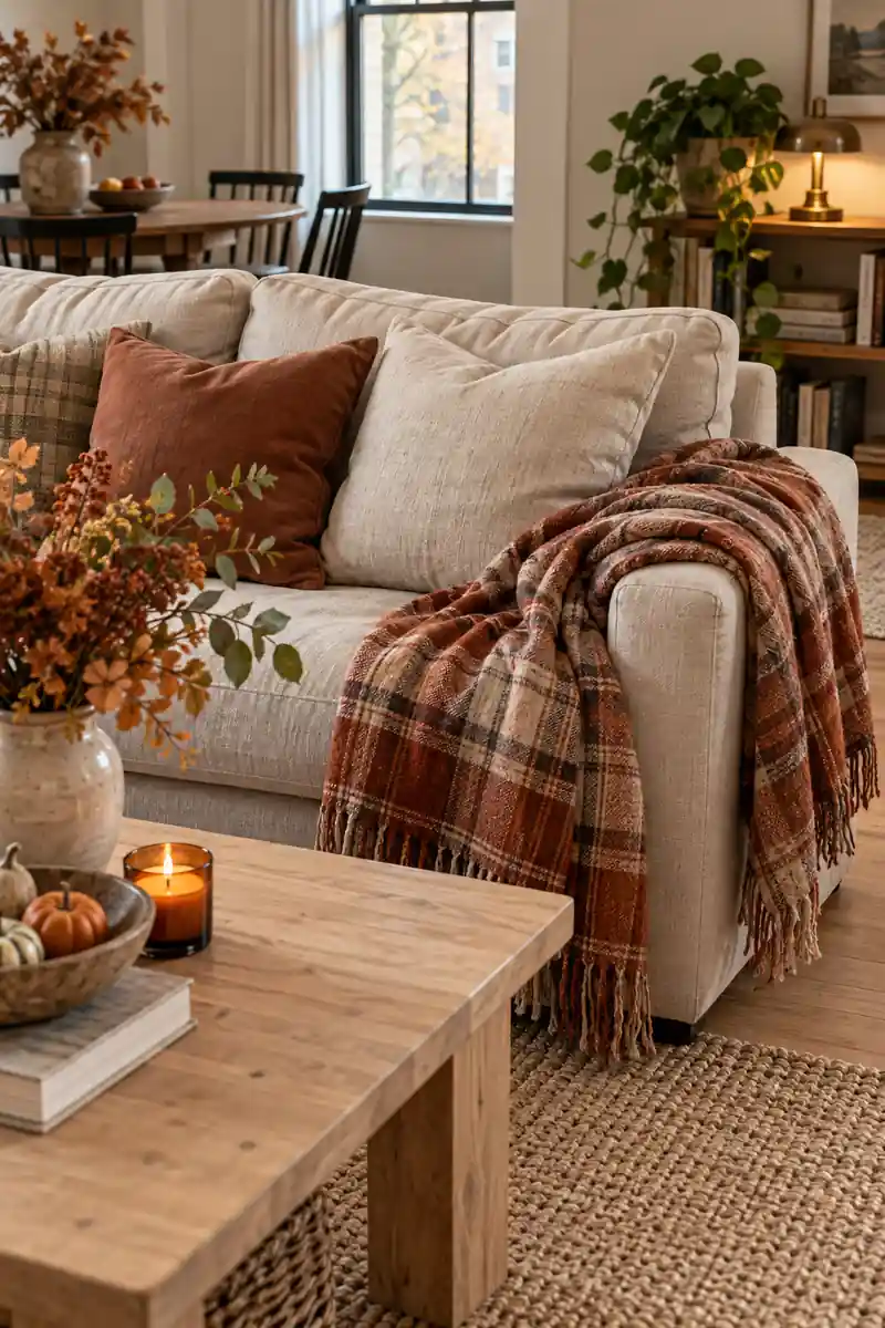
| Detail | Soft plaid | Crisp plaid |
|---|---|---|
| Color | Faded rust and cream | Black and ivory |
| Best pairing | Linen and pale wood | Smooth cotton and dark metal |
| Feeling | Relaxed and gentle | Clean and structured |
Plaid can set the mood quickly, so choose its scale before buying another accessory. A faded check feels gentle beside linen and worn wood. A sharper black-and-cream check feels more graphic. Let one plaid piece lead the room, then use plain fabrics nearby to give the pattern room to breathe.
7. Brushed Brass Notes
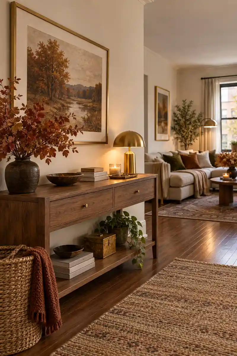
Do
- Repeat brass in two small places.
- Pair it with matte cotton or wood.
- Keep useful objects easy to reach.
Don’t
- Replace working fixtures for one season.
- Mix many decorative metal finishes at once.
- Crowd a table with matching ornaments.
Brass is most useful here as a small warm note, not a reason to replace every fitting. A picture frame or lamp base can connect with the gold in autumn colors. Choose a quieter finish if your room already has several shiny surfaces. Keep the surrounding shapes simple and fairly open.
8. Linen and Clay
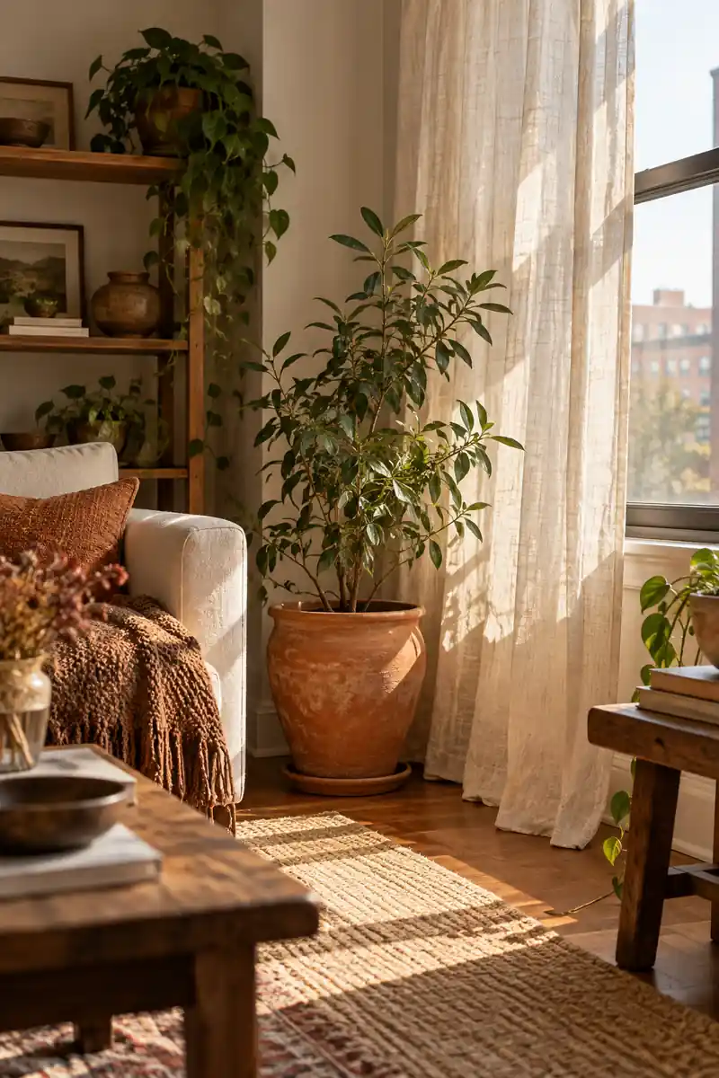
- Clay colors can range from peach to deep brick.
- A linen-look cotton fabric offers a similar visual effect.
- Matte pottery looks quieter than a glossy finish.
- An existing plant can stay in its nursery pot inside a cover pot.
Linen and clay give a room warmth through their surfaces rather than a strong seasonal motif. Try a clay-colored pot beside a pale linen curtain or runner. The rougher pottery and loose weave create an easy contrast. Leave the plant or arrangement simple so the materials remain the main part of the scene.
9. Ink Blue Autumn
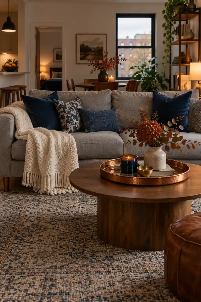
Blue can belong in a fall room, especially when it is deep and slightly muted. Keep an ink-blue cushion or blanket you already love and add warm cream beside it. A small copper-colored detail gives the cool shade a warmer neighbor without turning the room into a new color scheme.
This works well in apartments with gray furniture that is staying put. Treat the gray as a quiet background rather than something to hide. Use a warmer wood tray and a soft cream textile to link the blue to the room. You only need a few clear touches.
10. Pear and Cream
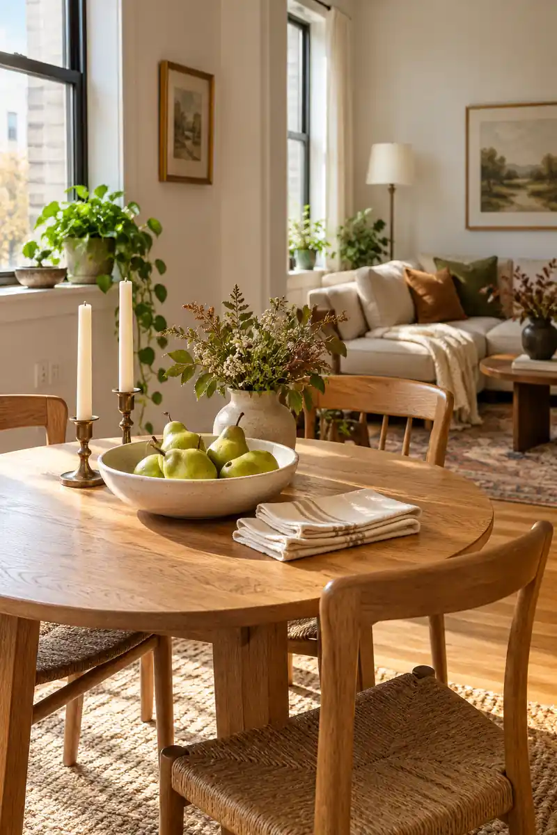
- A shallow bowl of fresh pears
- Plain cream napkins
- A small wood table
- Clear everyday drinking glasses
For a lighter fall look, borrow the green of pears instead of relying on pumpkins. A shallow bowl on the dining table can supply the color on its own. Pair it with a cream cloth and natural wood. Use fruit you plan to eat, and refresh the bowl as needed.
11. Plum Evening Mood
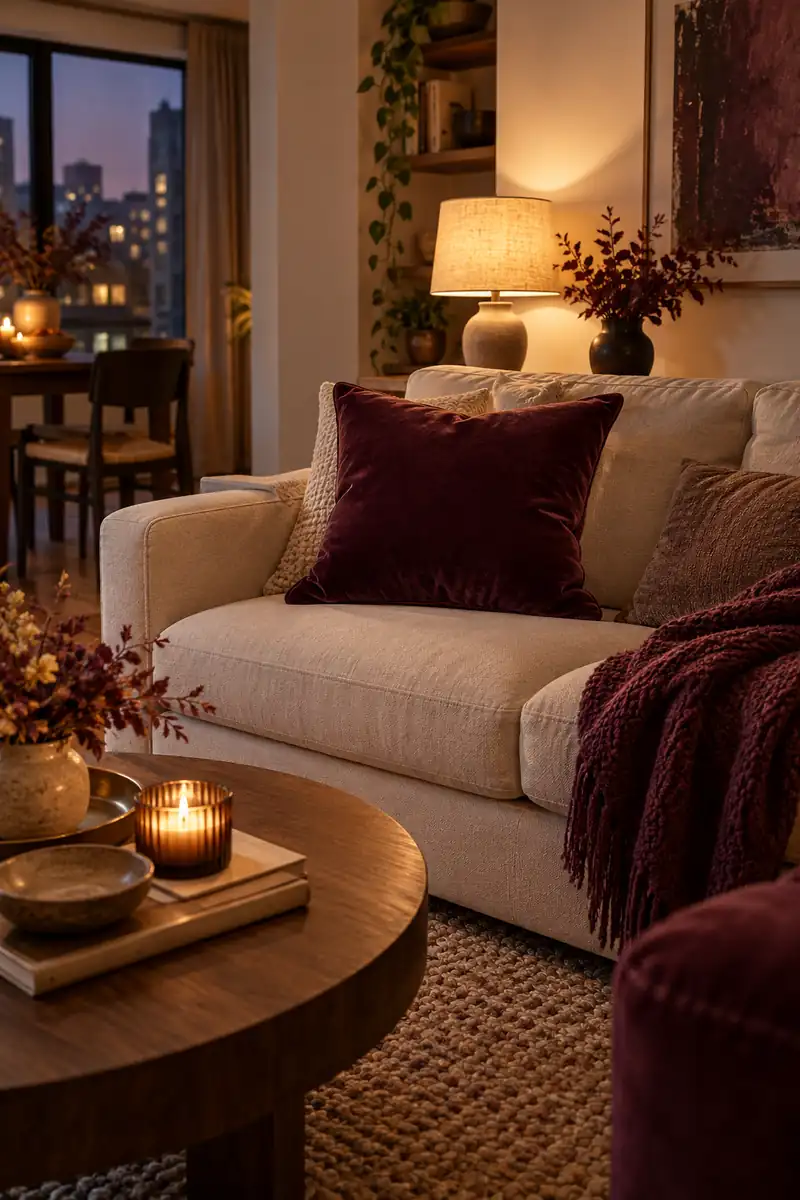
Quick tip: Check the plum fabric in daylight and under your usual evening light. Some shades look much darker after sunset, so start with a small piece.
Plum adds a deeper mood without the starkness of black. Try it in a cushion or small piece of artwork, then balance it with pale upholstery. You can repeat the shade in a book cover or napkin. Keep most surfaces simple so the room still feels welcoming during the daytime.
12. Warm White Windows
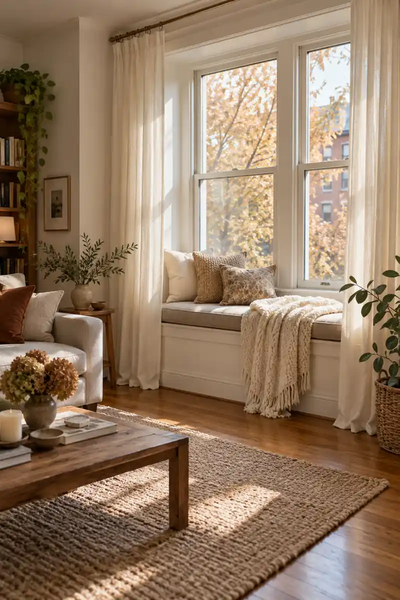
Before: One bright white fabric can look sharp beside warm flooring. A busy windowsill also breaks up the view.
After: Ivory and oatmeal create a gentler range of tones. A clear windowsill lets the curtain shape and daylight become the main details.
A fall room can feel soft and seasonal while staying mostly white. The key is mixing warm shades rather than using one bright white everywhere. Pair ivory curtains with a cream throw and an oatmeal cushion. Keep the window area open so the pale layers catch the available daylight throughout the day.
13. Muted Gallery Colors
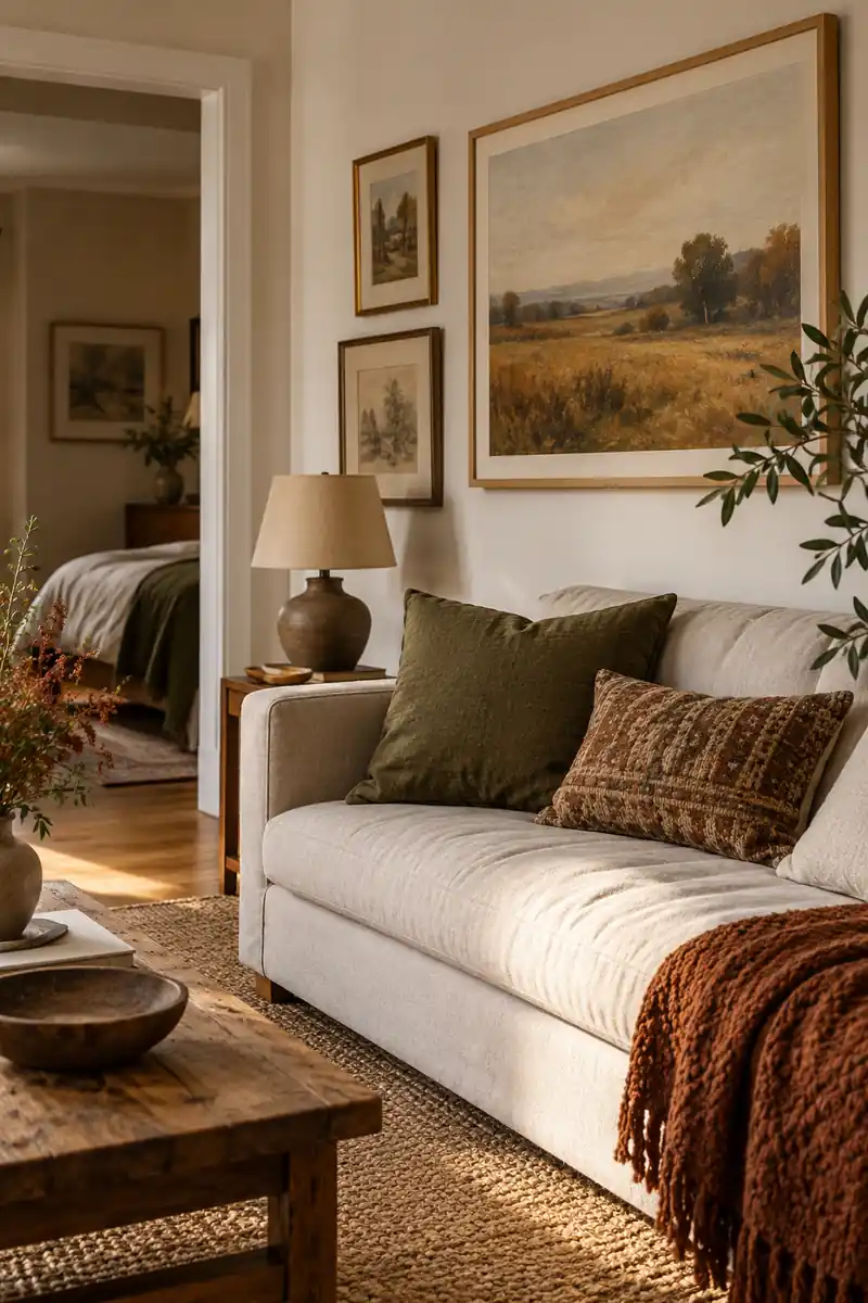
- Choose one existing frame as your starting point.
- Pick a print with two or three muted colors.
- Repeat one shade in a cushion or folded blanket.
- Keep the surrounding wall simple.
Art can carry your fall palette without adding objects to every table. Choose one print with muted ochre, brown, or deep green already in it. Pull a single color into a nearby textile. A small apartment feels more settled when the artwork and useful fabrics share a few quiet colors.
14. Pale or Dark Wood
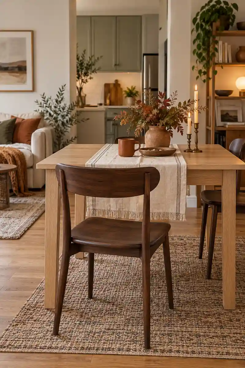
| Detail | Pale wood | Dark wood |
|---|---|---|
| Mood | Light and relaxed | Rich and grounded |
| Useful textile | Oatmeal cotton | Ivory linen |
| Autumn accent | Soft terracotta | Muted mustard |
You do not need matching wood furniture to build a warm fall look. Pale wood keeps the scene light, while a dark piece gives it more weight. Bring them together with a repeated fabric color. Cream cushions or a simple runner can connect different finishes without hiding the furniture beneath decorations.
15. Matte Pumpkin Shapes
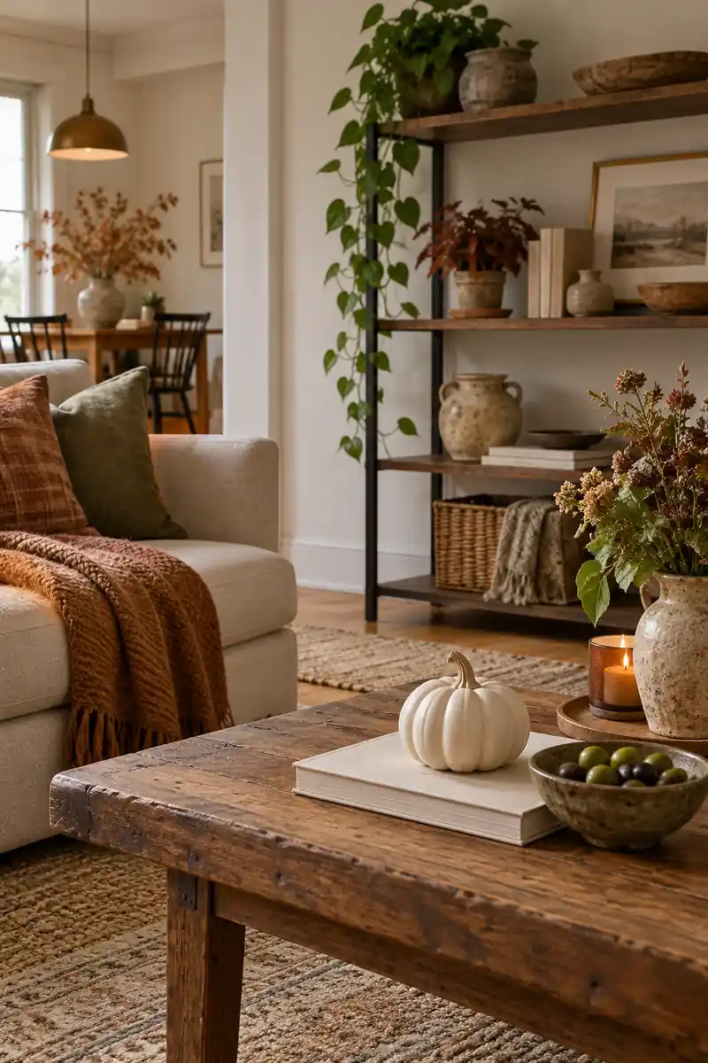
Do
- Choose one small pumpkin shape.
- Match it to an existing room color.
- Leave space around the display.
Don’t
- Cover every shelf with seasonal pieces.
- Add glitter if the room has a matte palette.
- Buy a whole matching set by default.
If you like pumpkins but want a quieter look, choose a small matte shape in a color already in the room. Cream, clay, or olive can feel seasonal without taking over. Place it with an everyday object, such as a book or bowl, instead of building a separate themed display.
16. Woven Coffee Nook
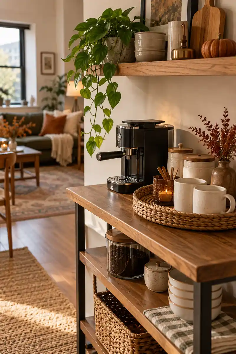
- A washable mat is easier to maintain near drinks.
- Woven texture can come from one small accessory.
- Plain mugs keep a compact arrangement visually calm.
- The useful work area matters more than the display.
A woven detail can soften the hard surfaces of a small coffee corner. Use a tray that suits the space and keep mugs inside easy reach. Pair its warm texture with plain ceramics rather than patterned extras. The corner should still work for making a drink, with a clear spot for spills.
17. Mushroom Bedroom Tones
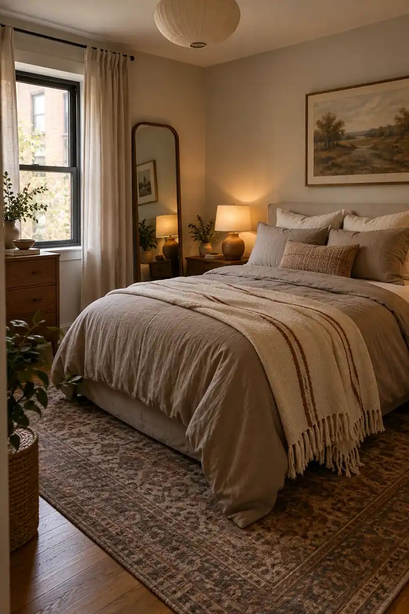
Mushroom shades sit between beige and gray, making them useful when your apartment already mixes warm and cool finishes. Start with bedding in a soft taupe, then add cream at the pillows. A narrow strip of rust in a blanket or print gives the room a small autumn note without dominating it.
Keep the bed looking easy to use rather than heavily styled. Two everyday pillows and one folded blanket may be enough for the space. If your headboard is dark, let it supply the contrast. You can then keep the rest of the room light and spare.
18. Ochre Dining Moment
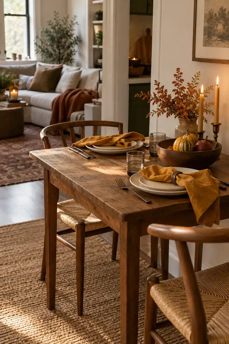
- Ochre cloth napkins
- Plain white plates
- One low brown bowl
- A natural wood tabletop
Ochre brings warmth to a dining spot without needing a large centerpiece. Try the color through napkins or one small bowl, then let everyday plates do the rest. A simple table looks inviting when the colors relate. Keep each place setting comfortable, especially if the same table doubles as your desk.
19. Soft Green Entry
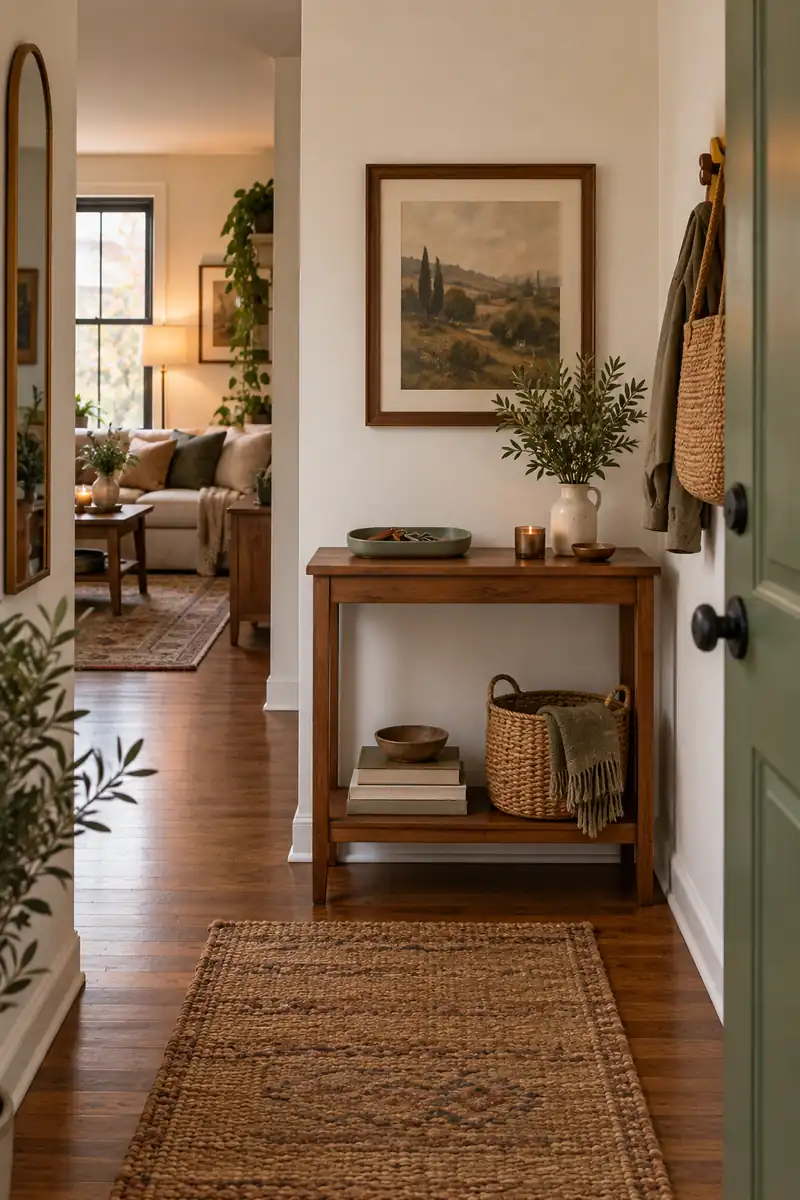
Quick tip: Use an accessory you already need at the door as the color accent. A sage key tray changes the mood without creating another object to dust.
A soft green entry can connect fall decor to the rest of a neutral apartment. Pair sage with warm wood and a little brown rather than bright orange. Use the color in a small print or tray. Keep the spot focused on keys, shoes, and the things you reach for daily.
20. Cream With Black
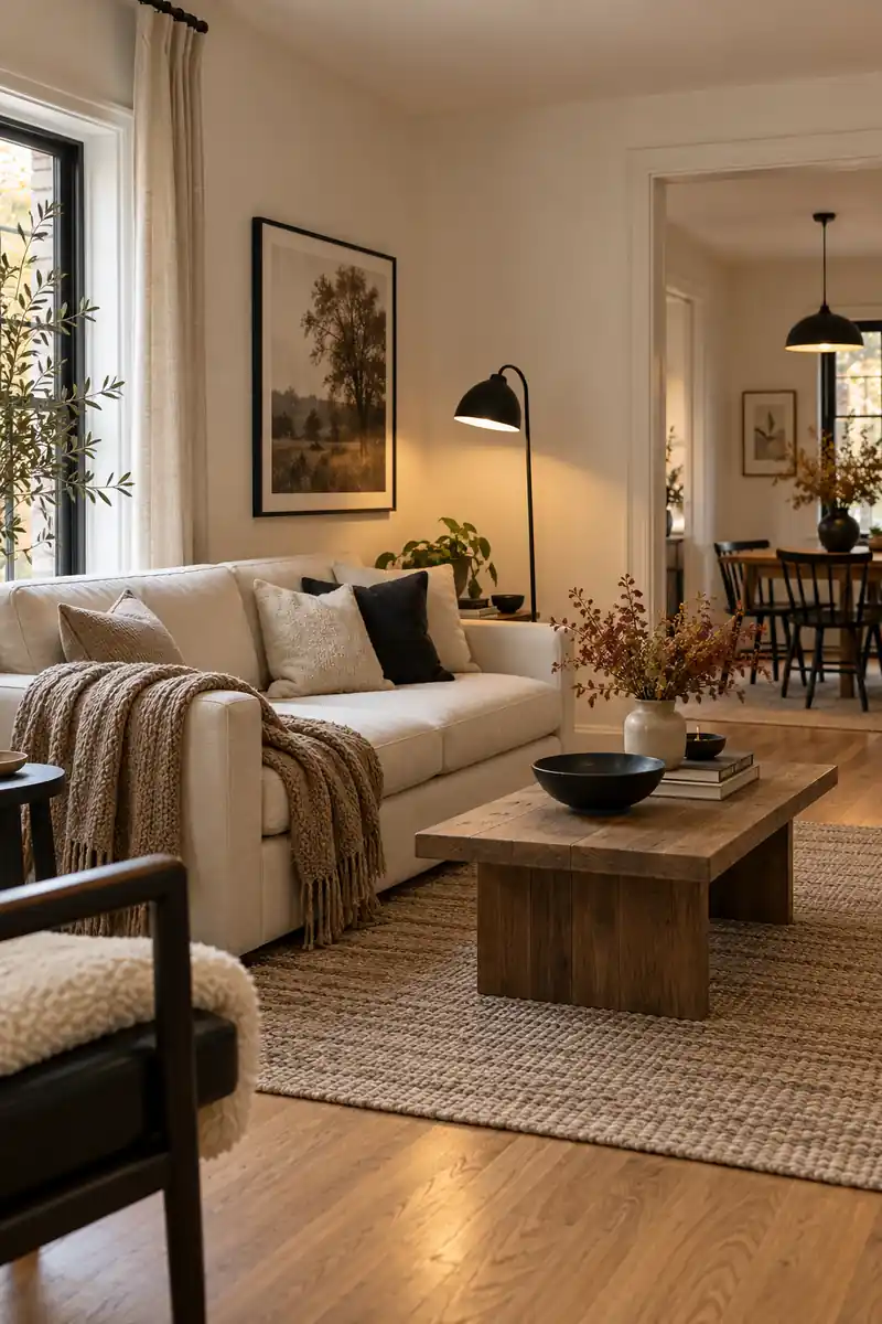
Before: Cream fabric and pale wood can blend into one soft field. Small objects may disappear into the background.
After: A thin black frame outlines one focal point. A nearby black lamp repeats the contrast without adding another color.
A little black can sharpen a soft fall palette without making it harsh. Use a thin frame or a simple lamp beside cream textiles and warm wood. Keep the black shapes small and repeated. The result feels clear and calm, especially in a studio where several parts of the room stay visible.
21. One Shared Palette
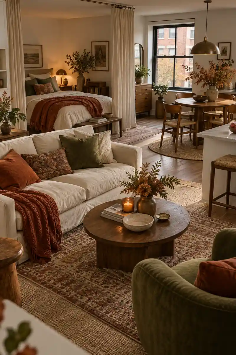
- Choose cream as the light base, or use your existing neutral.
- Pick rust or ochre as the warmer middle shade.
- Add olive, cocoa, or plum as the deeper note.
- Repeat each shade sparingly across the main zones.
When the bed, sofa, and dining table share one room, use a small set of colors to link them. Choose a light base, a warm middle shade, and one deeper accent. Repeat them through useful textiles and artwork. You can vary the textures so each area has its own gentle character.
Frequently Asked Questions
What colors work for a fall apartment aesthetic?
Rust, olive, ochre, cocoa, and plum all bring warmth or depth. Choose colors that work with your existing furniture rather than using all of them. A light neutral base with one warm shade and one deeper accent is an easy place to start.
Can fall decor work without pumpkins?
Yes. Textured throws, warm wood, amber glass, muted artwork, and seasonal colors can suggest fall without themed objects. Start with useful pieces so the room stays comfortable and easy to live in.
How do I keep a fall palette from looking too dark?
Keep larger surfaces light if that suits your room, and use deeper colors in smaller areas. Leave windows clear and look at the colors in both daylight and evening light. A cream textile can soften a dark chair or cushion.
How many fall colors should I use in a studio?
There is no fixed rule, but a small palette is easier to repeat across visible zones. Start with your main neutral and two supporting shades. Vary the textures rather than adding more colors whenever a corner feels unfinished.
Conclusion
A warm fall apartment does not depend on how many decorations you can fit inside it. The colors, surfaces, and small connections between pieces matter more. Start with one of these looks that suits the furniture you already have, then try it in a single corner.
Look at the result during the day and again in the evening. Keep what feels comfortable, and remove anything that makes the room feel crowded. A few useful textiles, one clear accent color, and space around your favorite objects can give you a fall look that feels personal and easy to enjoy.
Community
Join the conversation
Add a useful idea, ask a specific question, or share what worked in your space. Every comment is reviewed before it appears.