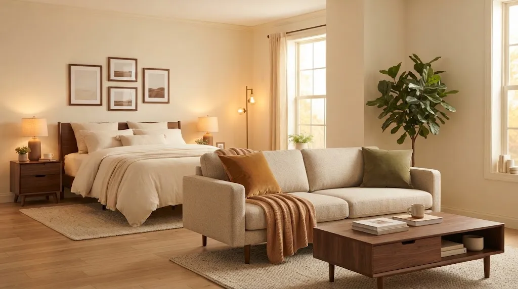
Nothing makes a studio apartment feel cozy faster than color. These cozy studio apartment color palette ideas show how the right mix of warm neutrals, earthy tones, and rich accents can turn one plain room into a space that feels calm and pulled together.
In a studio, every color you choose shows up in the same room, from the sofa and bedding to the rug and kitchen. A clear palette keeps all of it connected, so the space feels intentional instead of busy.
Each palette below includes hex codes, where to use each color, and the style it suits best, so you can save your favorite and start decorating.
1. Cream, Caramel, and Walnut: A Classic Warm Color Palette
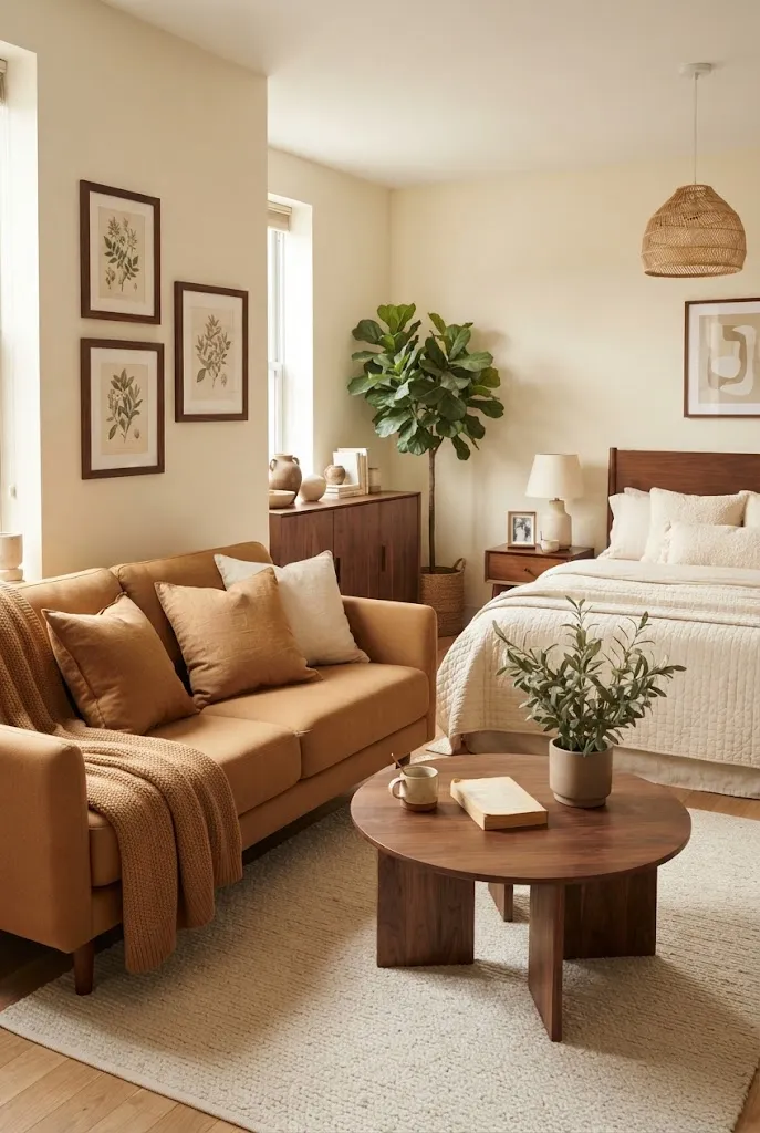
This is the coziest starting point for almost any studio. Creamy walls keep the room bright, caramel adds warmth, and walnut brings depth without making a small space feel dark.
It works with the furniture most renters already own, and it never looks dated. If you love a warm, lived-in feel, this palette pairs perfectly with these cozy studio apartment aesthetic ideas.
Colors: Cream #F2E8D5, Caramel #B9814D, Walnut #5A3E2B, Soft Olive #7A7B4F
Where to use it: cream on walls and bedding, caramel on pillows and a throw, walnut on furniture and frames, olive on plants or one accent pillow
Best for: first apartments and anyone who wants a warm palette that is easy to live with
2. Terracotta, Sand, and Olive: An Earthy Color Palette
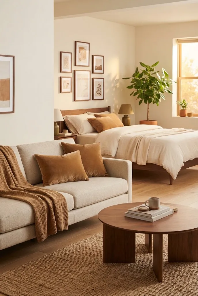
Earthy color palettes feel grounded and relaxed, and this one is a favorite for a reason. Terracotta adds warmth, sand keeps things light, and olive brings in a natural touch.
Use terracotta in small doses, like a rug, pillows, or a vase, so it glows instead of overwhelming the room.
Colors: Terracotta #C0643F, Sand #D9C4A5, Olive #6E6F43, Cream #F4ECDF
Where to use it: sand on the sofa or walls, terracotta on textiles and pottery, olive on plants and a throw, cream on bedding
Best for: boho, desert-inspired, and organic modern studios
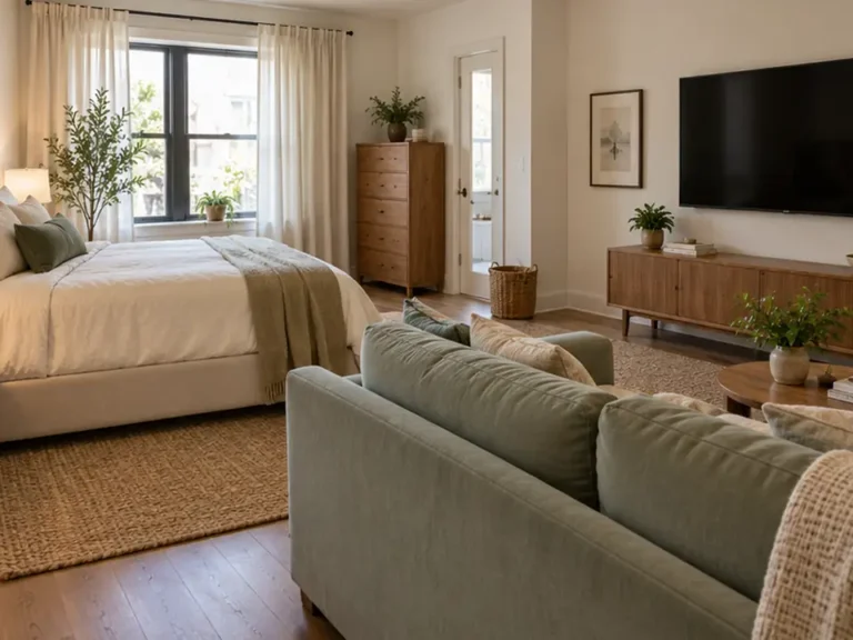
3. Sage Green, Oatmeal, and Honey Oak: A Cozy Green Palette
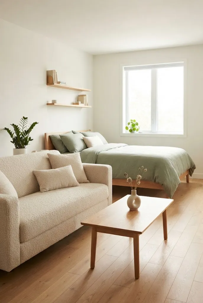
Sage green is a cozy color that still feels fresh. Paired with oatmeal textiles and honey oak furniture, it creates a calm, restful palette, which matters in a room where you also sleep.
This palette feels right at home in Scandinavian studio apartment styles and in bright rooms with plenty of plants.
Colors: Sage Green #A3AE8F, Oatmeal #E6DCCB, Honey Oak #C69A62, Warm White #F7F2EA
Where to use it: sage on the bedding, an accent wall, or a rug, oatmeal on the sofa, oak on furniture, warm white on walls
Best for: bright studios, Scandinavian and cottage styles, and restful bedroom zones
4. Rust, Cream, and Chocolate Brown for Fall-Ready Warmth
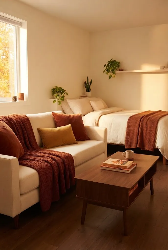
Rust and chocolate brown make a studio feel instantly snug, especially in fall and winter. Cream keeps the palette from feeling heavy in a small space.
Swap in a rust throw and brown pillows each autumn, and the whole room changes mood. These studio apartment fall decorations use the same warm colors.
Colors: Rust #A4472A, Cream #F3E9D8, Chocolate Brown #4B3022, Mustard #C89B3C
Where to use it: cream on walls and the sofa, rust on throws and pillows, brown on furniture and frames, mustard as a small accent
Best for: seasonal refreshes and anyone who loves a snug, autumn feel
5. Warm White, Camel, and Black: An Earthy Palette With Black
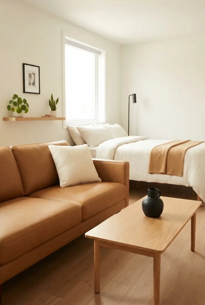
Adding black to an earthy color palette gives it a crisp, modern edge. Warm white and camel keep the room soft, while black accents add definition.
Use black sparingly on lamps, frames, and hardware. It suits the clean lines of these minimalist studio apartment ideas.
Colors: Warm White #F6F1E7, Camel #C19A6B, Black #1C1C1C, Oak #B98B5E
Where to use it: warm white on walls and bedding, camel on the sofa or a leather chair, black on lighting and frames, oak on furniture
Best for: warm minimalist and modern studios
6. Mushroom, Taupe, and Linen for Soft Neutral Warmth
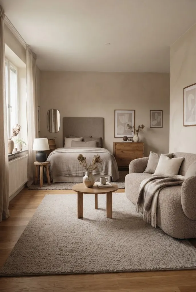
If you prefer neutrals, this palette proves they can still feel cozy. Mushroom and taupe add quiet warmth, while linen keeps the room airy.
Layer different textures, like bouclé, linen, and wool, so the neutral palette never feels flat.
Colors: Mushroom #B8A99A, Taupe #8B7D6B, Linen #EDE4D3, Warm Charcoal #4A4541
Where to use it: linen on walls and curtains, mushroom on the sofa, taupe on bedding and a rug, charcoal on small accents
Best for: calm, understated studios and people who dislike strong color
7. Dusty Rose, Cream, and Brass: An Earthy Palette With Pink
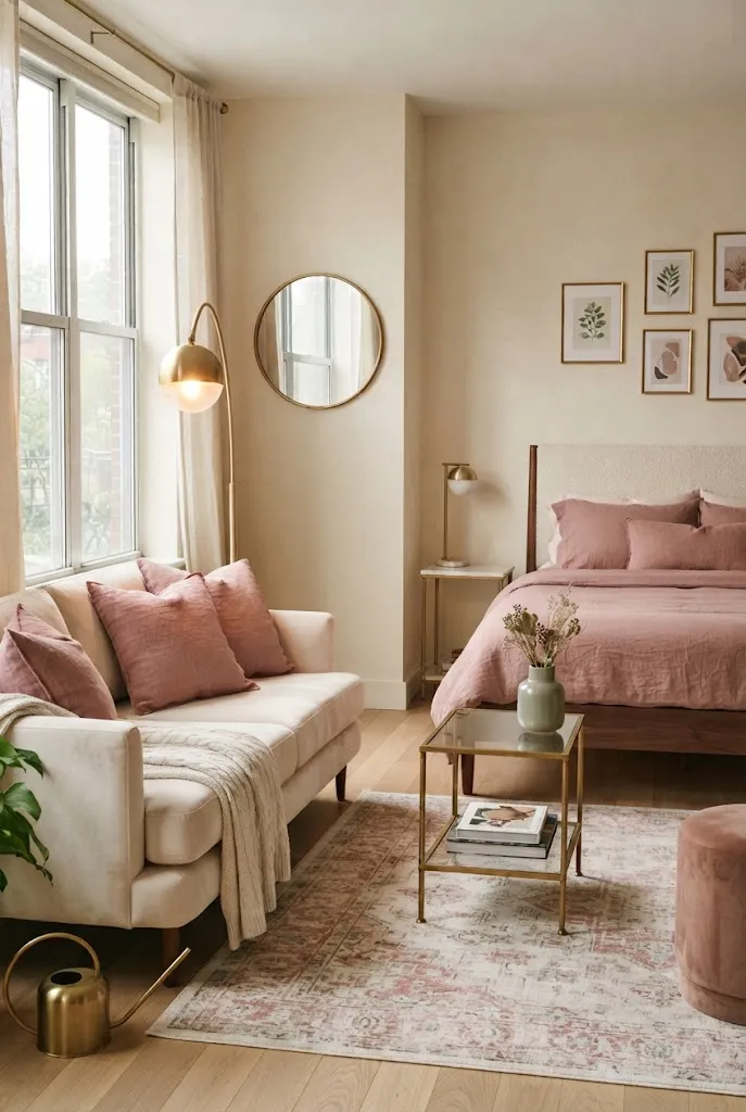
Dusty rose adds softness and warmth without feeling sugary. With cream and brass, it becomes an elegant, romantic palette for a small space.
Keep pink to pillows, a rug, or bedding, and let brass lamps add a warm glow. Find more ideas in these feminine studio apartment ideas.
Colors: Dusty Rose #C9A0A0, Cream #F4EBDD, Brass #B48A45, Sage #A7B09A
Where to use it: cream on walls and the sofa, dusty rose on bedding and pillows, brass on lighting and mirrors, sage on plants
Best for: feminine, romantic, and soft modern studios
8. Olive, Mustard, and Cream for Vintage Warmth
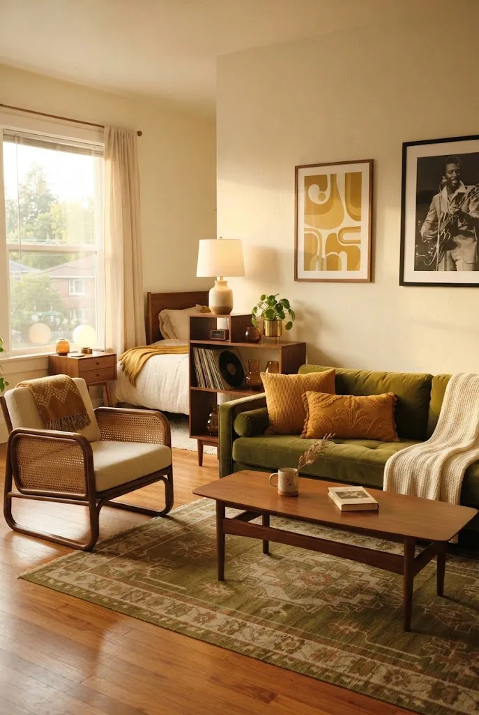
Olive and mustard give a studio a warm, vintage-inspired feel with a nod to the 1970s. Cream balances the stronger colors so the room still feels open.
Mix in wood and rattan to keep the palette relaxed rather than retro-heavy.
Colors: Olive #6B6A3A, Mustard #C99A2E, Cream #F2E7D2, Walnut #5C4033
Where to use it: cream on walls, olive on the sofa or a chair, mustard on pillows and art, walnut on furniture
Best for: vintage, eclectic, and mid-century studios
9. Forest Green, Cognac, and Ivory for Moody Coziness
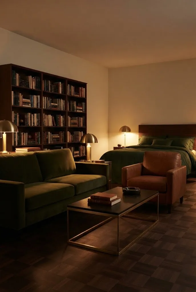
Deep green and cognac create a rich, moody palette that feels like a cozy library. Ivory keeps it from becoming too dark.
Choose forest green for one big piece, like a sofa or bedding, and use cognac leather or wood as the warm counterpart.
Colors: Forest Green #2F4A3A, Cognac #9A5B2F, Ivory #F6F0E3, Brass #B08D57
Where to use it: ivory on walls, forest green on the sofa or bedding, cognac on a chair or leather accents, brass on lamps
Best for: moody, traditional, and dark academia studios
10. Warm Gray, Cream, and Terracotta for a Gray Couch
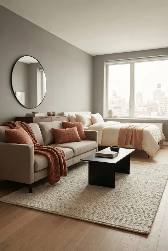
If you already own a gray couch, this palette warms it up instantly. Cream softens the gray, and terracotta adds the cozy color it needs.
Choose a warm gray with a beige undertone, and repeat terracotta in at least two places, like a pillow and a vase.
Colors: Warm Gray #A39E97, Cream #F2EADC, Terracotta #C26B4A, Black #232323
Where to use it: gray on the sofa, cream on walls and bedding, terracotta on pillows, a throw, or a rug, black on small accents
Best for: renters working around gray furniture
11. Navy, Camel, and Warm White: A Warm Palette With Navy
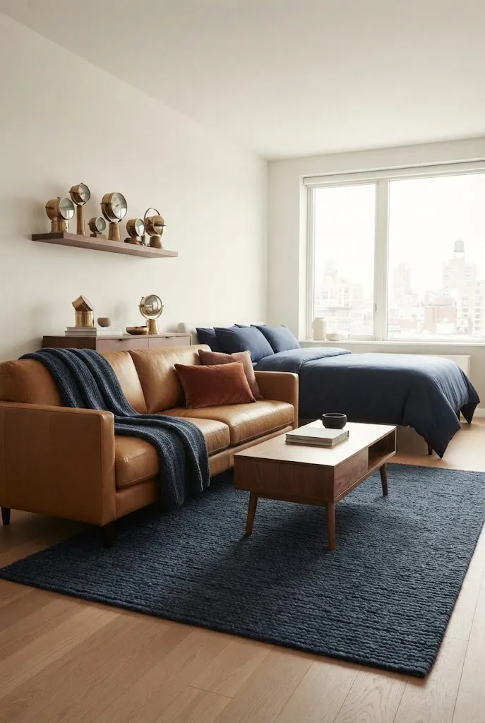
Navy can feel cozy when you pair it with warm tones. Camel and warm white keep it inviting instead of cold.
Use navy on a rug or bedding to anchor the room, then bring in camel through leather, wood, or a throw.
Colors: Navy #22324A, Camel #C29A68, Warm White #F5F0E6, Rust #A5502F
Where to use it: warm white on walls, navy on bedding or a rug, camel on the sofa or chair, rust as a small accent
Best for: classic, coastal, and traditional studios
12. Burgundy, Blush, and Cream for Romantic Depth
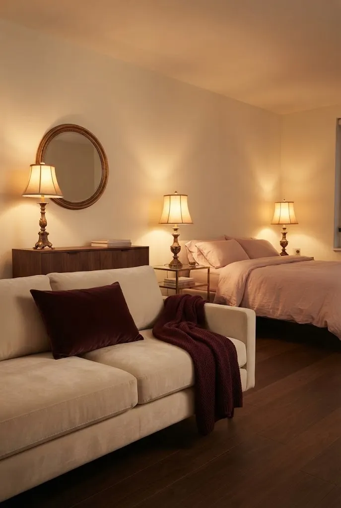
Burgundy adds depth and drama, while blush and cream keep it soft. Together they feel warm, romantic, and a little moody.
A burgundy throw or velvet pillow is often enough. Let cream carry most of the room.
Colors: Burgundy #6E2C34, Blush #E6C4BE, Cream #F4EBDD, Gold #B89A5E
Where to use it: cream on walls and the sofa, blush on bedding, burgundy on pillows or a throw, gold on frames and lighting
Best for: romantic and moody studios, especially in fall and winter
13. Apricot, Sand, and Sage for Light, Sunny Warmth
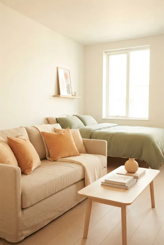
This soft palette brings warmth without any heaviness. Apricot glows, sand grounds the room, and sage adds a fresh contrast.
It is ideal for studios with little natural light, since all three colors reflect light well.
Colors: Apricot #EDB38A, Sand #DCC7A7, Sage #A5AF92, Warm White #F7F1E8
Where to use it: warm white on walls, sand on the sofa, apricot on pillows and art, sage on plants and bedding
Best for: darker studios and anyone who wants cozy without dark colors
14. Charcoal, Rust, and Oak for Moody Modern Warmth
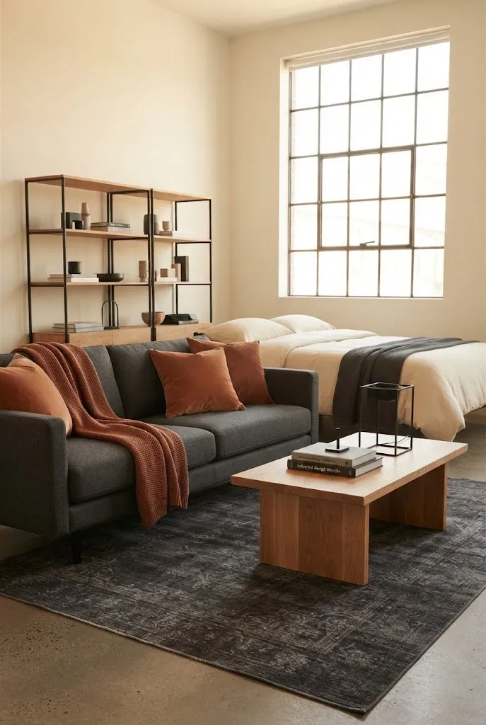
Charcoal and rust create a modern palette that still feels warm. Oak softens the contrast and keeps the room inviting.
Balance charcoal with plenty of light textiles so a small studio does not feel closed in.
Colors: Charcoal #3A3A3C, Rust #A34E2E, Oak #C39A6B, Cream #EFE6D6
Where to use it: cream on walls, charcoal on the sofa, rust on a throw and pillows, oak on furniture
Best for: modern and industrial studios
15. Butter Yellow, Cream, and Light Wood for a Cheerful Glow
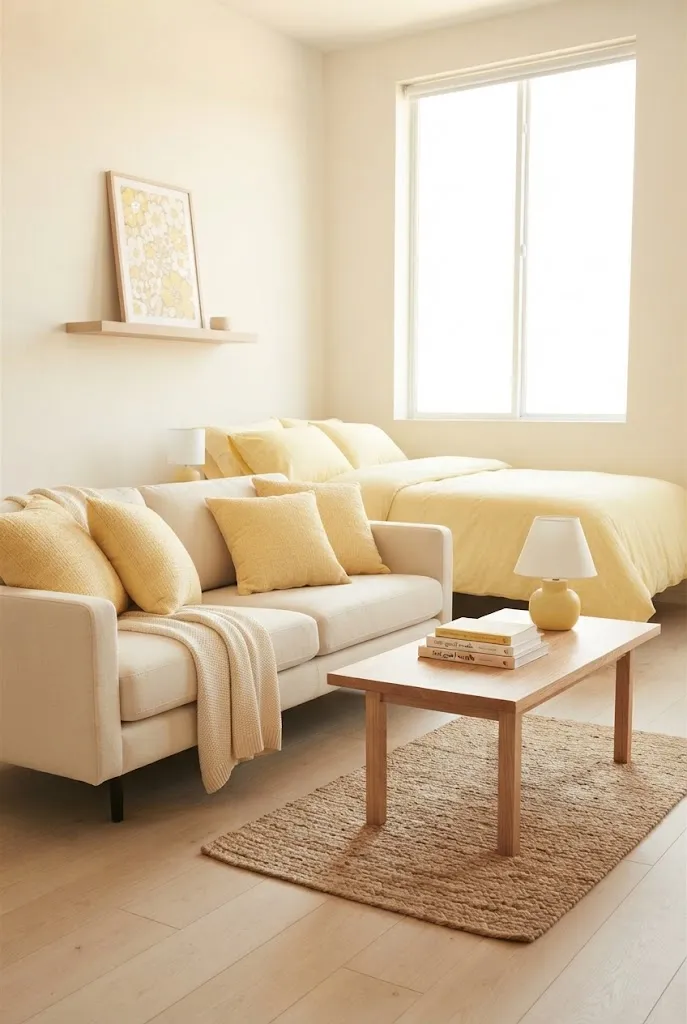
Butter yellow is a soft, happy color that makes a studio feel sunny all year. Cream and light wood keep it calm and fresh.
Add butter yellow through bedding, a lamp base, or art, and keep the rest of the palette light. It fits right in with these cozy studio apartment ideas.
Colors: Butter Yellow #F2DC9B, Cream #F5EEDF, Light Wood #D8B98D, Sage #A9B39B
Where to use it: cream on walls, butter yellow on bedding or pillows, light wood on furniture, sage on plants
Best for: cheerful, cottage, and Scandinavian studios
Cozy Color Palettes by Couch Color
Your sofa is usually the biggest piece of color in the room, so it is the best place to start. Save this quick guide to the cozy studio apartment color palette ideas that suit each couch color:
- Brown couch: cream, rust, and olive, or navy with camel
- Gray couch: cream, terracotta, and warm white, or blush with brass
- Cream couch: caramel, sage green, and walnut, or terracotta with olive
- Green couch: terracotta, mustard, and cream
- Black couch: camel, warm white, and oak
How to Build a Cozy Color Palette for a Studio Apartment
Before you choose from these cozy studio apartment color palette ideas, start with what you cannot change. Floors, kitchen cabinets, and countertops are part of your palette whether you like it or not, so choose colors that work with them.
Next, use the 60-30-10 rule. About 60 percent of the room should be your main color, usually walls and large furniture. Around 30 percent goes to a secondary color, like the sofa, bedding, or rug. The last 10 percent is your accent color for pillows, art, and small decor.
Choose colors with warm undertones, such as cream instead of stark white or warm gray instead of blue-gray. Then repeat each color in both the living and sleeping areas so the studio feels like one connected room. These studio apartment design ideas show how repeated colors pull a space together.
Renter-Friendly Ways to Use Your Palette
You do not need to paint to bring a cozy color palette into a rental. Start with the pieces that cover the most visual space:
- A rug in your main or secondary color. These mini studio apartment rug ideas can help with sizing.
- Bedding, pillow covers, and throws in your accent colors
- Curtains in a warm neutral. Browse these cozy curtain ideas for inspiration.
- Art and prints that repeat your palette, like these budget-friendly wall art ideas
- Plants and wood accents to add natural greens and browns
If you are allowed to paint, choose a low-VOC paint and keep the room ventilated while it dries, since paint is a common source of volatile organic compounds indoors.
Warm Lighting Makes Every Palette Cozier
Even the warmest palette can feel flat under cool white light. Warm white bulbs around 2700K make creams look creamier and earthy tones look richer, so check the color temperature of your bulbs before you judge a color.
Layer a floor lamp, a table lamp, and a small accent light so your colors glow in the evening instead of looking washed out.
Frequently Asked Questions
What colors make a studio apartment feel cozy?
Warm neutrals like cream, caramel, and taupe, earthy tones like terracotta and olive, and rich accents like rust or forest green make a studio feel cozy. Warm undertones matter more than any single color.
How many colors should a studio apartment color palette have?
Three to four colors is usually enough: one main color, one secondary color, and one or two accents. More than that can make a small studio feel busy.
Can dark colors work in a small studio?
Yes. Deep green, navy, or chocolate brown can feel cozy in a small space when you balance them with light walls, warm lighting, and plenty of cream or ivory.
What is the best cozy color palette for renters?
Of all the cozy studio apartment color palette ideas, cream, caramel, and walnut is the easiest for renters, because it works with standard white walls and most existing furniture.
Find the Palette That Makes Your Studio Feel Like Home
The coziest studio is not about having the most colors. It is about choosing a few warm shades that work together and repeating them across the room.
Pick the palette that matches your furniture and style, start with textiles and lighting, and build from there.
Save these cozy studio apartment color palette ideas to your Pinterest board so the hex codes are ready the next time you shop or decorate.
Community
Join the conversation
Add a useful idea, ask a specific question, or share what worked in your space. Every comment is reviewed before it appears.