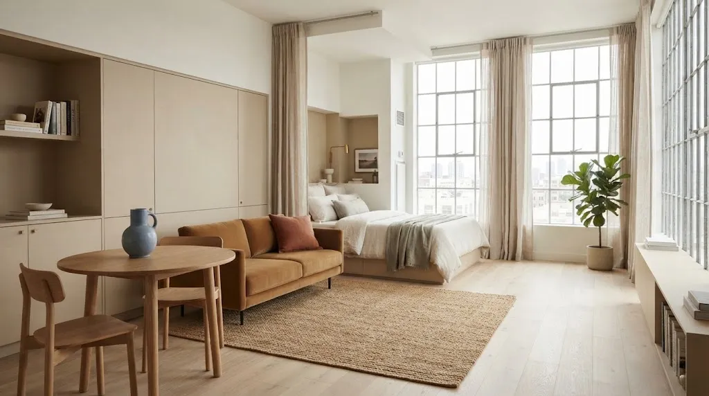
A small studio can feel surprisingly spacious when the colors are working in your favor. The right color palette ideas for small studio apartments can make walls feel lighter, create visual flow, and help separate different areas without adding bulky furniture.
Choosing colors for a compact home is not only about picking shades you love. Light levels, furniture size, flooring, and the amount of visual contrast all affect how open the room feels. A color that looks beautiful in a large room may feel much stronger in a studio.
I’ve noticed that the most successful small spaces usually rely on a simple base color, one supporting shade, and a few carefully placed accents. The ideas below explore different combinations, from soft neutrals and gentle greens to warmer shades that add personality without overwhelming the room. You’ll find practical ways to use each palette so you can create a studio that feels brighter, calmer, and more thoughtfully connected.
1. Warm White and Sand
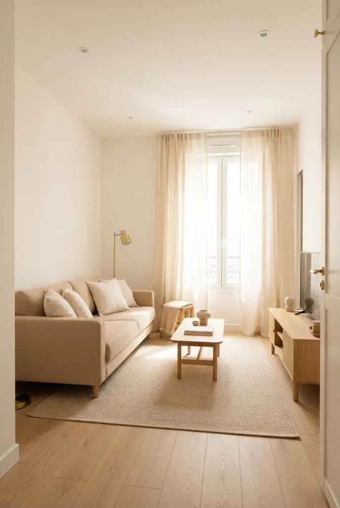
Warm white paired with sandy beige keeps a studio feeling open without making it look cold. The pale walls reflect daylight, while sand tones add enough contrast to define the sofa, rug, and sleeping area. I’ve noticed this combination works especially well when furniture is limited because the colors create separation without visual clutter.
Keep the darker beige shades below eye level, such as on rugs, cushions, or lower furniture. Let the walls, curtains, and larger vertical surfaces stay lighter. This keeps the room visually airy while still giving it warmth. Add light oak or natural wood for texture without introducing a heavy color block.
2. Soft Blue and Cream
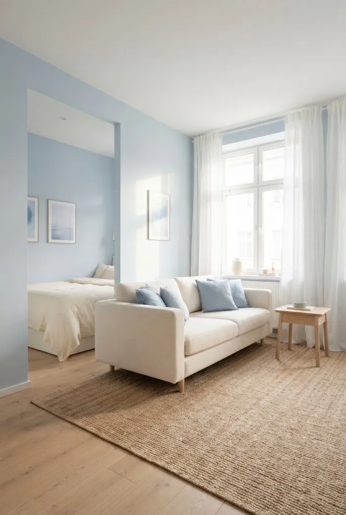
- Choose powder blue rather than a saturated navy for the main wall color.
- Pair blue with creamy white instead of stark white for a softer contrast.
- Repeat the blue in two or three small areas, such as cushions, artwork, or bedding.
- Keep flooring and larger furniture pieces light to prevent the palette from feeling visually heavy.
- Add natural wood for warmth and balance.
A pale blue and cream palette can make a compact room feel calmer and more spacious. The key is controlling the amount of blue. Use it as a soft supporting color rather than covering every surface. In my experience, repeating one gentle shade around the room helps the studio feel connected instead of visually divided.
3. Greige and Ivory
Quick Tip:
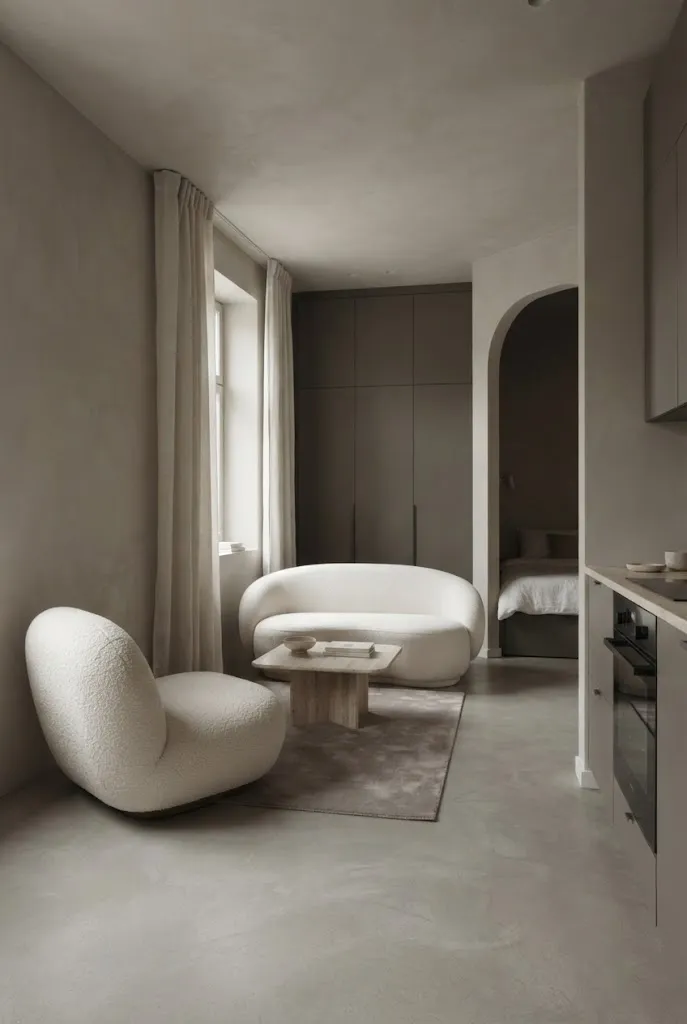
Keep greige slightly lighter on the walls than on your upholstery or accessories. Choose ivory for curtains and bedding to create gentle layering without sharp color changes. If the room receives little daylight, test the paint during morning and evening hours before committing.
Greige and ivory create depth while keeping the overall palette restrained. This combination is especially useful when you want a studio to feel polished without relying on lots of decoration. Use greige for walls or larger furniture, then bring ivory into fabrics and bedding. A small amount of warm taupe can anchor the lower half of the room.
4. Sage Green and Cream
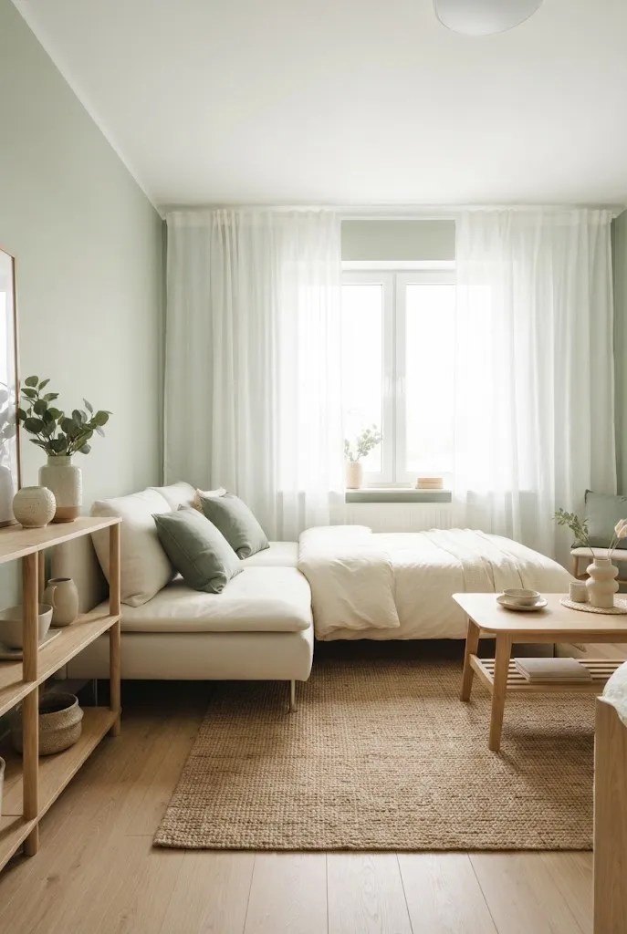
BEFORE: A compact studio with unrelated wall, furniture, and textile colors can make each area compete for attention. The eye stops at every color change, making the room feel visually chopped up.
AFTER: Sage green and cream create a gentle connection across the entire studio. Keep cream on the largest surfaces and repeat sage through bedding, cushions, artwork, or a small rug.
This pairing brings a soft natural quality without requiring lots of decoration. I’ve noticed muted green works particularly well when the room already has wood furniture or plants because those elements reinforce the same earthy direction. Keep the green slightly dusty rather than highly saturated, especially if the studio has limited natural light.
5. Dusty Pink and Beige
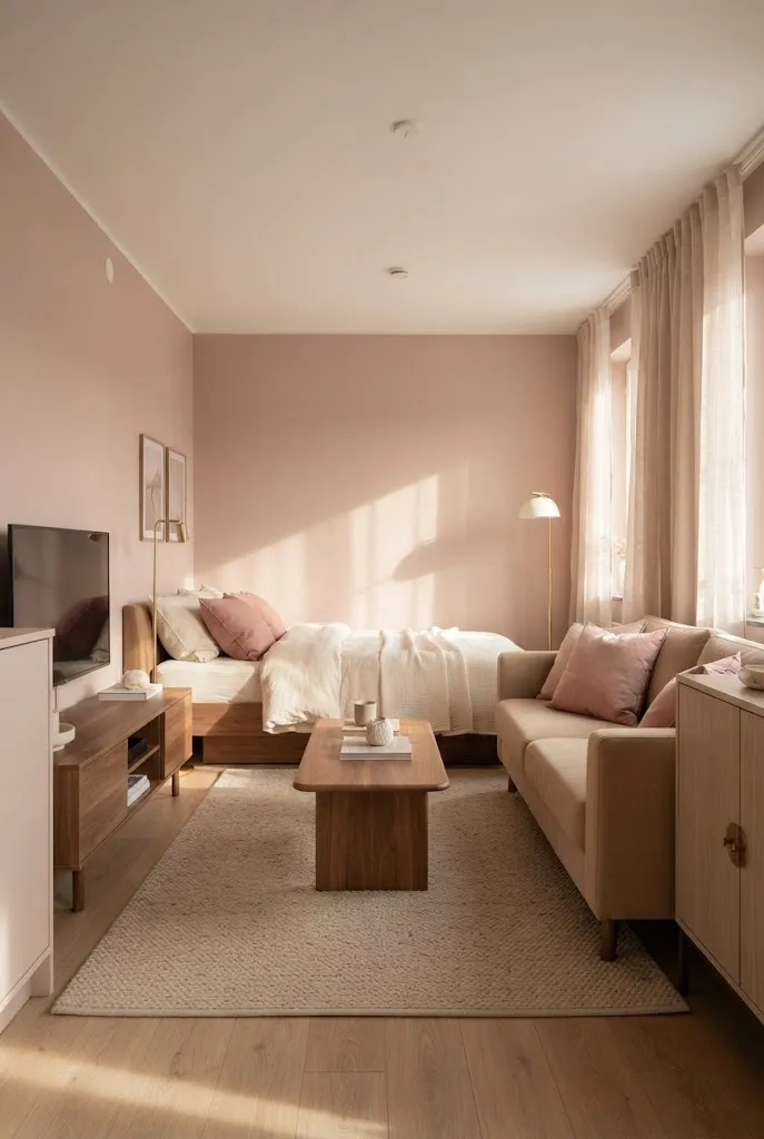
- Start with the base. Choose warm beige for the larger furniture, rug, or curtains so the room has a calm foundation.
- Add dusty pink. Use a muted rose shade on one wall, bedding, cushions, or a compact accent chair.
- Repeat the tone. Place the pink in at least two small areas so it feels intentional rather than isolated.
- Bring in wood. Light or medium wood adds warmth and prevents the palette from feeling overly sweet.
A dusty pink and beige scheme gives a small studio personality while keeping the overall contrast gentle. The trick is choosing a muted pink rather than a bright candy shade. Use cream between the two colors to create breathing room, then introduce natural wood to ground the softer tones.
6. Cream and Light Taupe
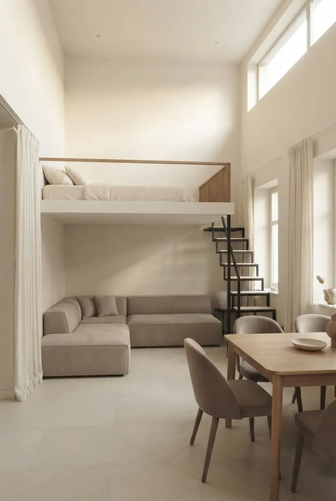
| Comparison Point | Option A | Option B |
|---|---|---|
| Wall Color | Cream | Medium taupe |
| Larger Furniture | Light taupe | Dark brown |
| Textiles | Ivory and cream | Mixed beige shades |
| Visual Effect | Airy and connected | Heavier and more defined |
Cream and light taupe work together by creating contrast through small shifts in tone rather than dramatic color changes. Keep the palest shades on walls and curtains, then move slightly darker with the sofa, rug, or bedding. This approach helps different studio zones feel connected while still giving each area subtle definition.
7. Olive Green and Linen
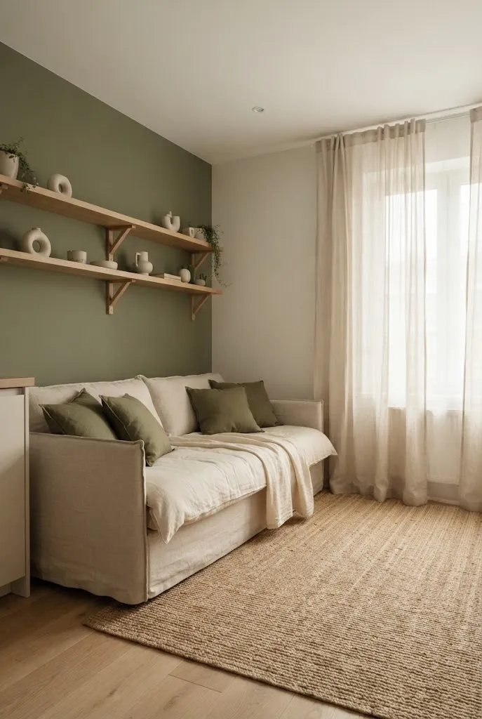
DO:
- Keep olive muted and dusty rather than highly saturated.
- Pair it with warm linen, cream, and natural wood.
- Use olive on one wall or through small repeated accents.
- Keep large reflective surfaces and curtains in lighter tones.
DON’T:
- Don’t cover every wall with deep olive.
- Don’t mix several strong green shades in one room.
- Don’t pair it with very cool gray furniture.
- Don’t overcrowd the palette with bright accent colors.
Olive and linen bring an earthy character to compact interiors without requiring lots of decoration. The lighter linen tones help soften the deeper green, while wood adds continuity. For a studio with good daylight, an olive feature wall can define the sleeping or dining zone without requiring a physical divider.
8. Pale Gray and White
Cost: Low | Time: One weekend | Skill Level: Beginner | Best For: Bright studios | Result: Clean, open appearance
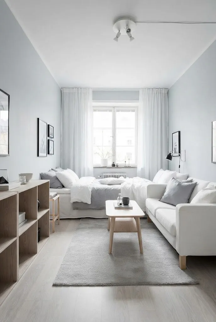
Pale gray and white create a crisp foundation for a small apartment, especially when the room receives plenty of daylight. Use gray on the walls and introduce white through curtains, bedding, and larger furniture. Add one or two warm wood pieces so the space does not feel overly stark.
For an even lighter effect, choose a soft gray with warm or neutral undertones instead of a deep charcoal gray. Keep decorative pieces simple and avoid adding too many competing colors. A small amount of beige, natural wood, or muted greenery can add warmth while allowing the gray and white combination to remain the main focus.
9. Terracotta and Warm White
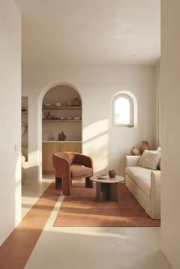
Terracotta brings instant warmth to a pale studio, but restraint keeps the room feeling spacious. Start with warm white as the dominant background, then introduce terracotta through one chair, a small rug, cushions, or artwork. I’ve seen this combination work particularly well in rooms with wood floors because the earthy tones naturally reinforce one another.
Keep stronger terracotta shades below eye level or concentrated in smaller furnishings so they do not visually shrink the room. Warm white walls and curtains should remain dominant, especially in studios with limited daylight. Add beige, cream, or light oak between the two colors to soften the contrast and create a more connected look.
10. Navy and Soft White
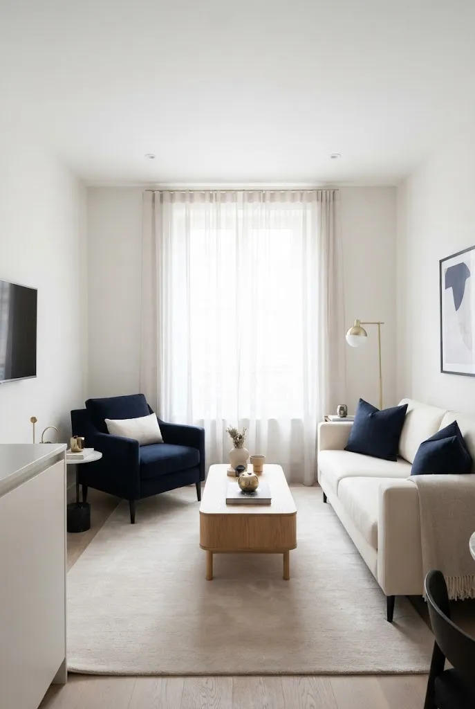
- Keep soft white on most walls and larger surfaces to maintain visual openness.
- Use navy on smaller furniture pieces, cushions, artwork, or bedding.
- Repeat navy in two or three places so the darker shade feels intentional.
- Add light wood or warm beige to soften the contrast.
- Keep the floor visually light if possible.
Navy adds definition without requiring a dark room overall. The strongest approach is to treat it as an accent rather than the dominant color. A navy chair near a white wall can create a clear focal point, while matching cushions or bedding help connect the palette across different studio zones.
11. Pale Lavender and Ivory
Quick Tip:
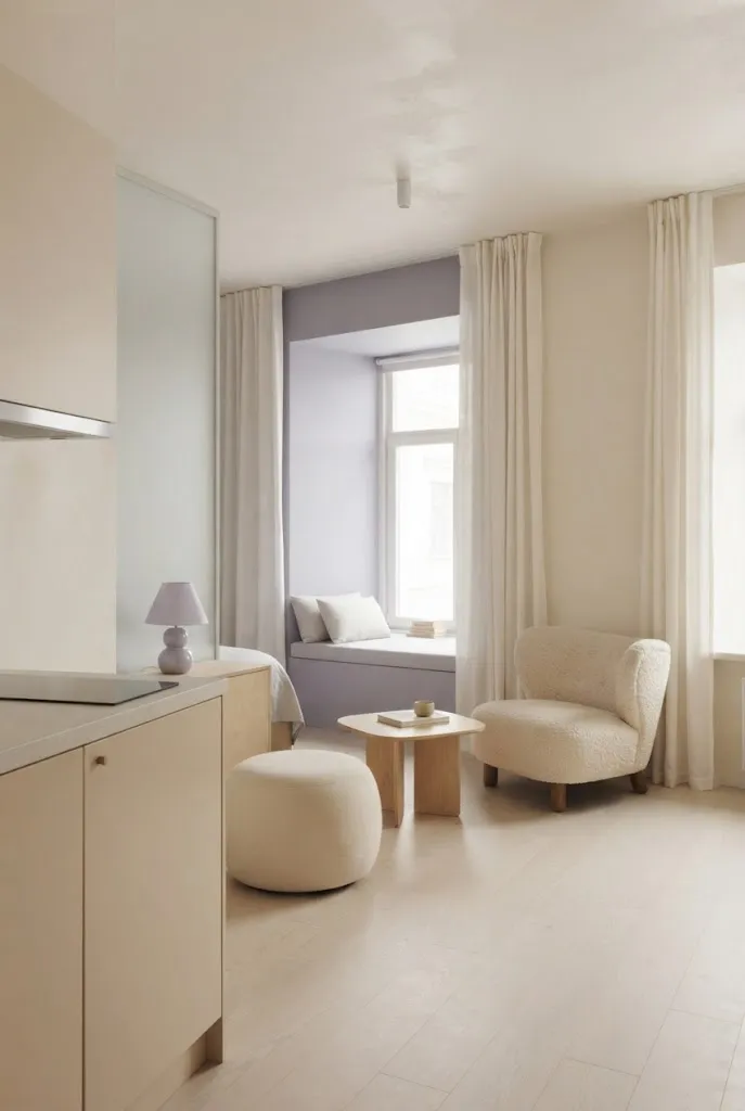
Choose a gray-based lavender instead of a bright purple for the walls. Keep ivory and cream as the dominant colors, then repeat lavender through two or three small accents. This keeps the color visible without making the compact room feel visually crowded.
Pale lavender works best when treated as a quiet background shade. It adds personality while retaining the lightness needed in a small studio. Pairing it with ivory also reduces the sharp contrast that can make compact rooms feel divided. Light maple, birch, or pale oak furniture can reinforce the airy effect.
12. Monochrome Beige Layers
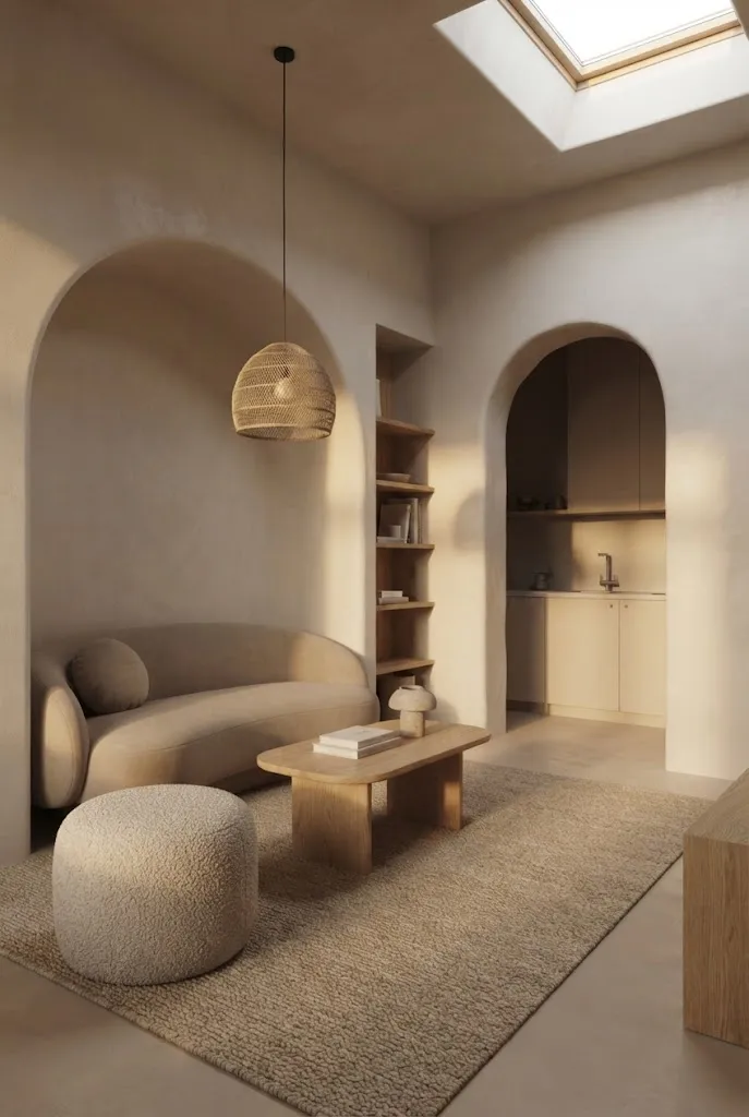
BEFORE: A studio using one flat beige shade everywhere can appear dull and visually unfinished. Without tonal or textural variation, the furniture may blend together too much.
AFTER: Layer cream, oatmeal, sand, and light taupe across different surfaces. Keep the lightest shades near the windows and walls, then use slightly deeper tones for rugs, seating, and smaller accessories.
A monochrome beige palette creates spaciousness through continuity rather than strong contrast. The important detail is variation. Mix smooth walls with woven textiles, boucle upholstery, and natural wood so the room gains depth without introducing another dominant color. This approach is especially practical for renters who want an adaptable, calm foundation.
13. Cream and Muted Teal
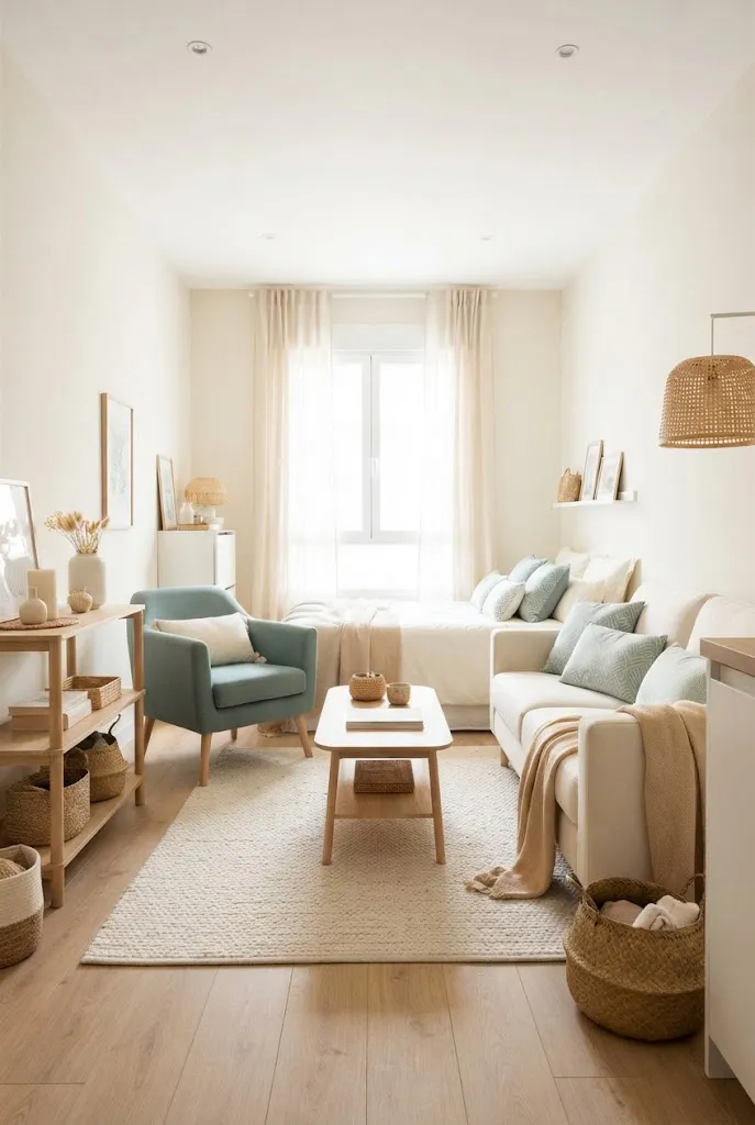
- Set the base. Keep walls, curtains, and larger surfaces in cream or ivory to maximize visual brightness.
- Introduce teal selectively. Add muted teal through cushions, artwork, bedding, or one compact accent chair.
- Balance the contrast. Choose pale wood furniture and warm beige textiles between the cream and teal.
- Repeat the accent. Use teal in at least two separate areas so the studio feels visually connected.
Cream keeps the background light while muted teal gives the room enough contrast to define individual zones. Avoid highly saturated turquoise, which can dominate a compact interior. A dusty teal feels calmer and pairs naturally with pale wood, woven textures, and warm neutral fabrics.
14. Warm Gray and Blush
| Comparison Point | Option A | Option B |
|---|---|---|
| Main Wall | Warm gray | Cool gray |
| Accent Shade | Muted blush | Bright pink |
| Furniture | Pale wood | Dark wood |
| Overall Effect | Soft and balanced | Stronger visual contrast |
| Best Textiles | Ivory and beige | White and gray |
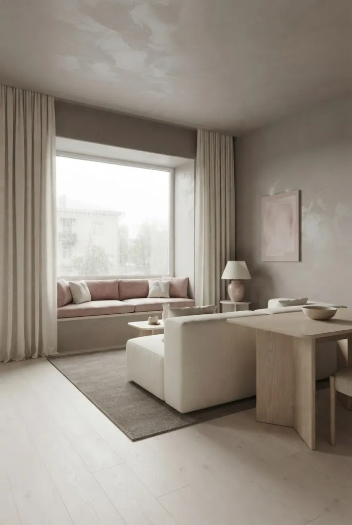
Warm gray provides enough structure to prevent blush from feeling overly delicate. Choose a gray with beige or taupe undertones, then introduce blush in small areas such as cushions, artwork, or bedding. Keep the larger furniture pieces neutral so the accent color remains controlled and the studio retains an open visual flow.
15. Sandy Beige and White
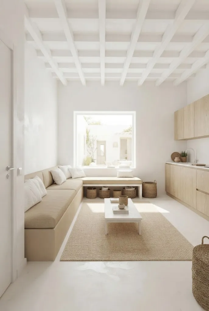
DO:
- Keep white on curtains and larger vertical surfaces.
- Choose sandy beige with warm undertones.
- Add pale wood for natural texture.
- Repeat beige through rugs, cushions, or bedding.
DON’T:
- Don’t combine too many beige undertones.
- Don’t use bright yellow-beige as the dominant shade.
- Don’t fill every surface with accessories.
- Don’t introduce several unrelated accent colors.
Sandy beige and white are especially useful when you want a studio to feel warm without making it visually busy. The lighter white surfaces reflect available daylight, while beige adds enough tonal variation to prevent the room from looking flat. Natural fibers such as linen, cotton, and jute strengthen the palette without adding visual clutter.
16. Soft Charcoal and Cream
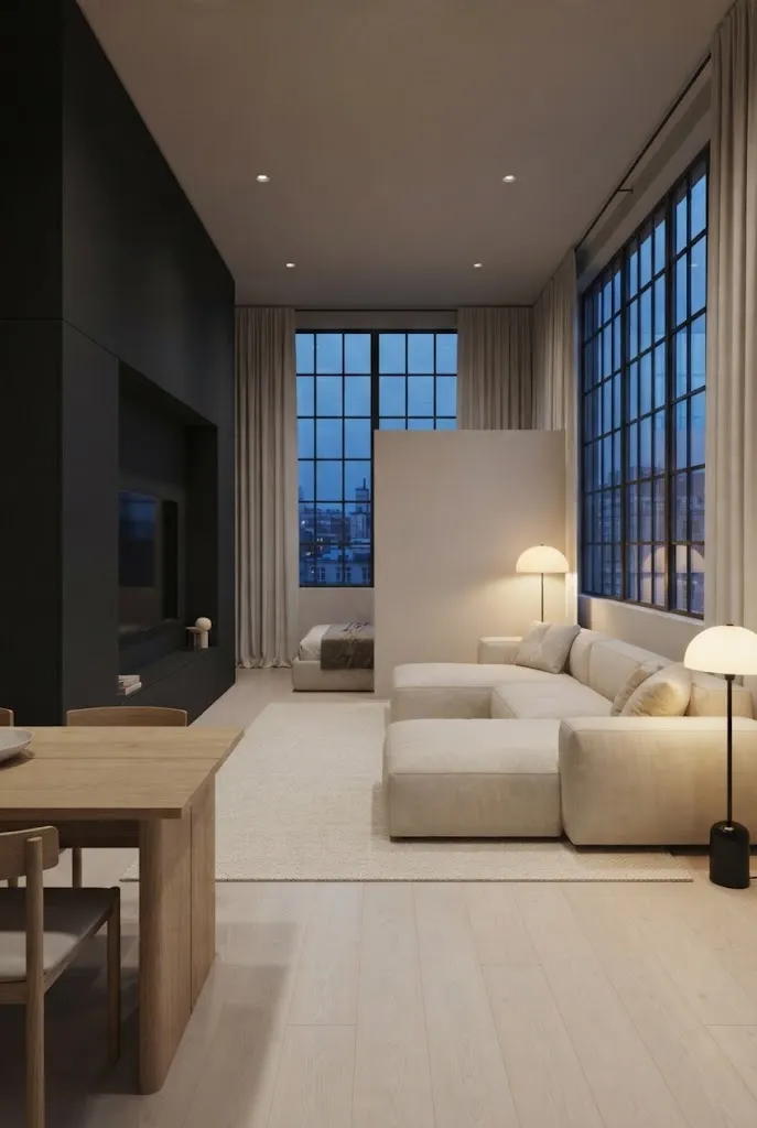
Cost: Moderate | Time: One afternoon | Skill Level: Beginner | Best For: Modern studios | Result: Defined but spacious
Soft charcoal can add structure to a small studio without making the entire room feel dark. Keep cream or ivory on the walls, curtains, and bedding, then reserve charcoal for one major furniture piece and a few small accents. The contrast creates clear zones while the lighter background keeps the room visually open.
17. Pale Peach and Cream
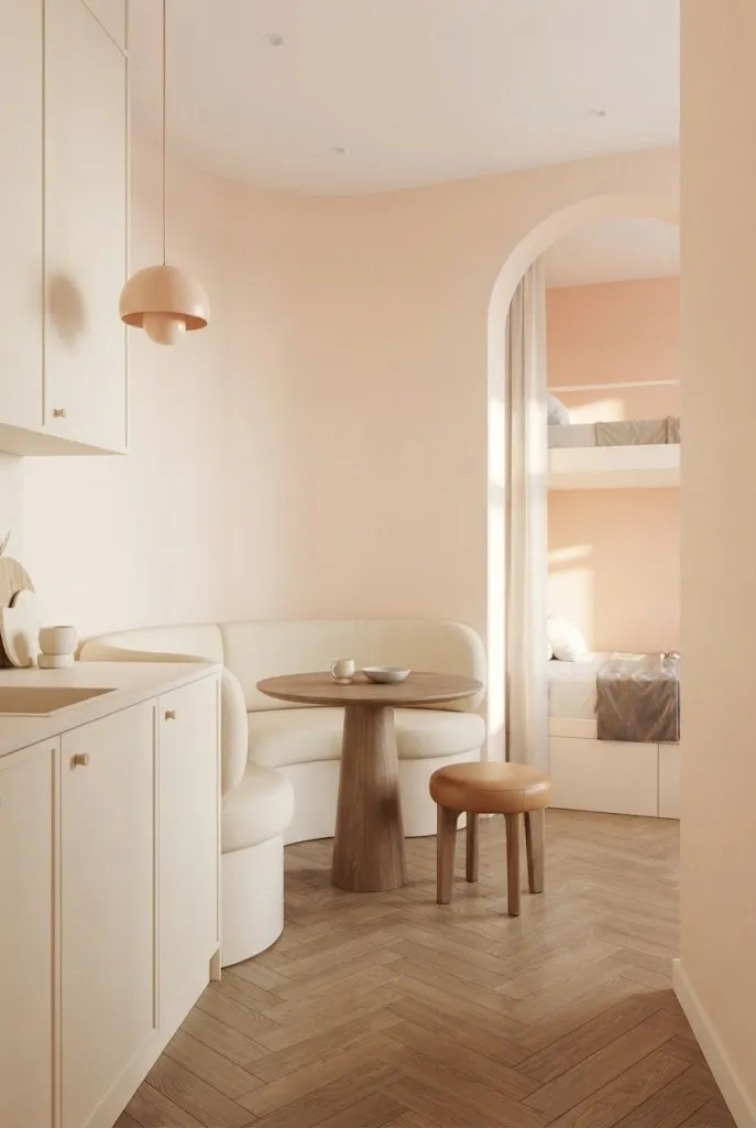
Pale peach adds warmth without the heaviness of a strong orange or coral shade. Keep cream dominant across the largest surfaces, then introduce peach through one wall, bedding, cushions, or artwork. In my experience, soft peach works especially well with light wood because both colors have warm undertones that make a compact room feel cohesive.
Use the palest peach you can find if the studio has limited daylight. A stronger shade can make walls feel visually closer, while a washed-out version keeps the background bright. Add one small terracotta or tan detail if you want extra depth, but let cream remain the visual anchor.
Conclusion
A small studio does not need to look plain to feel spacious. The right combination of light backgrounds, gentle contrast, natural textures, and carefully repeated accents can make every corner feel more connected and intentional.
These color palette ideas for small studio apartments give you plenty of starting points, whether you prefer warm neutrals, soft pastels, earthy greens, or deeper accent shades. Start with one palette that matches your furniture and natural light, then test a small area before committing.
I’ve seen how small color changes can shift the entire feel of a room. Save this post on Pinterest, try your favorite idea, and share it with someone planning a small-space makeover.
Community
Join the conversation
Add a useful idea, ask a specific question, or share what worked in your space. Every comment is reviewed before it appears.