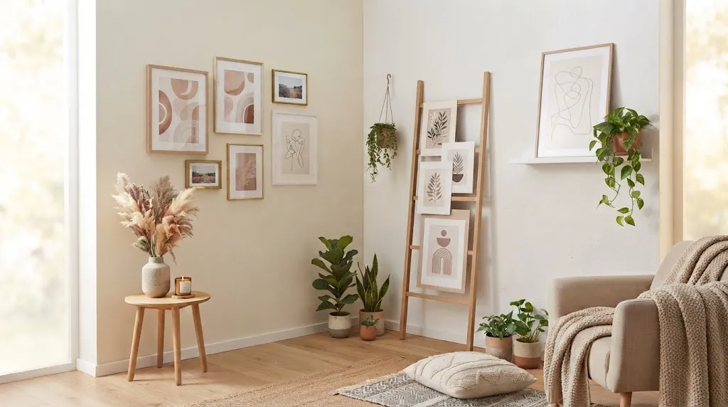
A blank wall says nothing about the person living behind it, and that changes the moment you start to style wall art in a studio apartment with intention. Every frame, print, and leaning canvas becomes a chance to tell a small story about who you are, even in four hundred square feet or less. I’ve noticed that the smallest apartments often benefit the most from thoughtful art placement, since every wall carries more visual weight when there is less of it to work with. This collection of twenty-two ideas covers everything from gallery corners to freestanding easels, each one built for renters, small spaces, and anyone ready to turn bare walls into something worth photographing.
1. Gallery Wall Corner
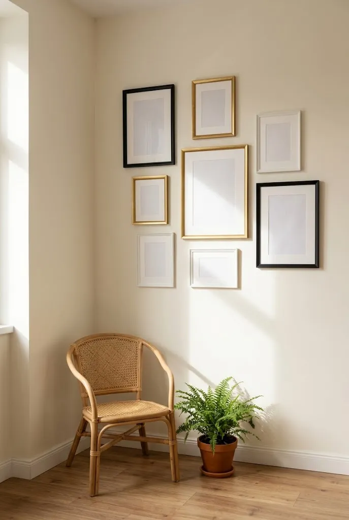
- Turns an empty corner into a focal point without needing extra floor space
- Mixes frame sizes and shapes for a curated, collected look
- Works well above a reading nook, sofa arm, or narrow hallway wall
- Easy to update piece by piece as your taste changes
A cluttered corner instantly becomes the most interesting spot in the room once you fill it with a curated collection of frames. This approach lets you display multiple pieces without committing to one large print, which is ideal when working with limited wall space. Mixing textures, like a woven macrame piece next to a framed print, adds depth and keeps the display from feeling flat. In my experience, corners that once felt awkward or wasted become genuine conversation starters once styled this way. Start small with three or four pieces and grow the collection gradually as new favorites come along.
Small apartments often lose personality when every wall stays empty to make the space feel bigger, but a well placed corner display proves the opposite is true. Layering framed art in a tight cluster draws the eye upward and outward, which actually makes the ceiling and room feel taller. This idea works especially well near a desk or reading chair, where you spend enough time to appreciate the details up close. Choosing pieces with a shared color palette keeps the arrangement cohesive even when the frame styles differ. The result is a corner that feels intentional, warm, and lived in.
2. Oversized Statement Print
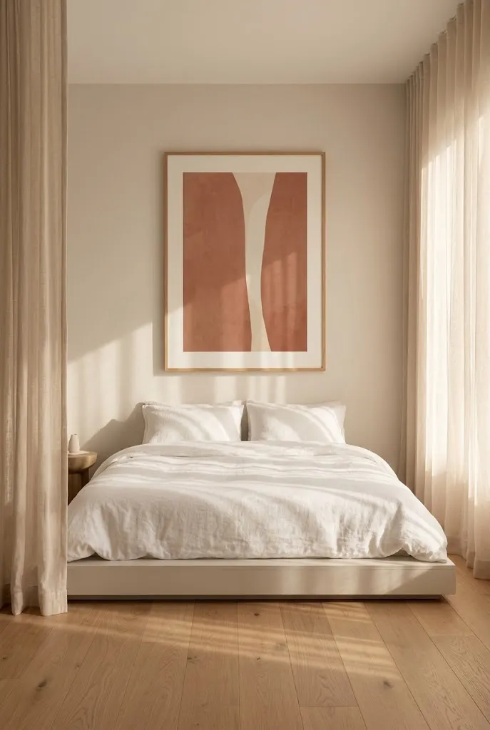
- Anchors an entire room with one bold piece instead of several small ones
- Reduces visual clutter, which matters most in compact layouts
- Works above a bed, sofa, or console table as an instant focal point
- Cuts down on the number of nails and hanging hardware needed
One large piece of art can do more for a room than five small ones scattered across the wall. This idea works especially well in a studio apartment, where every surface needs to earn its place. A single oversized print gives the eye one clear point to rest on, which makes the whole room feel calmer and more organized. I’ve noticed that renters often avoid big art because they worry it will overwhelm a small space, but the opposite tends to happen. Scale creates impact, and one piece almost always reads as more polished than a scattered collection of frames.
A bedroom or living area in a small unit rarely has room for a gallery wall, which makes one statement piece the more practical choice. Hanging a large print at eye level above the bed or sofa draws attention exactly where you want it, framing the main seating or sleeping area like a headboard would. This approach also saves money over time, since one great print often costs less than several smaller frames combined with matting and glass. That’s why many designers recommend starting a small space with a single anchor piece before adding anything to the walls around it.
3. Floating Shelf Display
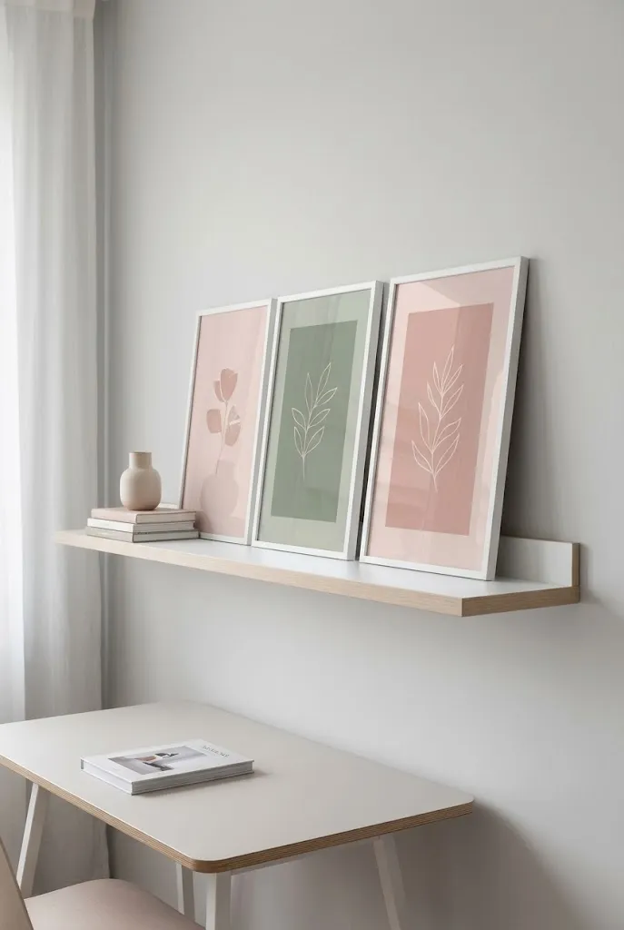
- Lets you layer framed prints with small objects like books or plants
- Easy to rearrange without extra holes in the wall
- Adds a three dimensional layer that flat frames alone can’t create
- Great for renters who want flexibility to swap pieces often
Floating shelves solve one of the biggest challenges when you try to style wall art in a studio apartment: commitment. Instead of drilling multiple holes for frames, you lean prints against the wall on a shelf and swap them out whenever the mood strikes. This setup also invites layering, since you can tuck a small plant, candle, or stack of books between the frames for texture. I’ve seen this work well in rentals where landlords limit how many holes tenants can make. The flexibility makes floating shelves one of the most practical options for anyone who likes to redecorate often.
A shelf display works differently from a fixed gallery wall because nothing is permanent, which suits people who change their minds often. Overlapping two or three prints at different depths creates a sense of movement that flat framed pieces on their own can’t achieve. Adding a plant or small sculpture in front of the art breaks up the flatness further and gives the eye something closer to focus on first. This idea also photographs beautifully for Pinterest, since the layered look reads as effortless and curated rather than staged. It remains one of the easiest upgrades for renters to try.
4. Mirror and Art Duo
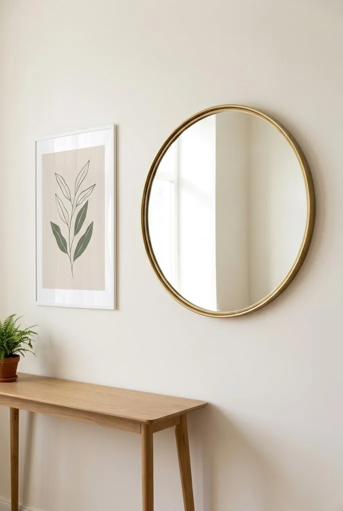
- Combines function and decor by pairing a mirror with a print
- Bounces natural light around the room, which helps compact spaces feel bigger
- Balances the wall visually when one piece alone looks too plain
- Works well in entryways, above dressers, or beside a window
Pairing a mirror with a framed print solves two problems at once in a small space. The mirror bounces available light around the room and makes it feel more open, while the print next to it adds color and personality that a plain mirror can’t offer alone. This combination works well in apartments with only one small window, where extra light makes a noticeable difference. Placing the two side by side, rather than stacking them, keeps the arrangement balanced and prevents either piece from overpowering the other. It is a simple pairing that does double duty for function and style.
A studio apartment often has limited wall space, so every piece needs to serve more than one purpose. Mirrors reflect whatever is across from them, which means the print or plant on the opposite wall effectively gets duplicated in the room without adding more furniture or decor. Choosing a mirror frame that echoes the print’s frame finish, like matching brass or matte black, ties the pairing together and makes it look intentional rather than accidental. In my experience, this duo works especially well near an entry or hallway, where guests get a quick, polished first impression of the space.
5. Leaning Ladder Frame
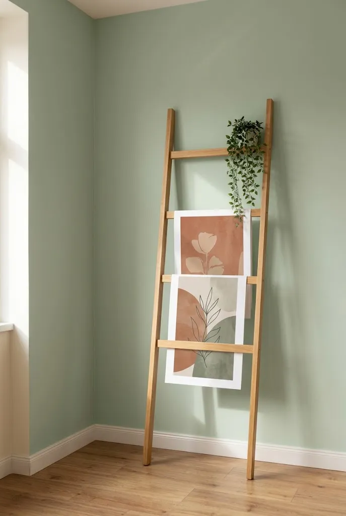
- Adds height and visual interest without any wall mounting
- Great for renters who can’t drill holes
- Easy to restyle by swapping frames on each rung
- Works well in corners or beside a bookshelf
A leaning ladder frame is one of the simplest ways to add art to a rental without touching the walls at all. The vertical structure draws the eye upward, which helps a small room feel taller than it actually is. Each rung can hold a different print, so you get a layered display that looks curated even though nothing is permanently fixed in place. I’ve noticed renters especially love this option because it travels easily to a new apartment without leaving a single hole behind. It also doubles as a spot to drape a scarf or hang a small plant for extra texture.
This idea works particularly well in a corner that would otherwise sit empty, since a ladder frame takes up very little floor space while still making a visual statement. Swapping the prints seasonally, or whenever a new favorite comes along, keeps the display feeling fresh without any extra effort or tools. The slight lean against the wall also gives the arrangement a relaxed, lived-in quality that feels less stiff than a perfectly aligned gallery wall. Pairing the top shelf with a trailing plant softens the display and adds a natural, organic touch that photographs beautifully.
6. Tapestry Focal Wall
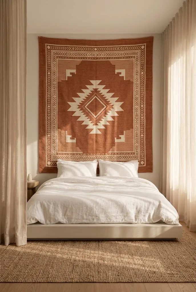
- Covers a large wall area affordably compared to multiple framed prints
- Adds texture and softness that flat art alone can’t provide
- No frames or glass needed, which keeps the look casual and light
- Easy to hang with just a few small nails or a curtain rod
Covering an entire wall with a woven tapestry gives a small room instant texture without the cost of multiple framed pieces. Fabric softens a space in a way that flat prints behind glass simply cannot, adding warmth to a bedroom or living corner almost immediately. Hanging one large piece also means fewer nail holes overall, which makes this a landlord-friendly option for renters. That’s why many designers recommend tapestries for studio apartments specifically, since they cover more visual ground per square foot than smaller art pieces. The fabric also absorbs some sound, which can help a compact space feel quieter and cozier.
A tapestry works especially well behind a bed or sofa, where it functions almost like an oversized headboard for the room. Choosing a pattern with earthy or muted tones keeps the look grounded rather than overwhelming, even when the piece spans several feet wide. Unlike framed art, a tapestry can be hung with a simple rod or a few strategically placed nails, which makes installation quick and low commitment. The result is a wall that feels finished and intentional, with far less effort and expense than filling the same space with several individual frames.
7. Above-the-Headboard Cluster
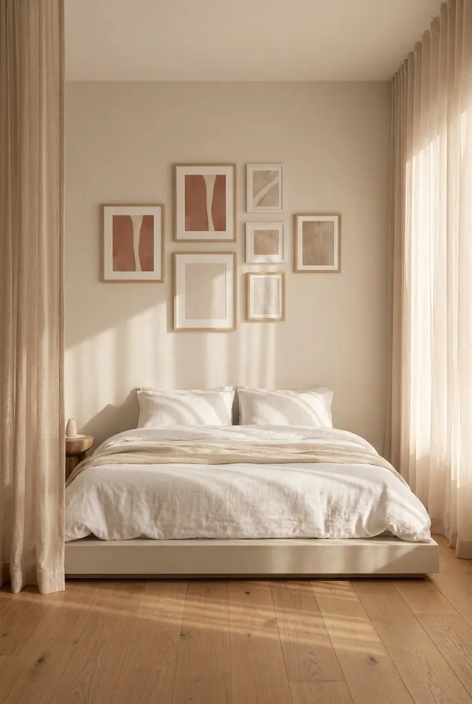
- Creates a soft, layered backdrop for the bed without a traditional headboard
- Works with mismatched frame styles for a relaxed, collected feel
- Adds personality to the one wall guests see most in a studio
- Cheaper alternative to buying a statement headboard
Skipping a traditional headboard and clustering art above the bed instead saves both money and floor space, which matters most in a single-room layout. The cluster acts as a visual anchor for the sleeping area, giving it a defined presence even without a physical piece of furniture behind the pillows. Mixing frame finishes, like a mix of wood and thin metal, keeps the arrangement from feeling too matched or store-bought. I’ve tried this approach in my own small apartment, and it consistently reads as more personal than a single large canvas would. The layered look also hides an oddly placed outlet or wall imperfection better than one solid piece.
In a studio apartment, the bed often sits in the same open area as the living space, so the wall behind it becomes one of the most visible spots in the entire home. A cluster of art turns that wall into a soft, welcoming backdrop rather than a blank space that feels unfinished. Keeping the frames within a similar color story, even if the sizes vary, helps the whole arrangement feel cohesive from across the room. This idea also gives you room to grow the collection slowly, adding one new piece whenever something catches your eye.
8. Pegboard Art Wall
- Turns a functional storage piece into a rotating art display
- Lets you rearrange prints, hooks, and small shelves in seconds
- Ideal for a workspace corner or entryway in a small unit
- Adds a modern, organized look that hides clutter
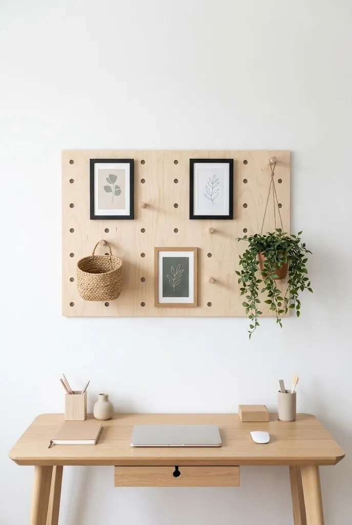
A pegboard might sound more like a garage tool than a decor piece, but styled correctly it becomes one of the most flexible ways to style wall art in a studio apartment. Small hooks and shelves let you mix framed prints with plants, baskets, or even a hat, which adds function alongside the visual appeal. Because everything hangs on movable pegs, rearranging the whole display takes minutes instead of a full afternoon with a hammer and level. I’ve noticed this option works especially well for people who use their studio as both a bedroom and a home office. The board itself becomes part of the design rather than something to hide.
This idea suits a workspace corner particularly well, since it keeps supplies within reach while still looking intentional and styled. Choosing a natural wood pegboard rather than a stark white one adds warmth and keeps the setup from feeling too utilitarian or office-like. Layering in a small trailing plant or a woven basket alongside the framed prints softens the overall look and breaks up the grid pattern of the holes. Because nothing is permanently fixed, this display also grows easily as you find new pieces to add over time, making it a long term solution rather than a one time setup.
9. Windowsill Leaning Art
- Uses unused sill space instead of the wall itself
- Adds height variation next to curtains or blinds
- Easy to swap seasonally with no tools required
- Softens a plain window with layered color and texture
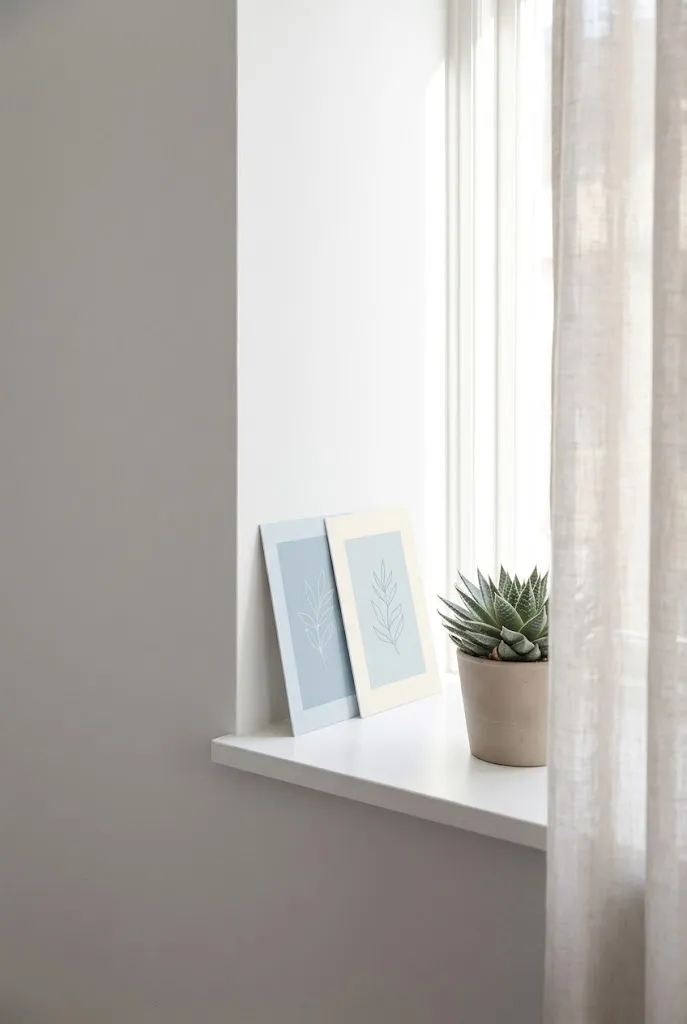
Not every idea for displaying art needs to involve the wall at all, and a windowsill proves that point well. Leaning one or two small prints against the glass, tucked beside a curtain panel, adds color and personality to a spot that usually goes overlooked. This works particularly well in a studio apartment where wall space is already spoken for by shelving or furniture. Because nothing is mounted, swapping the prints for the season takes only a few seconds. In my experience, this small styling trick often gets noticed by guests before anything else in the room, simply because it is unexpected.
A windowsill display also benefits from the natural light source right behind it, which makes colors in the artwork appear brighter throughout the day. Pairing a leaning print with a small plant creates a mini vignette that feels curated without requiring much effort or planning. This idea works especially well for renters who want to add personality without committing to permanent wall changes. Rotating the prints between seasons, swapping a warm toned piece for something cooler in summer, keeps the nook feeling fresh year round with almost no extra cost involved.
10. Frame Gallery Grid
- Creates a clean, symmetrical look using matching frame sizes
- Reads as polished and organized rather than eclectic
- Works well above a console table or sofa
- Easier to plan and hang using a paper template first
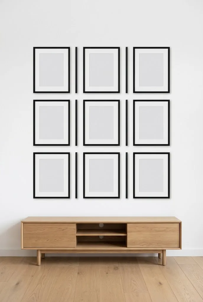
A grid layout takes the opposite approach from a scattered gallery wall, favoring clean lines and equal spacing over a relaxed, collected look. Using frames of the same size and finish keeps the arrangement feeling structured and calm, which suits a more modern or minimalist studio apartment. Planning the grid with paper templates taped to the wall first helps avoid uneven spacing or extra nail holes. I’ve seen this work well in small living rooms where a symmetrical layout makes the whole space feel more organized and less busy. The evenness also makes the collection read as one cohesive piece rather than several separate frames.
This idea suits anyone who prefers order over eclectic mixing, since every frame follows the same rules for size, spacing, and finish. A three by three or two by four grid above a console table or sofa creates a strong horizontal anchor for the room without overwhelming a small wall. Choosing prints with a shared color palette, even if the subject matter varies slightly, keeps the grid from feeling repetitive or flat. The structured format also makes this one of the easier layouts to replicate exactly if you ever move to a new apartment.
11. Bookshelf Art Lean
- Combines books, small frames, and objects for a curated tablescape feel
- Uses vertical shelf space instead of adding more to the walls
- Easy to update without any new holes or hardware
- Adds personality to an otherwise plain storage piece
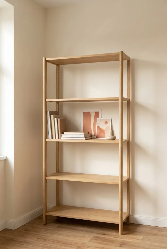
Shelves are often treated as pure storage, but leaning a small print or two among the books turns them into a styled display without adding anything to the walls. This idea works well for anyone who has already maxed out their available wall space in a compact apartment. Mixing frames with stacked books, small ceramics, or a candle creates a tablescape effect that feels personal and layered rather than staged. That’s why many designers recommend this approach for small shelves near a reading chair or desk, since it adds visual interest at eye level without competing with larger pieces elsewhere in the room. The combination feels effortless once it is arranged.
This approach also gives you more room to experiment, since nothing needs to be permanently mounted or perfectly aligned. A small framed print leaning against a stack of hardcover books adds height variation, while a single ceramic piece next to it breaks up the straight lines of the shelf itself. Choosing a warm color palette for both the books and the art helps everything feel intentional rather than mismatched. This idea works especially well in a reading nook or beside a desk, where the display gets appreciated up close during everyday moments.
12. Sofa Back Art Row
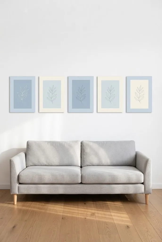
- Fills the long stretch of wall behind a sofa without overwhelming the space
- Uses a horizontal row of frames to match the shape of the seating below
- Keeps sightlines low, which suits rooms with lower ceilings
- Simple to hang using a level string for even spacing
A long row of frames behind the sofa fills the widest wall in a small living area without crowding the room. This layout follows the horizontal line of the sofa itself, which creates a sense of order that feels calm rather than busy. Choosing frames of the same height, even if the widths vary slightly, keeps the row looking tidy from across the room. Five small prints often cost less than one oversized canvas, which stretches a modest budget further. The result is a wall that feels finished and proportioned to the furniture it sits above.
A studio apartment often has one dominant wall, and the space behind the sofa is usually it. Filling that stretch with a coordinated row of art gives the room a defined edge instead of leaving it blank and unfinished. Using a paper template on the floor first helps map out spacing before any nails go into the wall. That’s why many designers recommend planning frame placement on paper, since it prevents uneven gaps once everything is hung. This layout also works well with mixed frame colors, as long as the sizes stay consistent for a clean, unified line across it.
13. Kitchen Nook Art Corner
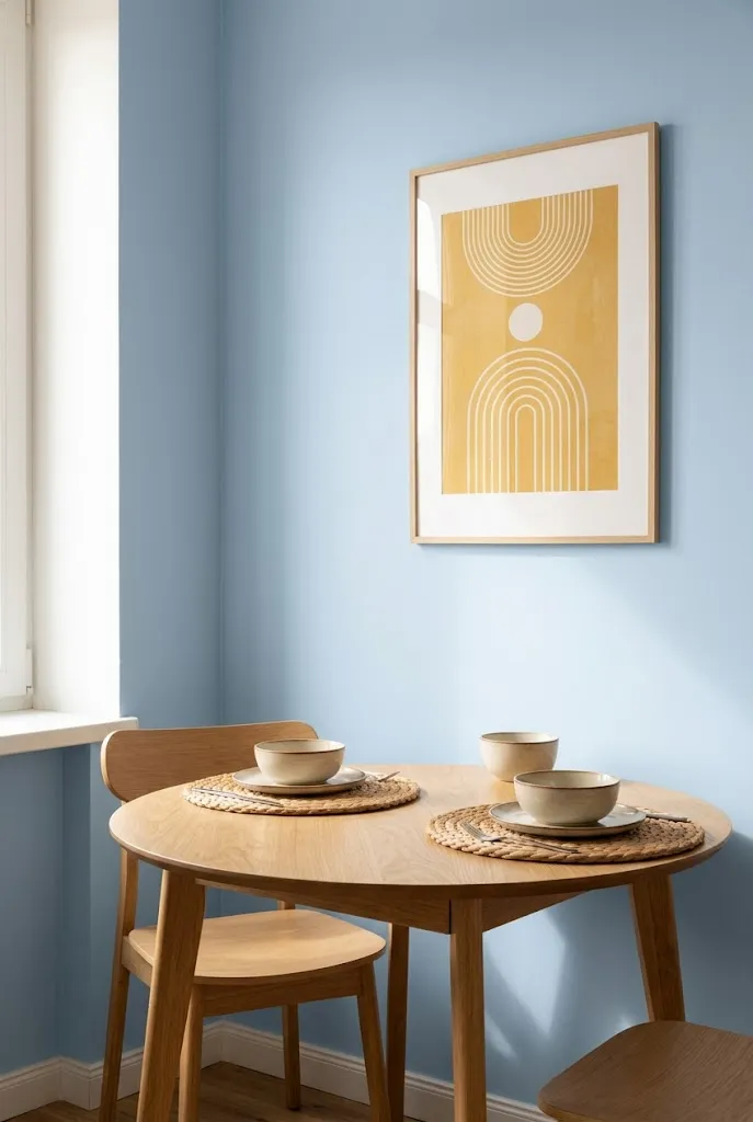
- Brings personality to a small dining or kitchen corner often left bare
- Works well with a narrow shelf or single nail above a table
- Adds warmth to a functional space without needing much room
- Easy to keep food safe since prints sit above counter height
A kitchen nook in a studio apartment rarely gets styled, yet it often sits within view of the entire living space. Hanging a single small print above the table brings warmth to a corner that usually stays plain and overlooked. Choosing a piece with color that matches the kitchen’s palette ties the space together without introducing anything new to clean or maintain. In my experience, even one framed print above a breakfast table changes how the whole room feels during meals. This small addition makes the nook feel like an intentional part of the home rather than an afterthought.
Small kitchen corners in a compact home often go unnoticed when it comes to decorating, since most attention goes to the living area or bedroom. Adding art here closes that gap and gives the eating space its own sense of character. A print with a simple, cheerful design suits this spot better than something oversized or overly detailed, since the wall itself is usually narrow. Positioning the piece slightly above eye level keeps it out of the way of daily activity while still remaining visible from the table. This small styling choice makes a compact kitchen feel complete rather than plain.
14. Vertical Frame Column
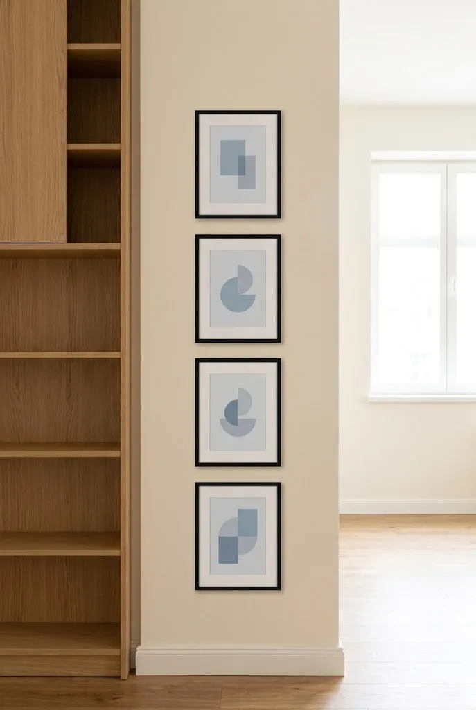
- Suits narrow walls beside a door, window, or tall furniture piece
- Draws the eye upward, which helps rooms with low ceilings feel taller
- Uses matching frame widths stacked in a single straight line
- Simple to hang with a measuring tape and level for accuracy
Narrow walls are common in a studio apartment, especially the strip beside a door frame or tall piece of furniture. A vertical column of matching frames makes use of that awkward space instead of leaving it bare. Stacking three or four prints in a single straight line draws the eye upward, which helps a room with a low ceiling feel taller than it is. I’ve tried this in tight hallway sections, and it makes the space feel more finished. Keeping the frame widths identical, even with different images inside, is what makes this column read as organized.
A single wide wall gets most of the attention in a small apartment, but narrow strips deserve styling too. A column of art turns an overlooked gap into a deliberate design choice rather than empty space that feels forgotten. This idea works well beside a tall bookshelf or wardrobe, where the vertical line of the frames echoes the shape of the furniture next to it. Measuring the gaps between each frame before hanging keeps the spacing even from top to bottom, which matters more here than in a wider grid layout. The finished column reads as neat and considered.
15. Behind the Door Display
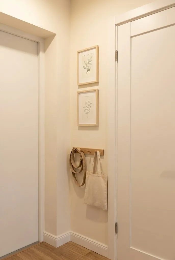
- Makes use of an overlooked wall strip most people skip entirely
- Works well near an entry, coat area, or closet door
- Keeps larger walls free for furniture and storage needs
- A practical spot for smaller prints that need less visual weight
Every small apartment has a few overlooked strips of wall, and the space beside a closet or entry door is one of the most common. Because this area rarely fits furniture, it often sits empty even though it stays within view every time someone walks in or out. Adding one or two small prints here fills that gap without competing for space needed elsewhere in the room. I’ve noticed this spot works especially well for guests, since it becomes one of the first things they see upon entering. It turns a functional hallway moment into something worth a glance.
A closet door or entryway wall rarely gets decorated, since most attention goes toward the living area or bedroom. Using this narrow space for one or two small prints gives the entry a finished, welcoming feel without requiring any extra floor space. Choosing pieces with soft, calming colors suits this spot well, since the area is usually seen briefly rather than lingered in for long periods. That’s why many designers recommend keeping entryway art simple rather than bold, letting the main statement pieces live in the living room or bedroom. This small addition makes the entry feel considered.
16. Bathroom Wall Print
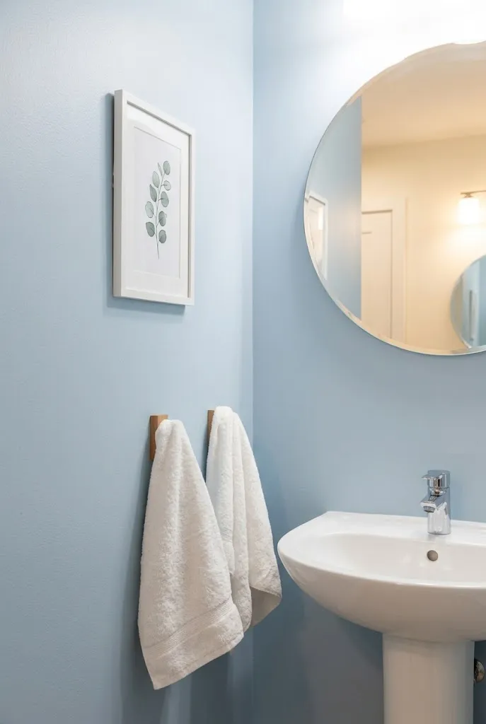
- Adds personality to the smallest room in a studio without using floor space
- Works well with a single small waterproof or laminated print
- Suits a spot beside the mirror or above the towel rack
- Easy upgrade that costs very little compared to other rooms
A bathroom is often the last room to get any decorating attention, yet it usually has just enough wall space for one small print. Adding a single framed piece beside the mirror gives the room a finished feel without requiring any major renovation or extra furniture. Choosing a moisture-resistant frame or a laminated print keeps the piece safe from humidity over time. In my experience, this tiny addition makes a rented bathroom feel far less generic than leaving the walls completely bare. It is one of the lowest-cost upgrades available in the entire apartment.
Because a bathroom in a studio apartment is usually compact, there is rarely room for more than one or two small pieces of art. Choosing a print with a calming color palette, like soft blues or greens, suits the relaxing purpose of the room better than something bold or busy. Positioning the piece near the mirror or above the towel rack keeps it visible without getting in the way of daily routines. This small styling choice often gets overlooked, yet it consistently makes the smallest room in the home feel just as considered as the living area or bedroom.
17. Closet Door Mini Gallery
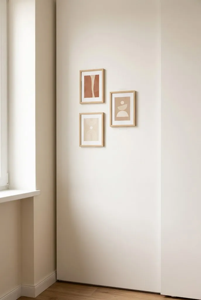
- Turns a flat, plain door into a small personal display
- Uses removable hooks or adhesive strips instead of nails
- Ideal for renters who need damage-free hanging options
- Adds character to a surface usually left completely blank
A closet door is one of the largest flat surfaces in a studio apartment that almost never gets decorated. Using adhesive hooks or strips instead of nails makes this option ideal for renters who need to avoid permanent damage. Three or four small prints arranged in a simple line or loose cluster turn a plain door into a personal display without any drilling required. I’ve seen this work well in shared apartments, where residents want to add personality without altering the space permanently. It is one of the most damage-free ways to add art to a small home.
Closet doors take up significant visual space in a studio apartment, yet they are almost always left blank and overlooked. Filling that space with a small collection of prints gives the room one more layer of personality without needing any additional wall area. Adhesive strips designed for lightweight frames hold securely while still removing cleanly when it is time to move out. This idea works particularly well for someone renting short term, since the entire display can come down in minutes without leaving marks behind. The closet door becomes an unexpected but effective spot for art.
18. Layered Frame Stack
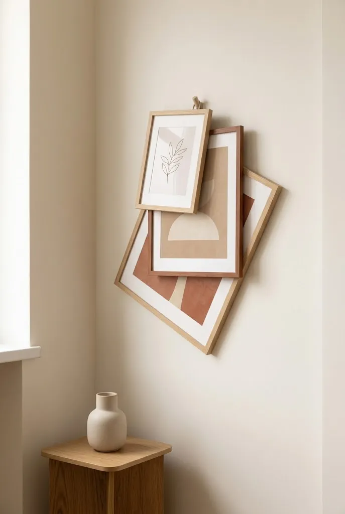
- Creates depth by overlapping frames of different sizes on the same nail
- Uses fewer wall holes than a spread-out gallery arrangement
- Adds a relaxed, collected look with minimal planning
- Works well in tight corners where space is limited
Overlapping frames on a single hook creates the illusion of depth without needing multiple nails spread across the wall. This layered stack works especially well in a tight corner where a full gallery wall would feel too crowded. Choosing frames in slightly different sizes, with the largest at the back, gives the arrangement a natural sense of movement. I’ve noticed this trick works particularly well for renters who want a curated look but are limited to just one or two wall holes. It requires very little planning compared to a spread-out layout, yet still reads as intentional.
A layered stack suits small apartments because it delivers visual interest in a compact footprint, which matters most when every wall serves multiple purposes. Overlapping the frames slightly, rather than spacing them evenly, gives the display a relaxed, collected feeling similar to how art accumulates naturally over time. This approach also works well above furniture that already has some height, like a side table or narrow bookshelf, since the stack does not need to stretch very far. The result is a corner that feels styled without requiring a large art budget or extensive wall planning.
19. Framed Postcard Wall
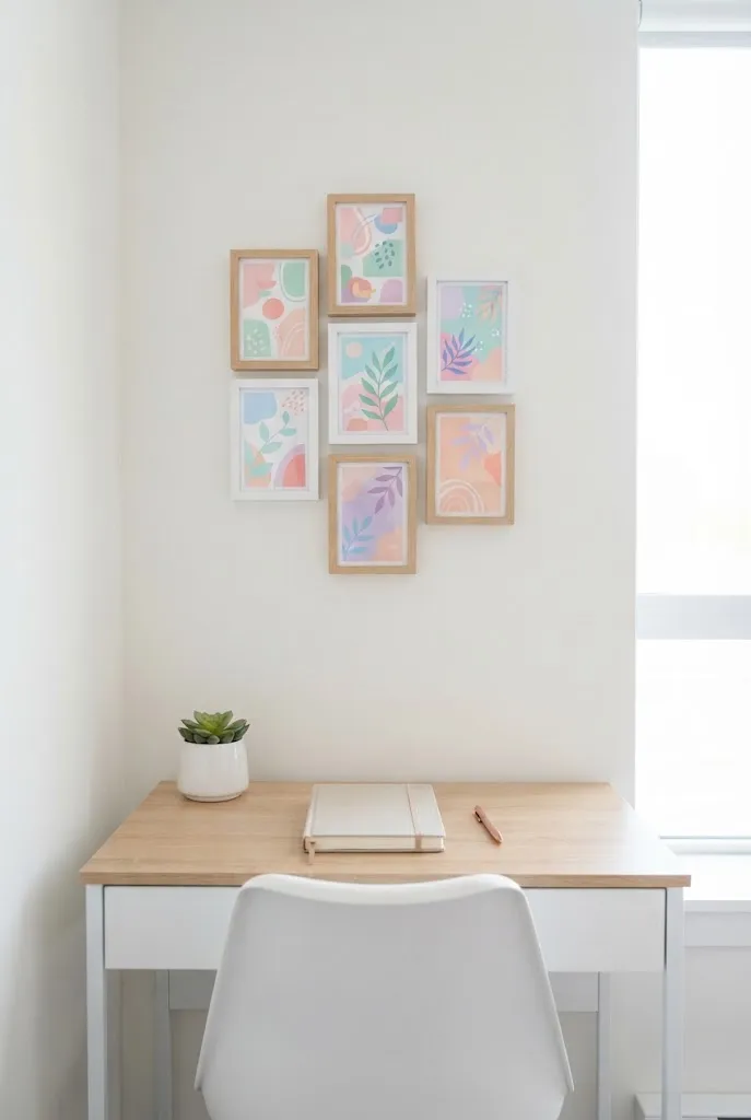
- Uses small, affordable prints for a budget-friendly art display
- Fills a compact wall area with color and personal touches
- Easy to swap out individual pieces as new favorites are found
- Suits a desk area or narrow hallway strip
Postcard-sized prints are one of the most affordable ways to fill a wall with color and personality. Because each piece is small, a cluster of five or six frames still fits comfortably in a compact space like a desk area or narrow hallway. This approach also makes it easy to collect pieces over time from trips, local shops, or online prints without a big upfront cost. That’s why many designers recommend postcard-sized art for people just starting to build their collection, since the low price point removes the pressure of committing to a single large piece. It is a budget-friendly entry point into wall styling.
A desk area in a studio apartment benefits from art at eye level, and small postcard frames fit that need without overwhelming the workspace. Arranging the pieces in a loose, slightly uneven cluster keeps the display feeling playful rather than overly formal. Swapping one or two prints whenever a new favorite postcard comes along keeps the wall feeling fresh without needing to replan the entire layout. This idea works well for anyone who enjoys collecting small mementos, since the frames double as a personal scrapbook displayed openly on the wall.
20. Behind the TV Art Frame
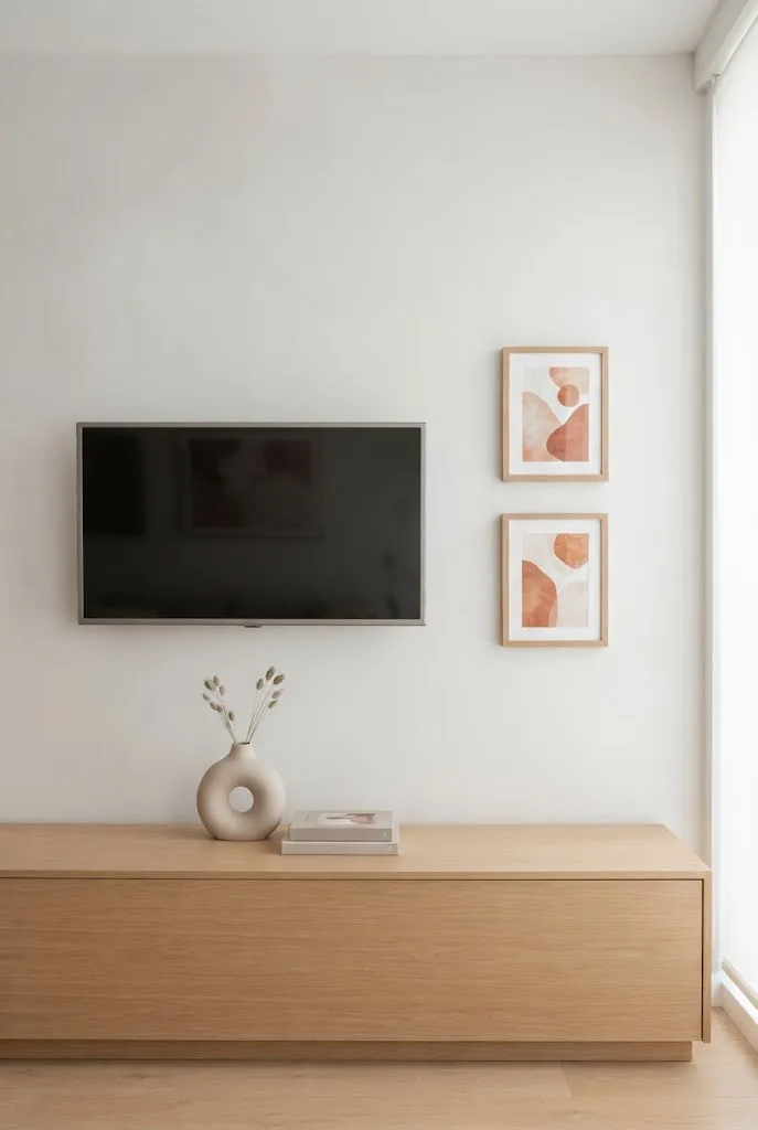
- Softens the look of a mounted TV screen when it’s turned off
- Uses one or two prints positioned around the screen edges
- Balances a technical object with something warmer and more personal
- Works well in a living area where the TV is the main wall feature
A mounted television often dominates the main wall in a studio apartment, leaving the surrounding space feeling unfinished once the screen goes dark. Adding one or two small prints beside or around the TV softens its presence and ties it into the rest of the room’s decor. Choosing frames with warm tones helps balance the cool, technical look of the screen itself. I’ve noticed this small addition makes a big difference in how put-together the main living wall feels overall. It keeps the room from looking like the television is the only design choice made.
This idea works well because most studio apartments have one central wall that serves double duty as both the entertainment area and the main visual focus of the room. Placing art asymmetrically to one side of the screen, rather than perfectly centered, avoids competing directly with the TV for attention. A single accent color repeated in both the art and a nearby throw pillow or rug ties the whole wall together. This small styling choice helps the space feel like a living room first, rather than a room built entirely around a screen.
21. Freestanding Easel Art
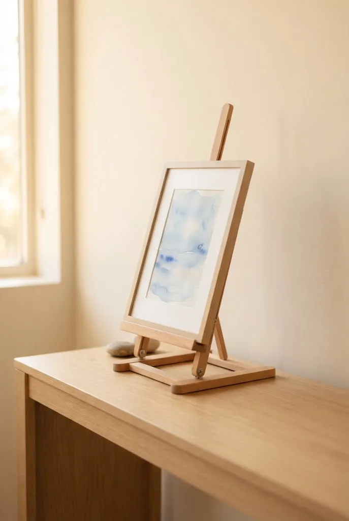
- Uses zero wall space, ideal for rentals with strict no-hole policies
- Easy to reposition anywhere in the room as needed
- Adds an artistic, studio-like touch to a small living area
- Works well as a rotating spot for seasonal or favorite prints
A freestanding easel solves the wall space problem entirely by moving art off the wall altogether. This option suits renters with strict no-hole policies, since nothing needs to be mounted or attached to any surface. Placing a small easel on a console table or shelf gives the room an artistic, gallery-like touch that feels intentional rather than accidental. In my experience, this setup also makes it incredibly easy to rotate pieces with the seasons or whenever a new favorite print comes along. It requires no tools and takes only seconds to set up in any corner of the room.
An easel display works especially well in a studio apartment because it can move freely to wherever it is needed most, whether that means a console table, a windowsill, or even the floor beside a bookshelf. This flexibility makes it one of the lowest-commitment ways to add art to a small home. Choosing a single striking print rather than several smaller ones keeps the display simple and uncluttered on a tabletop surface. The relaxed, propped-up look also gives the room a lived-in, artistic feel that a rigidly mounted frame cannot quite replicate.
22. Curtain Rod Print Hang
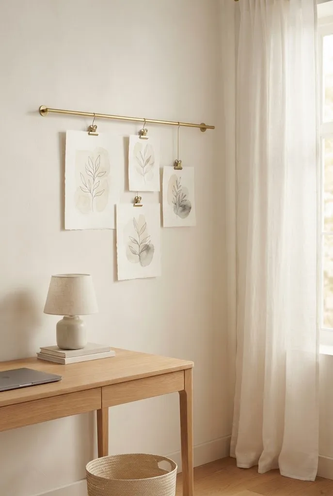
- Uses a slim curtain rod and clips instead of nails or frames
- Great for swapping prints, fabric, or postcards whenever the mood strikes
- Works well beside a window or above a compact desk
- Adds soft, gallery-like movement to an otherwise flat wall
Hanging prints from a slim curtain rod with clip hooks brings a soft, gallery-like movement to compact walls that a static frame can’t match. This approach works well for anyone who loves to rotate their art seasonally, since swapping one print for another takes seconds and needs no tools at all. I’ve noticed this technique doing double duty above a compact desk or reading nook, where the gentle movement of paper catching a breeze adds unexpected charm. Choosing a slim brass or wood rod keeps the look elevated rather than utilitarian. It fits naturally into a studio apartment, where flexibility and quick styling changes matter just as much as visual appeal.
A curtain rod display also solves the framing dilemma many renters face, since prints, postcards, or even fabric swatches can clip on without needing glass or backing boards. This keeps the overall look lightweight, almost like laundry-line styling brought indoors with intention. Positioning the rod slightly above eye level near a window lets natural light filter through thinner paper prints, creating a soft glow during the day. That’s why many designers recommend this idea for small reading corners or work desks, where a rotating display stays fresh without much effort. It remains one of the most flexible art solutions for any renter.
Conclusion
A studio apartment can feel just as rich and personal as any larger home once the walls start doing their part. These twenty-two ideas prove there is more than one way to style wall art in a studio apartment, whether you lean toward a bold statement print or a quiet cluster of postcards above a desk. I’ve seen how small changes like these can completely transform a space, turning a plain rental into somewhere that actually feels like home. Save this post for later, try one idea this weekend, and pass it along to a friend furnishing their first small space too.
Read More:
21 Mini Studio Apartment Rug Ideas to Make Rooms Look Bigger
6 Studio Apartment Rug Mistakes to Avoid (And What to Fix Instead)
Community
Join the conversation
Add a useful idea, ask a specific question, or share what worked in your space. Every comment is reviewed before it appears.